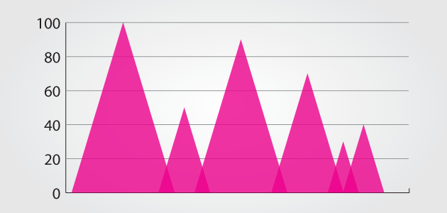
In the process of setting up a visual style for an infographic, designers often make little graphical tweaks to charts. Often these tweaks are completely benign and just help the chart to fit in better with its surroundings. But sometimes the changes can make the chart less effective at communicating information. Let’s take a look at seven of the tweaks that designers make to bar charts, and dissect if and how they are harming the communication of the data.
- Rounded Corner Bars are probably one of the least harmful such tweaks. Along with the simple rounded version, there are also versions that replace the tips of the bars with, say, wine bottles or crayons — depending on the theme of the design. The only potential issue with this change is that the tops of the bars are missing a strong horizontal line, which could conceivably make bars harder to compare. This potential downside can easily be mitigated with good grid lines that help to delineate the real bars
- Triangle Charts done correctly are in the same situation as rounded bars. Unfortunately, they are often done incorrectly, and these issues can cause problems.
- Overlapping Triangle Charts are a potential issue because they use an aesthetic choice that represents a concept that is not typically present in “bar” charts. In Euler diagrams, overlapping areas between regions represent the subset that those regions have in common. But in bar charts, the categories are almost always exclusive, so this overlap doesn’t make sense in that regard. Add to that the problem of potentially changing the perceived area, and you have a tactic that is squarely in the gray area of best practice.
- Quadratically Increasing Triangle Charts are far too common. Their problem is that the “bars” increase in size horizontally and vertically, quadratically increasing the area. Since area is a potential indicator of the data, there are conflicting indicators. The height and the width tell you one thing, while the area tells you another. This technique is definitely wrong, and is known as the Shrinking Family Doctor.
- Extended Bars that are well executed can be a great way to label a bar chart, but when they are executed poorly, they can distort the proportional relationships between data. They need to have a very clear delineation between where the labeling stops, and they should really only be used for values that could only be non-negative (think about what the technique would look like for a bar representing a negative value).
- Vanished Labels are a major problem. Without adequate labeling, it is impossible to know what a bar chart is representing, how much each bar represents, how to compare bars, etc. Grid lines are crucial for bar charts, and their importance only increases as the number of bars increases (a two-bar chart probably doesn’t need grid lines).
- Correct Axis Context is closely related to labeling. Context is especially important when there are multiple bar charts on a page that represent the same units. The axes for each chart should have the same extents. This allows comparisons to happen across charts. Equally important is providing the correct context within the chart. Starting an axis at anything above 0 is rarely a good idea, and when a chart dips into the negatives, it is often a good idea to make the quantity axis a mirror image so the absolute value of the maximum and minimum of the axis are the same. When part-whole percentages are involved, the quantity axis should always go from 0 to 100.
When done correctly, bar charts can be very clear, while still showing off creativity. But tweak them enough, and they may become messy representations of data. Be careful with your bars. Drew Skau is Visualization Architect at Visual.ly and a PhD Computer Science Visualization student at UNCC with an undergraduate degree in Architecture. You can follow him on twitter @SeeingStructure


