Sometimes, 90% of the conversation focuses on a problem that is a small part of the big picture. Data visualizations can be a useful tool in stepping back, zooming out, and establishing context in an issue. Here is a look at a few factors in telling stories with data.
Data neutrality
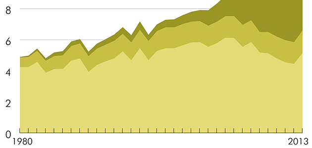
It’s easy to begin a project with an idea of the story that you are looking to tell, but it’s better to begin a project by being open to the story that the data tells. Neutrality is difficult. Just as a few words can change the tone and alter perceptions, so can a few graphs. The much referenced book, How to Lie with Statistics, explores how graphs can be altered to adjust perceptions. Sometimes it’s accidental, and sometimes purposeful choices are made to morph the data into telling a predetermined story. Horizontal and vertical axes can be cropped or stretched to create a visual perception. Color is also a tool that is used to provoke certain reactions. Timelines and context, an example Using consistent time periods across multiple data sets is essential to understanding how the data pieces fit together. For example, when developing my recent data visualization, Fields of Gold: Changes in the US Corn Industry, I was struck by how important consistent timelines are to telling a story. 

Visual solutions to information problems
Even though you may attempt to match the timeframes on comparative data sets, the information may just not be available. Consider using visual design cues to establish a spatial understanding of how the timelines relate. The design of a piece can be more than just a way to make something look slick or trendy. The design can be a communication tool that helps readers to better understand the data. 
Clear and informative communication
As data visualization gains popularity as a communication tool, some blogs have offered healthy critique of published graphs. (WTF Visualizations, Flowing Data’s mistaken data, and Junk Charts) Whether the featured visualizations are misleading or just confusing, the graphs on these sites can be a useful lesson on what not to do. 
Steph is a writer and data visualization designer living in Asheville, NC. She loves collaborating on projects that involve spreadsheets, graphs, and interesting data sets. Find her online at FlapjackMedia.com, or on Visual.ly at flapjackmedia.
