Here’s a concept that nearly everyone that works with video marketing takes for granted — and being able to speak it will paint you as an authority in the eyes of clients, prospects, and colleagues alike.
I’m talking of course, about the 12 principles of animation, 12 fundamentals compiled by master Disney animators, Frank Thomas and Ollie Johnston in their 1981 book, The Illusion of Life.
Keep reading to know all of them.
- Why Do You Have To Know This?
- 1. Follow Through & Overlapping Action
- 2. Arcs
- 3. Slow in/Slow out
- 4. Timing
- 5. Anticipation
- 6. Staging
- 7. Pose to Pose and Straight Ahead Action
- 8. Appeal
- 9. Squash & Stretch
- 10. Solid Drawing
- 11. Exaggeration
- 12. Secondary Action
- In conclusion…
- Bonus
Download this post by entering your email below
Why Do You Have To Know This?
What a great question!
The short answer is that it will help you identify objectively “good” animation.
To get a bit more detailed, we sort of have to expand on why Frank & Ollie came up with the 12 principles in the first place.
Things like gravity, inertia, weight, air, and depth don’t exist naturally in an animated, two-dimensional world.
Frank, Ollie, and the rest of Disney’s Nine Old Men realized that in order to make their characters and worlds believable, they would have to simulate those properties on the page.
The same goes for computer animation today.
In After Effects, if you tell an object to go from point A to point B within one second, the computer (by default) will have that object begin moving at its maximum speed and arriving with a complete, instantaneous stop.
Things don’t move that way in the real world.
Everything that moves eases into that motion and then slows to a stop.
Here’s an example of how a computer moves something from one point to another by default, and how easing makes it feel more natural.

In the simple animation above you can see how the lighter square ramps up to its final velocity and eases to a stop, whereas the darker square goes from zero to final velocity instantaneously.
This is one sign of “objectively good” motion, and this is just ONE of the 12 principles of animation in action.
Now let’s pull apart an example of a Rock-produced animated video for the Gerber Life Insurance Company, and identify where each of the 12 principles comes into play.

1. Follow Through & Overlapping Action
These are two tight-knit techniques that we practically ignored in the real world and were developed to give the impression that characters or objects obey the same rules of physics that we do.
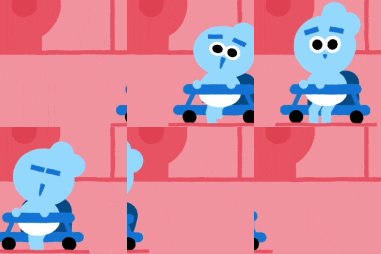
In the top example of follow through, the loosely tied parts of the body continue moving after the character has stopped.
Note the hair and the back of the walker seat. These parts keep moving beyond that point as the baby slows to a halt.

In the overlapping action example, a sense of inertia is created by moving the limbs and head of the teddy bear at different rates from its torso, since they are lighter.
As the torso pushes forward, the head and limbs need time to catch up.
This creates another effect called drag, where the appendages need a few frames to catch up with the torso.

2. Arcs
More often than not, a “natural action” follows an arched trajectory.
The same holds true for projectiles, but we don’t have any examples of anything being thrown in this piece.
In the example, you can see the subtly implied arcs in the motion of the hands, the back of the walker, and the tilt of the head.
This gives the character’s movement a more natural-looking and believable feel.
The only exception to the use of parabolic movement in animation would be if you were animating something mechanical.

3. Slow in/Slow out
As we demonstrated near the beginning of this post, objects in the real world, such as the human body, animals and vehicles, need time to accelerate and slow down.
For this reason, more frames are created near the beginning and end of an action, which produces a slow in (time to accelerate) and slow out (time to decelerate and stop), generating a more believable motion.
There are 4 different instances of slow in/slow out in the example.
Starting with the baby’s face, we can see the eyes open and look up with an exaggerated easing in and easing out.
Next, the eyebrows move from the tops of the eyes to higher up on the forehead in a nice slow, easy push. Again, not at a constant rate of motion.
Finally, you can see how the phone eases into place over the frame.
By default, the phone would just slide in and stop immediately in one constant, lifeless, emotionless swoop.

4. Timing
Timing refers to the number of frames for a given action, basically dictating how long it takes for something to get from one point to another.
In animation, correct timing helps sell the idea that what we’re seeing on-screen adheres to the laws of real-world physics.
In the example, we can see how smaller and more nimble characters take less time (fewer frames) to get from one point to another.
The larger characters move slower, implying they have more mass and need to exert more effort.
Timing doesn’t just apply to mass, however. It can also dictate mood, emotion, or communicate more about a character’s personality.
For example, an athletic character might have a springiness to their actions, which would also consist of fewer frames than a lazy character, who would move less often and more slowly.
Another great application of timing would be if the aforementioned athletic character was in a sad mood.
The timing would change to reflect that in their actions to communicate how they’re feeling through body language.

5. Anticipation
Anticipation is a means of preparing the audience for an action on-screen.
In this example, there are a few big hints to the next action in the sequence.
Namely, the half-closed eyes, the slow wavering motion of the head nodding, and the subtle upturn of the head and downturn of the eyebrows as the baby slumps into the fall.
Again, this makes the action more believable than just having the head fall forward suddenly from rest, and it all takes place over just a few frames.

6. Staging
Staging is the term used to describe the layout of visual elements in the frame to direct the audience’s attention to what is most important in the scene while avoiding any unnecessary (or distracting) details.
Frank and Ollie described it as, “the presentation of any idea so that it is completely and unmistakably clear.”
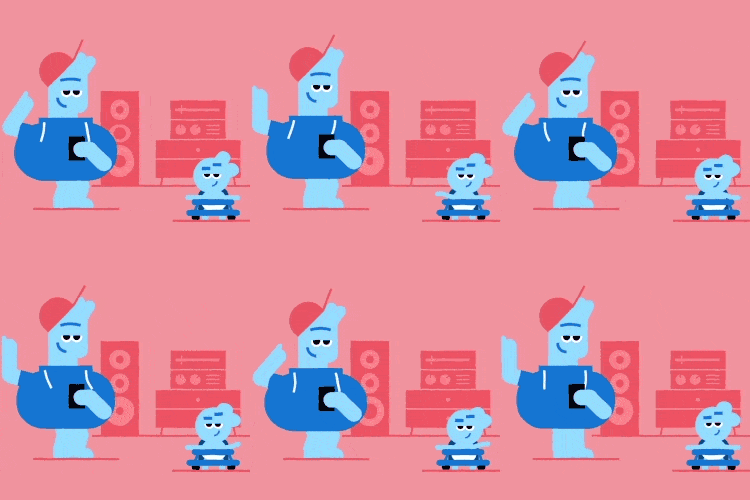
In this example, it’s clear that the father and child are in a room with loud music, despite the spartan frame and lack of audio.

7. Pose to Pose and Straight Ahead Action
These are two different methods of “traditional” animation.
Straight ahead action is an animation technique involving starting at the first frame and drawing all the subsequent frames after until you reach the end of the action.
This technique only really applies to the traditional frame by frame animation.
On display in this piece (and most other examples of computer animation) is the pose to pose method.
Pose to pose involves drawing out the keyframes of a sequence and then filling in all the drawings (frames) in between.
In computer animation with rigged 2D or 3D characters, the animator sets the keyframes for the character, and the computer fills in the frames between those keyframes automatically.
This doesn’t mean the work is done “automagically.”
It is now the job of the animator to determine how everything moves with motion graphs and various transformation properties such as scale, position, and rotation (which can all be keyframed individually).

8. Appeal
In short, this is all about making something that your audience likes.
For animated characters, appeal is akin to charisma in a live action actor.
I find that appeal applies to how things move as well, with natural arcs and easing being far more pleasing to the eye than rigid, mechanical motion at a constant rate.
In character animation, both heroic and villainous characters also need to be appealing, but that doesn’t mean they need to be sympathetic.
Again, the character or motion needs to feel natural AND interesting to create a connection with the audience.

9. Squash & Stretch
Squash and stretch is used to give a character or object the appearance of having both weight and flexibility.
One of the first things an animator in training will do is the bouncing ball exercise, wherein a ball drops from the edge of the frame in a stretched state, before hitting the ground to squash out, and then launches back up into the next arc with slightly less stretch, velocity, and height to account for inertia.
In the example here, squash and stretch has been subtly added to the character’s torso to help sell the illusion that he has real weight.
The body stretches as his legs straighten to bring the sides in, and squashes back out as they bend to give him a “bounciness” and create a sense of inertia.

10. Solid Drawing
Even though computer animators draw far less than their flipbook forefathers, solid drawing skills can still help the modern-day animator create believable weight, volume, and depth in their characters.
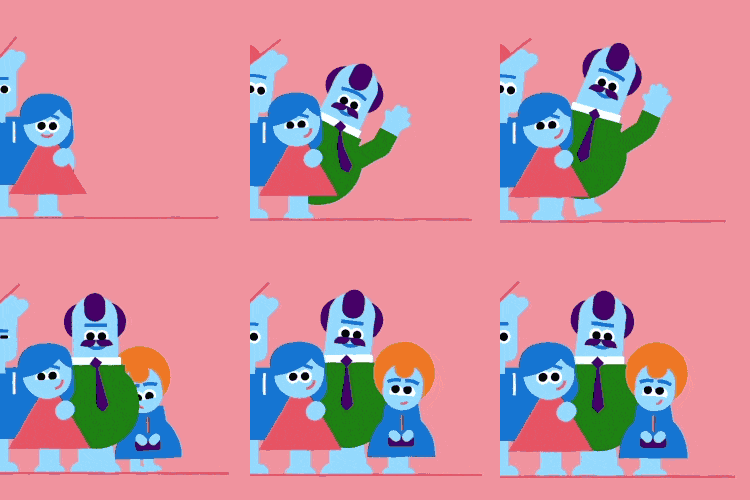
Even though the piece we’re reviewing is quite flat with characters consisting of colorful geometric shapes, there are still great examples of real depth and dimension throughout, like the man’s head dipping as he steps into view, or the smaller woman stepping around him to get into frame.

11. Exaggeration
One thing to note about animation is that it is completely possible to perfectly mimic motion in the real world, but this is often a little static and “boring” in practice.
That’s why animators exaggerate the motion in their work.
Exaggerating movement adds much-needed interest and appeal to nearly any scene.
For Disney, they wanted to keep the exaggeration true to reality, just “wilder” and “more extreme.”
However, if you take the work of John K. for example (see Ren & Stimpy), the motion and poses go beyond anything you can find in nature, becoming a true caricature of real life.
In the example we’ve chosen here, the sound from the speakers is physically blowing the baby’s hair and head back, her little hands clinging to the walker for dear life.
It communicates that the music is loud.

12. Secondary Action
Secondary actions emphasize the main action.
In this example of the father walking, we see the secondary actions of his hair and the brim of his hat bouncing, and the ties on his hoody swinging along with each step.
The secondary action helps sell the illusion that the character is walking and that HIS motion is creating these secondary movements directly.
This also serves as great examples of exaggeration (speed of the bounce and sway), squash and stretch (his belly “squishing” with each step), and overlapping action and follow through (the rate at which elements attached to the body move in relation to the body).

In conclusion…
If you’ve read this far, congratulations!
You’ve got a thirst for knowledge and about 10 minutes on your hands, which are both really valuable.
Beyond that, you’ve probably recognized that a LOT of these principles relate to “traditional” animation.
Even so, you’ve also noticed no doubt, that the work truly does speak for itself when you take the time to apply these principles to computer animation and increase the charm of a simple motion graphics piece exponentially.
Work that employs the 12 principles of animation is far more interesting to watch.
Pull up a handful of videos and you will see where the lack of these principles truly takes a toll on the end product.
Bonus
I know that there is a LOT to take in here and you’re probably wondering how in the heck you can remember all of this.
That’s where pneumonic devices come into play.
You might have noticed that we listed out these 12 principles of animation in a certain order.
That was no accident!
If you take the first letter of each principle and put them in order, you spell out the phrase “FAST AS PASSES,” which is a great way to commit these to memory.
Check out the list below.
- Follow thorough & overlapping action
- Arcs
- Slow in/slow out
- Timing
- Anticipation
- Staging
- Pose to pose & Straight ahead action
- Appeal
- Squash & Stretch
- Solid Drawing
- Exaggeration
- Secondary Action


