11 Infographics About Infographics

See what 1400+ marketers had to say about the top marketing trends for 2024.

People who create infographics do their work partly because they believe infographics are a great way to communicate information. Since the people in this field also need to communicate information about their work, it was inevitable that infographics about infographics would eventually be created. Here are 11 of these meta infographics.

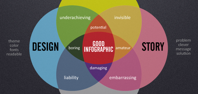
1. Infographics are still new to many people, and what better way to explain what they are to someone than with a Euler diagram? Information, Illustration, and Design does just that.

State of Marketing Report 2024


2. Infographics often contain data visualizations, and this diagram shows just what a data visualization is.


3. Now that we know what they are, we need to know what makes an infographic good.


4. And it would also be useful to know the steps to making one.


5. For a slightly more humorous take on creation, there’s also SEOmoz’s guide.


6. The state of infographics shows where they fit into current online culture, and what they are good for.


7. And the infographic of infographics covers an analysis of 49 infographics.


8. But why would you need an infographic? Never fear, there’s an infographic to answer that too!


9. An anecdotal approach is not typical for good infographics, but the Most Popular Infographics is done in jest, so we’ll let it slide.


10. And in case you needed a graphic to test your abilities at using infographics, Are You Good at Following Flow Charts? is perfect for you.


11. We’ll leave you with this fun Venn diagram that not only refers to venn diagrams, but also refers to the media it was created in.


Now that you’ve mastered infographics, it’s time to take the rest of your visual content to the next level. Check out our Visual Content Playbook for in-depth research, buzzworthy examples, and interviews with social media experts at LinkedIn, Whole Foods andBuffer.


Drew Skau is Visualization Architect at Visual.ly and a PhD Computer Science Visualization student at UNCC with an undergraduate degree in Architecture. You can follow him on twitter @SeeingStructure

Guide to visually communicate complex data - Promotional Banner
Share
facebook
linkedin
twitter
mail

2024 State of Marketing Report

Your golden ticket to crush your goals with data-driven insights!

2024 State of Marketing Report

Your golden ticket to crush your goals with data-driven insights!

Subscribe to our blog

Sign up to receive Rock Content blog posts

Rock Content WriterAccess - Start a Free Trial

Order badass content with WriterAccess. Just as we do.

Find +15,000 skilled freelance writers, editors, content strategists, translators, designers and more for hire.

Want to receive more brilliant content like this for free?

Sign up to receive our content by email and be a member of the Rock Content Community!

Talk to an expert and enhance your company’s marketing results.

Rock Content offers solutions for producing high-quality content, increasing organic traffic, building interactive experiences, and improving conversions that will transform the outcomes of your company or agency. Let’s talk.