We all know visualizations can be a great way to represent data, but some visualizations are better than others at certain data. Sometimes, a bar chart is better than a line chart. This is because visualizations don’t just represent data, they also represent qualities of data.
One of these qualities is the degree of continuity. There are three main levels of continuity that data can have.
- Continuous – These are values like Temperature or Time. They can be subdivided into infinitely small increments.
- Discrete – These are values like Number of Elephants. They have a set amount of accuracy, often nothing smaller than 1. Usually each member of these values is numbered, not named.
- Categorical – These are values like States or Fruits. These are also discrete, but the values are different enough from each other to each have a name.
Now that we know we have these levels, and we know what they are, how do we visualize them best? Let’s take bar charts and line charts as an example.
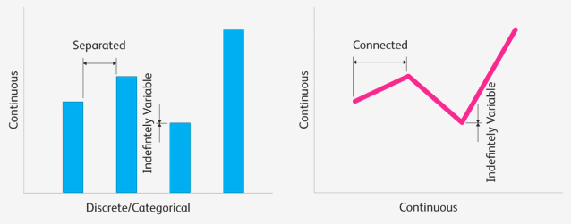
The height of each column in a bar chart can vary indefinitely. This means that the vertical axis can be continuous, because there are no set notches that a bar’s height must fit into. Bar charts have individual separated columns. This means that each bar must represent individual separate data points, making the horizontal axis good for discrete and categorical data.
Like a bar chart, a line chart has points with indefinitely varying vertical positions. This means that the vertical axis of a line chart is also good for continuous data. Unlike bar charts, line charts have a line connecting individual data points. The line implies continuity, so the horizontal axis is good for continuous data.
These qualities are secondary to the visualization. Primarily, these visualizations represent the numerical values of the data on their vertical axis. So how strong are these secondary qualities? In a 1999 study, Jeff Zacks and Barbara Tversky found that these secondary qualities can have a impact on people. During a survey of participants, they received some rather humorous responses.
So, when you have the option to choose bars or lines, think carefully. It might make the difference between growing old and changing sex.
Drew Skau is a PhD Computer Science Visualization student at UNCC, with an undergraduate degree in Architecture.


