A comparison infographic might be the resource you need to properly analyze data for your business.
It’s no longer a secret that the use of data and infographics are fundamental in a company’s daily routine, either to assist in decision-making or to convince potential customers of the benefits of your solutions.
In all cases, this kind of approach only works if you are able to take your company to high levels of data literacy.
Understanding the data is critical if you want to be ready to communicate it to clients. However, it’s also necessary to invest in data visualization techniques in order to improve the audience’s understanding. For this, the use of graphic resources is absolutely imperative.
Charts, tables, slides, videos, maps — all these are examples of materials that you can use in presentations and other interactions with the audience. Following this line, comparison infographics offer the best way for you to gather visual elements and thus optimize everyone’s experience.
Don’t know what it’s all about or want to learn more about this type of content? Read on to find out:
- What is a comparison infographic?
- When are comparison infographics useful?
- What are the main layouts of comparison infographics?
- How to make a comparison infographic?
- Which tools are useful to the creation of infographics?
Download this post by entering your email below
What is a comparison infographic?
You already know what an infographic is, right? It’s a content format that presents information in both text and images. In some cases, these infographics can be transformed into interactive content, making them more attractive to the audience and generating more appropriate material for learning.
Regardless of whether it’s static or interactive, the infographic’s idea is to use as little text as possible, relying on images to make readers assimilate the message at first glance. The use of the right resources can give life to concepts that may seem abstract if limited to text.
There are different types of infographics (informational, timeline, how-to, etc.) that can be used for various purposes.
In this text, our focus is on the infographic comparison, which is basically used to examine the differences and similarities between two or more things. Observe the example below:

As you can see, the image focuses on visual resources to present the differences between the left and right hemispheres of a human brain. It may seem too simple but the important thing is to understand that the same idea can be applied to compare products, services, professionals, ideas, etc.
In the next topic, let’s talk more about how this kind of content can impact your results.
When are comparison infographics useful?
Now that you understand what a comparison infographic is, you may be wondering how this format fits into your strategy. The good news is that it’s a versatile content that, depending on its elements, can be used to achieve several goals.
All you need to do is understand your objectives well and know how to use comparison infographics in your favor. For example, if the goal is to convince someone to make a change, whatever it may be, an infographic comparing pros and cons can be an interesting ally.
The same idea applies to compare different products, highlighting their main differences, and answering the customer’s questions.
Another fascinating example is the use of comparative infographics to confront myths and facts. This is a beneficial alternative for companies dealing with new solutions in the market, which are not yet well known to the public and, therefore, suffer from false impressions and lack of information.
By the way, this situation can be compared to the awareness campaign generated by the new Coronavirus pandemic. As it was a virus with new characteristics, much incorrect information ended up being spread. To deal with that, many organizations used infographics like this one:

What are the main layouts of comparison infographics?
As you have probably noticed, there are several types of layouts that can be used in comparison infographics. We’ll talk about the main ones below.
Visually appealing table
Using tables is always important to highlight the most relevant data and information about a project, product, or any other issue. To improve its efficiency, you can transform simple tables into visually appealing infographics, as done in the example below, which uses colors and flags to compare seven national soccer teams.

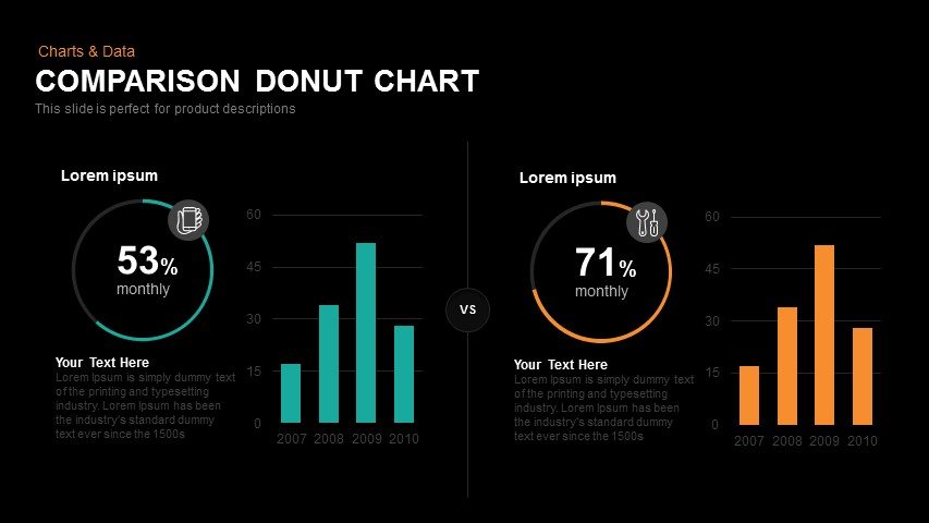
Bar graphs and donut charts
These are two of the most common features when we talk about data visualization. You can combine them to make a complete demonstration of the characteristics of one item, comparing it to another.
In the example below, you can get an idea of how this can apply to the performance analysis of two different products.
Venn Diagram
The Venn diagram is a very positive resource for comparing more complex ideas, which not only present differences but also similarities. Using colors to define the boundaries of the diagram and highlight the most important information makes this type of infographic even more effective.

How to make a comparison infographic?
Well, if you want to create your own comparison infographic, the first step is to define your goal.
Do you want to compare two different products? Do you want to present the pros and cons of a possible strategy? The possibilities are many, so get together with your team and define the main objective.
After defining the goal, you need to think about the design. Of course, it’s possible to create layouts from scratch but the ideal is to search for editable templates, which several platforms offer.
Then, it’s time to deal with the data. This is one of the most important steps since it’s necessary to have the wisdom to choose the most relevant information, besides deciding how it will be distributed in the content.
After adding your data to the template, customize it. Change the colors, fonts, texts, and run a/b tests to find the most appropriate alternative for your situation. If you want to reach an even larger audience, it’s essential to invest in data visualization for mobile.
This whole process can be more natural if you have specialized help. So, in the next topic, we’ll highlight some of the tools you can use to create your own comparison infographic.

Which tools are useful to the creation of infographics?
Creating an infographic has never been easier. There are several offers of free platforms that can assist your company in the production of more basic content.
However, if you want to make the most of this approach’s benefits, it’s essential to invest in a paid service and enjoy more advanced tools.
Visually, for example, is one of the most efficient solutions for creating not only infographics but different types of visual content.
The comparison infographic is a resource that can make the achievement of your goals easier. It enables different types of analysis, helping your brand communicate with customers or even employees.
Visually is a collaborative platform that connects your company with over 1,000 specialized creative professionals, ensuring quick and qualified services.
Want to know more about Visually’s solutions? Access the website and get a quote now!
<!–[if lte IE 8]><![endif]–> hbspt.cta.load(355484, ‘147604d5-f787-450a-9875-2098fafbcccf’, {});