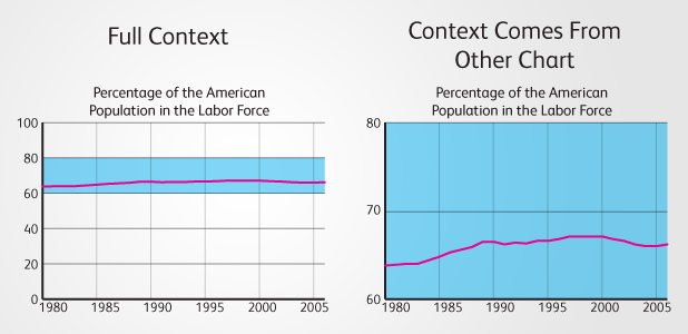
The thing about telling stories through data is, sometimes you don’t know what the story is until you’ve visualized the data. And if the story isn’t what you expected, you may have to either: A. tell the “new” story as it is, or B. find another set of data and another story to tell. Unfortunately, sometimes the commissioner of the visualization may ask you to go with option C. tweak the visualization, or even the data, so it shows the story they want to tell. In the past, the team at Visual.ly has been asked to crop axes in order to exaggerate trends in a chart. The argument is that “as long as the axis is labeled correctly, it is okay”. It would be nice if this were true, but it is not. If we are to truly do visualization, then all of the information related to the chart should be visual. Properly labeled axes are always important, but they should never be part of the primary method of interpreting the data from a visualization. Often times, within a chart there are relationships that are shown between the blank spaces. The visual mark itself is not the only place that information is shown. One example of this is in a line chart showing percentages. (Data)  Cropping the vertical axis on this chart could help to make the changes over time more apparent.
  The problem with this is that the line itself is not the only part that shows data. You can see the pink section shows the percentage of the American population not in the labor force, while the blue section shows the percentage that is in the labor force.
  When we look at the chart this way, we can see that it is more than just the line itself that matters. There is a part to whole relationship shown in the vertical, and cropping the y-axis would destroy that relationship. There is hidden context in many visualizations, and this context helps give an accurate depiction of the data, even if the viewer is unaware that the context exists. Percentage line charts are not the only charts where context is important. For example, in quantitative charts, showing an axis that starts at zero is important, so that the real quantity can be visualized. When multiple charts with the same units are used together, they should all have the same minimums and maximums so that each chart can be compared to the other. This higher level coordination within and between charts is good practice because it gives people a more clear understanding of the data, and it does not attempt to distort the data to exaggerate an existing pattern. That said, there are some cases where axis cropping is necessary. Sometimes the change in data is imperceptible despite being a significant increase or decrease. In cases like this, two charts should be shown, one with full context, another cropped, with an annotation in the full context chart that shows the region that the new chart has been cropped to.
  In any case, make sure the visualization shows as much context as is reasonably possible. It is in the best interest of everyone involved that the data is shown clearly and accurately. Being dishonest with data is not only wrong, but getting caught in the act is not a happy situation for commissioner or visualizer. Drew Skau is Visualization Architect at Visual.ly, and a context-aware PhD Computer Science Visualization student at UNCC, with an undergraduate degree in Architecture.