The ever-growing amount of data and its availability in current society have led companies from different sectors to pay considerable attention to data visualization techniques.
Organizing and presenting valuable information for effective client communication or even showing results and follow-up outcomes inside the company have been some of the most common features of the global scenario.
This approach has helped several businesses to better understand their environment and how to cope with the different challenges and opportunities they face.
To be able to better visualize the data available in your business means to build a wiser comprehension of your actions and how to make the best of it.
If you want to enhance the way you manage your business and leverage the use of the available data related to the products, services, and several developments of your company, then it is necessary to improve how you coordinate the information and evidence sent for the stakeholders.
Download this post by entering your email below
 hbspt.cta.load(355484, ‘c8a10277-8aca-43b0-9cf1-b13e1a581280’, {});
In this post, you will understand it in detail to achieve the greatest results with the current tools for data visualization.
We will address some of the best data visualization techniques and tools:
Charts
Charts are one of the most popular techniques to visualize your data efficiently. It generally consists in:
- bar chart: shows the percentage of growth between different elements;
- line chart: shows the progress of one element throughout time;
- pie chart: allows the comparison between parts of a whole.
If you think they can be developed only in paper or desktop computers, be aware that today data visualization for mobile is already possible and greatly used. The technology has been a great facilitator for analysts and strategists in several businesses and you can be one of the professionals who use these digital tools to improve your results.
Check out this infographic made by Visually for Rosetta Stone to see how pie and bar charts can be used as data visualization techniques.

Regardless of the chart you choose, it is certain that all of them are very useful with the extra advantage of being simple and direct, making it easily understandable for clients, partners, and co-workers. That’s why charts are so popular and relevant in the business world.
Heat maps
Several marketing analysts use heat maps as a way to check which are the most navigated areas of the company’s website they are evaluating, for example. It helps to see how much time users spend in certain links and spots of the page and how the company can improve people’s experience to make the most of the business’s site.

From Visually.
In a moment in which data literacy is already a basic requirement for anyone, it is really useful to understand how your audience functions in the virtual arena and how you can offer the best experience for them. Do not dismiss this factor so that you achieve the most favorable outcomes for your company.
Treemaps
Treemapping is a technique quite common in computer science, used to display data hierarchically whilst handling with different elements. It is very common for marketing analysts when they are working with algorithms and Big Data since treemaps can deal with complex information in a simple fashion — after all, to be able to properly handle metrics for content performance became a core element for every digital business.

From Visually.
This technique also helps to trace the growth and development of certain information in the map from its roots, showing how it turned into a bigger or smaller component of the whole in the process. If you need to manage detailed data and organize it in a comprehensible manner, consider using treemaps.
Histograms
Histograms are relatable to bar charts but instead of simply putting the development of different elements concerning another value, such as a time, this technique focuses on the occurrence of certain events to evidence their patterns. This might help you identify strengths and weaknesses in your company and how often they happen.
With this information in hand, you can make better decisions to accomplish more interesting outcomes. As you can see, data visualization is not only to organize inputs but rather to benefit your view of your business and your actions.
Bubble clouds
Another interesting and efficient data visualization technique is the bubble chart. It is a variation of the scatter plot in which the dots are replaced by bubbles, offering a two-dimensional graph where you can combine and contrast different values for diverse elements.
In this infographic made by Visually for Visa, you can see the use of bubble clouds to easily communicate the worldwide presence of the company.

The bubble clouds are used in charts where the development of certain aspects needs to be seen concerning a period or any other reference so that you realize how the different elements you are analyzing are evolving. It is certainly useful if you want something visually simple but more complex than a bar or a line chart.
The development of your business needs to have constructive models of data visualization in hand. The ease with which companies can access and benefit from Big Data also requires knowledge and organization of the information to properly use the techniques mentioned in this article.
If you know how to define the scope of a project and then manage, interpret, and analyze all the data generated from it, your outcomes will certainly be more favorable.
All the models we offered here will facilitate your path to the goals you want to achieve. In some cases, simpler charts, such as bar and line charts, are the best to be used regarding the readiness in which the information is displayed for everyone.
However, in other cases, more complex models, such as histograms and treemaps, can help you improve the handling and visualization of data. It all depends on your purpose and for who you are displaying all this information.
If you are seeking for better results in your company and are unsure about how to do it, now you have all the necessary information to change this reality. Make use of all data visualization techniques and tools displayed here to better manage your business and achieve your goals.
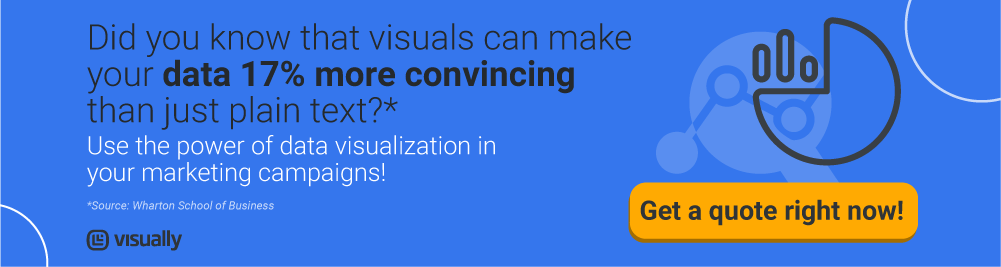
Visually has the best solutions for your business and several ways of offering it to you. Get a quote right now and find out how we can help your company grow wiser.
<!–[if lte IE 8]><![endif]–> hbspt.cta.load(355484, ‘c060ded0-f017-4df0-92e8-7ace6dd314c0’, {});