Delicious Infographics: Nutritional Data, Visualized With Food

Updated: February 12, 2021

Need content for your business? Find top writers on WriterAccess!

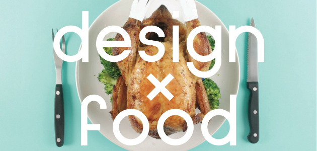
It is well known that infographics can be informational, communicative, and even beautiful, but one designer aims to add another adjective to this list – nutritious. When Ryan MacEachern began a new low carbohydrate diet, he decided to also begin a new infographic project, Design x Food. “I have always been fairly conscious of calorie intake,” MacEachern said, “but had never kept a diary of what I had eaten. The project really helped me to get a perspective on nutrition in food and portion size.” Design x Food explores the nutritional content of typical foods against a carefully measured weeklong ledger of MacEachern’s bland new diet. Instead of using computer-generated visualizations to show the data, MacEachern let the food do the talking by turning them into the project’s graphs and charts. And instead of using the food he ate during his diet (a typical day might consist of eggs, tuna, and low-fat cottage cheese), Design x Food uses colorful, vibrant, and often unhealthy foods that were excluded from his diet. This juxtaposition allows an interesting comparison between different foods with various nutritional statistics. Graphically, MacEachern utilized simple design characteristics and solid pastel background colors in order to make the information both easily understandable and visually appealing. “I instantly had a vision in my head of how I wanted the charts to look. They slowly evolved with the addition of plates and related cutlery to each picture. I really wanted the information to be clear and consistent because I was using such strange materials to get the data across. The colour choices were very important to me, as I knew I wanted white text. I needed colours that were pastel and that would show up with the text. The visual style and consistency really makes it stand out.” Design x Food is a small project to make nutritional data interesting and thought provoking, but MacEachern has thought about creating future iterations on a larger scale with whole dining tables of charted food. Feedback has been overwhelmingly positive and the project has had over 20,000 views on Behance. Design x Food comes as both a poster, which can be found on Behance, and a book, which can be found on Issuu. Ryan MacEachern can be found on Behance and on Tumblr. Jon Salm is an associate client analyst at Millward Brown Digital in New York City and a freelance data journalist in the Visual.ly marketplace. He has a bachelor’s degree in English from Washington and Lee University. You can find him online at about.me/salm.jon and follow him on twitter @S4LM3R.

Share
facebook
linkedin
twitter
mail

Human Crafted Content

Find top content freelancers on WriterAccess.

Human Crafted Content

Find top content freelancers on WriterAccess.

Subscribe to our blog

Sign up to receive Rock Content blog posts

Rock Content WriterAccess - Start a Free Trial

Order badass content with WriterAccess. Just as we do.

Find +15,000 skilled freelance writers, editors, content strategists, translators, designers and more for hire.

Want to receive more brilliant content like this for free?

Sign up to receive our content by email and be a member of the Rock Content Community!

Talk to an expert and enhance your company’s marketing results.

Rock Content offers solutions for producing high-quality content, increasing organic traffic, building interactive experiences, and improving conversions that will transform the outcomes of your company or agency. Let’s talk.