If you follow Rock Content on any social channel, chances are you have seen some Rock Content posts telling you to “Get your b(r)and together” or to “Amplify your Marketing Skills”.
Well, those spirituous pieces are part of our one and only zero-budget-in-house-made Brand Campaign. Our VP of Marketing, Giu Caltabiano, brilliantly walks us through the main contexts and concepts of the campaign in this article. But today, I’m here to talk about the Design process behind it.
Before we start, a little disclaimer: although I indeed had the opportunity to create the visuals that went live, I wasn’t the only creative who worked on this campaign… far from that. And as I like to remember that we’re always “standing on the shoulders of giants,” I’d like to give a big shout-out to every Rocker and freelancer who interacted with this campaign before me. It was thanks to the experiments and the base they’d built that it was possible to go further and lapidate several iterations until we had the final results.
Moving on… let’s address…
The concept
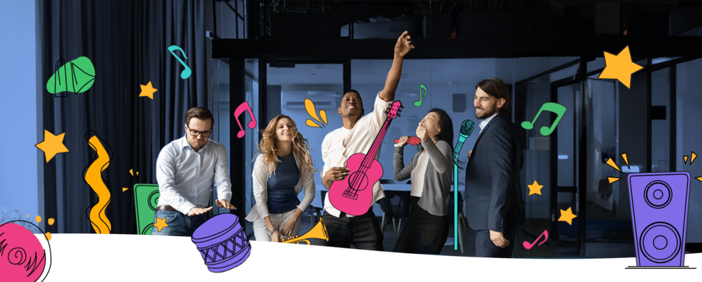
The main idea was to have marketers in their professional environments. But instead of a serious and focused mood, we would have them performing… literally.
Like true Rockstars (by the way, this is how we refer to our clients, in case you didn’t know), playing with our company’s name (Rock Content), the concept would bring together both Rock music and Content production in a funny way.
It was also important that the images represented Marketers having a victorious moment and feeling empowered like a Rockstar. We wanted to demonstrate that using Rock Content can make you feel that “victorious moment” all the time.
So we took each of the Category Entry Points (CEPs) that were defined and came up with copies like “Discover your Marketing Groove,” “Turn up your content volume” and the main one: “Get your b(r)and together”.
The visuals
One of the challenges of a zero-budget campaign is that you can’t have a dedicated photoshoot with models to create the exact image you have in mind, for instance.
Initially, we wanted to have our own teammates at Rock Content as the models, but the idea of gathering everyone inside a studio became a non-starter with the COVID pandemic and the company becoming remote-first shortly after.
We decided to then go for a stock image bank approach, but using interventions in the images to customize them whenever possible. We can see some of the mood board references below:
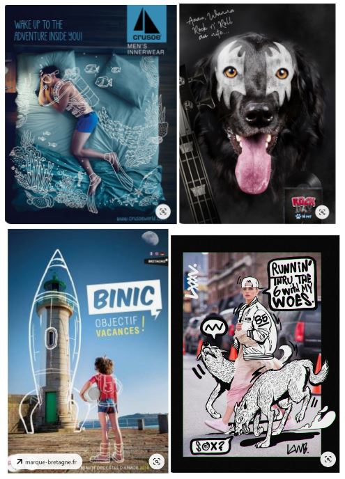
To create these interventions in Rock Content’s visual style we referred to our illustrations pack and guide as a reference. These illustrations have a very unique style: a highly stylized line drawing with a flat colored shape in the background. We use them in every channel, social media, and sometimes even in some of our logos.
Some of the illustrations in the Rock Content Illustration pack served as a reference for the campaign
Illustrating the music
Researching and selecting possible images for the campaign, we decided to create custom illustrations so that the combination of photo and illustration became more organic. We took the challenge of getting this “air guitar” band and putting some instruments in their hands.
It worked fine, but something was missing…
We wanted to convey energy, music, and celebration. So those illustrations could really use some colors. After a few tests with Rock Content’s color palette, we added the copy, CTA, and voilá! We had our concept image.
The concept image for the campaign. Note that we’ve put the “r” in “brand” in a pink tone so we could have the wordplay between “band” and “brand”
Further on, across all our seven CEPs, we tried several photos and different instrument combinations, like drum kits, stage dives, and even a “one-man band”.
Several interactions and color combinations were tested, and many copies were improved upon until we had the final version.
Distribution and engagement
Ok, so a zero-budget approach also has an impact on the campaign’s launch and distribution, right? With no paid media involved, we reached out to all Rockers to help us promote it organically.
We adapted the seven concept visuals to some formats that would help us with this challenge and distributed them internally. LinkedIn headers, email signatures, and Google Meet Backgrounds were part of this package, besides the posts that we always asked the Rockers to engage with.
We also created short introduction videos with the Brand Campaign visuals to be aired before our webinars, like Jam Sessions and Marketing Backstages.
Thanks to these collaborative efforts, we reached almost 70,000 views comprising LinkedIn, Instagram, Pinterest, and X (Twitter) impressions, besides global users on all Rock Content websites globally. All of it in the first two months after the launching and without dropping a dime on paid media.

Main takeaways of the design process of our brand campaign
I guess there’s one main takeaway from this campaign: a more restricted scenario can be a unique opportunity to exercise creativity.
By that, I don’t mean that a short or zero-budget brand campaign is better for creativity, but that we can still create something of value even if the budget is unfavorable.
Speaking as a creative professional, restrictions make you stretch your mind to find new ways and solutions with the resources you have at hand.
You may not have the canvas, best brushes, or oil paint tubes, but you can still make a beautiful drawing with only a pencil and a simple sheet of paper.
With this in mind, and our Rocker’s unrelenting collaboration, it’s possible not only to get the b(r)and together, but also to make some good ‘ol noise.
