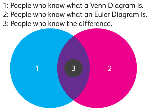
By the time you finish reading this blog post, you should be in group three. Venn and Euler (pronounced ‘oiler’) diagrams are incredibly popular on the internet as funny charts. They offer a simple way of depicting concepts of set theory.
So, what’s the difference between the two? Why are they funny? Are they useful for real data?
Both chart types are used to display concepts from set theory:
Union – The combination of two sets. In Venn and Euler diagrams.
Intersection – Included in both of two sets. In Venn and Euler diagrams.
Difference – Everything but the intersection of two sets. In Venn and Euler diagrams.
Relative Complement – In one set and not in the other set. In Venn and Euler diagrams.
Absolute Complement – Everything that is not in the other set. Only in Euler diagrams.
Subset – A set contained wholly in another set. Only in Euler diagrams.
Disjoint – Two sets with no elements in common. Only in Euler diagrams.
All Venn diagrams are Euler diagrams, but not all Euler diagrams are Venn diagrams. Euler diagrams only have the intersection combinations that actually exist in the real world. Venn diagrams represent every hypothetically possible logical relation between categories.
Venn diagrams, by definition, have to display every possible intersection combination, which creates some interesting layout issues.
When there are three circles, every intersection is shown, but as soon as you get to four categories, circles don’t work.
Ellipses can work for up to five categories, but beyond five, strange shapes need to be used to weave in and out of all the intersection combinations.
Five is already pretty complex to read, but as soon as these strange shapes come into play, reading the diagrams becomes nearly impossible, and text descriptions of the relationships are often easier to understand.
This brings us to why so many of these diagrams are funny.
The vertebrate and invertebrate Venn diagram we showed you earlier suggests that some animals can simultaneously have a spine and not have a spine.
While this may not be hilarious, anyone who took sixth grade science class can tell you that it is rather silly. With a better subject matter, pointing out relationships that don’t exist can be pretty funny.
Some diagrams achieve humor by putting something into a category where it doesn’t belong, or one where you wouldn’t normally expect it to be. Some creative labeling (like in the Euler diagram below) always helps, too. 
We know Euler diagrams can be funny, but can they be useful?
Some diagrams embed quantity information using the area of each portion of the diagram.
One good example of this is the Global Map of Social Networking 2011 by Global Web Index. On their own, Euler diagrams like this give you a fairly good general idea of the involved values.
Reading exact quantities out of them would be a bit tough, but for gaining an overview, they are good. This particular graphic uses these Euler diagrams as small multiples, letting you compare regions.

They do a good job of showing overlap in categories. They look “cool” – something many designers feel is important. They do a reasonable job of showing quantity. They show complex and interesting relationships in a way that’s simple to understand.
If you’re a designer and you want interesting charts, look carefully at your data. You might be able to use an Euler or Venn diagram.
Drew Skau is a PhD Computer Science Visualization student at UNCC, with an undergraduate degree in Architecture.


