The impact of well-designed typography is far greater than the impact of word or image alone. It’s the perfect storm: the elegant symbol that is at once direct linguistic object and beautiful, eye-catching graphic. Typography lends itself to the metaphysical, but it’s also a fundamental part of any successful design. It can be as simple as a sans serif title, in stark relief, easy to read and understand, dripping with raw impact. Or it can be an ornate image, like the word mountain formed from peaks and valleys: text that is what it says. Here are some infographic examples of great typography at work: some simple and direct, others playful and clever, all communicative and powerful visual designs.
Clean, Simple, and to the Point

This is an example of minimalist typography. It’s clean, clear, and communicative. This infographic is reasonably text-heavy, which is a real challenge typographically. Titles need to stand out but paragraph text needs to stand out too, striking the right balance between emphasis and readability. The designer has used just two typefaces – one for titles, one for paragraphs – and kept his choice consistent throughout. Consistency is critical. The title font is sans serif and bold, but narrow enough to leave plenty of space for the images to breathe. The paragraph text is small with a light serif, like a newspaper’s text. While many may argue that serif should be saved for large text, here it works well in a small size. Despite this infographic’s text-heaviness, the images still drive the narrative. The typography does its job without calling attention to itself, emphasizing the hierarchy of information without overshadowing the rest of the content.
Text Direction

Sometimes vertical, diagonal, or curved text can help form graphic lines, guiding the viewer through the narrative. But be careful experimenting with text direction: too many lines, lines at slightly incongruous angles, or lines that crisscross can cause visual confusion that overwhelms the text itself. In the above infographic, the text is curved to reflect the knife’s blade and to draw the eye ever downward. Angle is used to give the piece movement and momentum, which also reinforce the infographic’s subject.
When Originality Works

Sticking to digital fonts may feel safe, but sometimes safe is so boring, it hurts. Often, images produced on computers and distributed on the Internet lack a friendly, organic quality: a quality that really gets a viewer’s attention. Drawing by hand subverts the paradigm and allows the artist to have a little old-fashioned fun. In the infographic above, main titles look hand-drawn while paragraph text is in a handwritten-style computer-generated font. This is a smart compromise, since small handwriting can be difficult to decipher on a screen. In the image below, a hectic hand-drawn flow chart is the perfect choice for an infographic about distraction.

Getting Creative with Branding

Companies often employ a particular font or typographic style to define their brand identity. Working within corporate typographic guidelines creatively can be a real challenge. It requires delicacy: too many liberties may dilute the brand, undermining the message, but creatively using a familiar identity in a new way piques the viewer’s interest. The above image showcases an unconventional and typographically interesting choice. In the title, the artist used Instagram’s font for the word “Nation” instead of for the word “Instagram,” where it would ordinarily appear. This uses the brand’s familiar typeface to subtly suggest exactly what the infographic sets out to illustrate: that the platform is a wide-ranging tool that has grown far beyond its original scope.
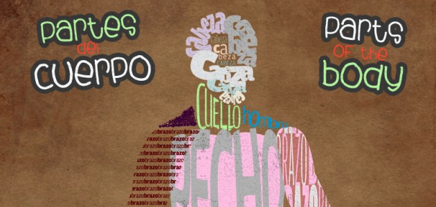
Words as Objects

Here is a rather obvious (but lovely) example of using typography metaphysically. The word for stomach is the stomach. The word for arm is the arm, and so on. I’m particularly fond of the swirling cabezas, reminiscent of a face and of the convolutions of the brain. Anni Murray is a writer, editor, multimedia artist, amateur mycologist, and biology student. She is currently working on Prism, a speculative science fiction story cycle. Follow her on Twitter.