I’d like to introduce you to Rock Content’s new embed!
We’ve worked really hard to make this new embed the best experience possible for you and your readers, but why tell you when I can show you?
New Look
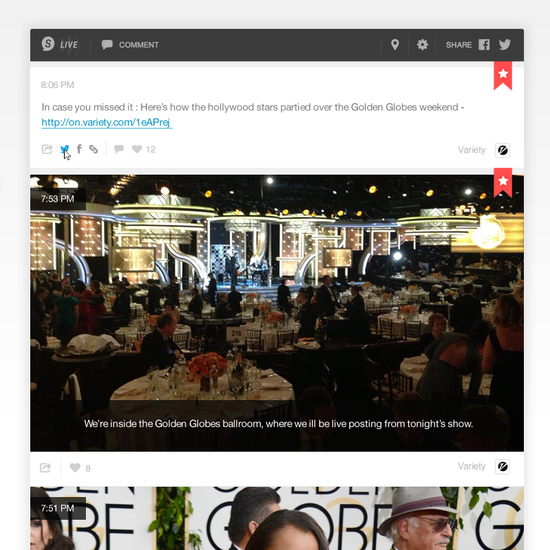
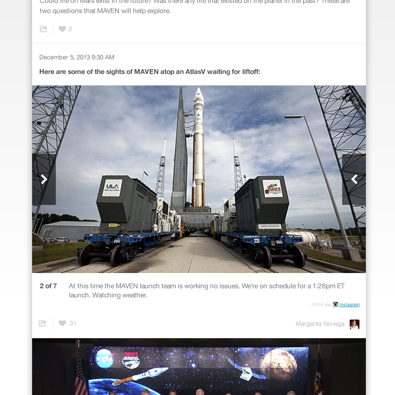
We completely rebuilt the embed to bring you this new, clean design. Starting from scratch allowed us to re-think the user interaction on all embed features, resulting in a much needed consistency of fonts, colours and feature organization. For instance, with the new look, we organized user engagement features and cleaned up social interaction for posts.
An Emphasis on Content
With this design, we focused on getting the interface out of the way to allow for an emphasis on content. There’s less clutter and more space for full width media. The new embed lets what really matters shine through: your stories.
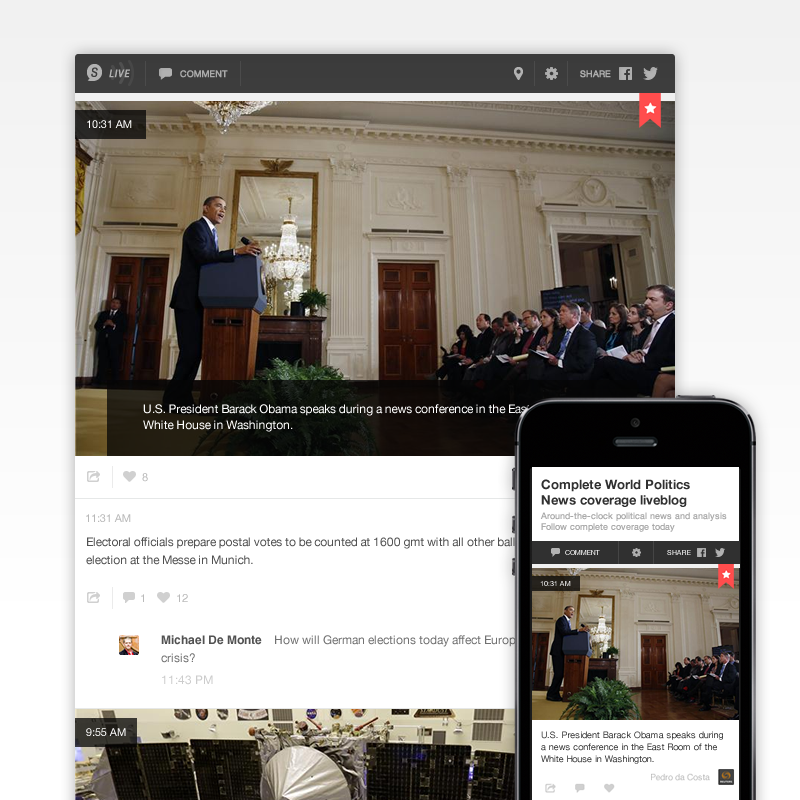
Flexible & Responsive
Redesigning our embeds is just the beginning. Because the underlying code is flexible and easier to work with, the new look will serve as the starting point for unifying the look, feel and user experience across all of our user-facing products, including white labels and mobile themes.
How to start using it
Using the new embed is no different than any of your other embed templates. To get started, set up a template using our new embed. Then, select that embed template from the list and place the iframe code on your site as usual.


