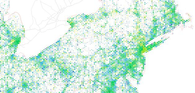
Data Visualization is driven by data. Its form is often derived from optimizing the efficiency of inputting data (and information about that data) into a human brain. It is a very pragmatic practice, built around numbers and logic. And yet it is beautiful. It evokes emotions. It can be aesthetically pleasing, or hideous. It communicates complex concepts and provokes thought. It is consumed for enjoyment. Some visualizations even share similarities with poetry.
There are several stages in the life cycle of data visualizations, and while the core of the practice is driven by rational thinking, any number of stages in the process have opportunities for subjective decisions or artistic interpretations.
Creation
The topic covered by a visualization is the starting point for the process of creation. Just like in many art pieces, this is where the inspiration begins. The decisions made during this stage determine the mood of the piece, and the concepts it addresses. Another opportunity for artistic decisions is in the architecting of the visualization. Deciding on the form that the visualization will take on, determining connections between the data and the visual variables, and setting up the structure of the visualization are all points for artistic decisions. These decisions often have optimal choices, but choosing what to optimize for is where human creativity sneaks into the process. This stage doesn’t just determine what the visualization will look like, but the details of what it communicates, and what data it prioritizes. 
Consumption
After a visualization is created, people view it (that is the point, after all). Sometimes visualizations are consumed privately, especially if they show sensitive data. But often, they are publicly shared in printed publications, video formats, or on the internet.
Privately viewed visualizations are typically very functional, as the investment into their aesthetics tends to be lower. Publicly viewed visualizations are still functional, but they have often had much more time invested into improving their appearance. Many people consume them for enjoyment. They spur conversations on cultural issues, and trigger emotions.
The obvious answer here is that data visualizations can be art. They share similar processes to art creation, and they are viewed in a similar manner. If you create visualizations, keep it up — and start thinking of yourself as an artist if you don’t already. Drew Skau is Visualization Architect at Visual.ly and a PhD Computer Science Visualization student at UNCC with an undergraduate degree in Architecture. You can follow him on twitter @SeeingStructure


