LinkedIn is considered one of the most popular platforms in the world. In fact, it is touted as the world’s largest professional network.
Due to the fact that it has more of a professional image, the social media and overall digital marketing strategy you take will be different than the strategy you take with a different site like Facebook or Pinterest.
One tactic that many people aren’t very familiar with is the use of banners on their company page or profile.
Appearing behind your profile photo, these banners have the potential to establish your brand and gain additional exposure.
Here’s what you’ll learn in this guide about LinkedIn banner examples:
- Why Should You Care about LinkedIn Banners?
- How to Create a LinkedIn Banner?
- Top 7 LinkedIn Banner Examples
- Wrap Up: LinkedIn Banner Examples to Inspire
Why Should You Care about LinkedIn Banners?
One of the first things a user sees when they visit any website is the banner at the top of the page.
Well, the same is true with your LinkedIn company profile. The banner is one of the first things people will see, as it takes up a large portion of the page.
Therefore, you want to make a good impression from the get-go. Along with a professional photo, a creative banner can have a positive impact on the user’s perception of your brand in mere seconds.
Without a banner, you aren’t putting your best foot forward. Ultimately, you should put as much effort and thought into creating your LinkedIn banner as you do in choosing your main profile image.
A LinkedIn banner can be used to attract a larger audience and spread awareness about your brand while also reinforcing your company’s values.
It can essentially serve as your digital business card, should you decide to add your contact information to the banner.
All in all, adding a LinkedIn banner to your company profile page is one of the quickest, easiest, and most effective ways to make your profile stand out.
This visual element can represent ultimately anything you want, such as your products/services, contact information, a social cause, or something else entirely.
Download this post by entering your email below
How to Create a LinkedIn Banner?
When creating your LinkedIn banner, there are a few things you must take into consideration.
To begin, you must ensure it is the correct size. The last thing you want is to create the perfect banner only for it to appear blurry or for key elements of the design to be cut off once it is uploaded to your profile.
The dimensions of a LinkedIn banner are as follows:
- Company Pages: 1128 x 191 pixels
- Company Profiles: 1128 x 376 pixels
As you can see, this is a significant difference between a company page and a company profile. Therefore, if you were to simply create a design without knowing the dimensions of the banner needed, you could have to start all over once all is said and done.
And no one wants to have to do extra work!
There are many tools you can use online to help you make an awesome banner for virtually any platform, such as Canva.
You can type in the exact dimensions you need, or you can use LinkedIn banner templates that are ready-to-use in the optimal size already.
When you start the development of the banner, there are some key features that any quality LinkedIn banner contains:
- Title, and possibly, subtitle.
- Your logo or photo.
- Vivid background/color palette.
- A call to action, your motto, or your position.
Most importantly, you want to ensure that your colors, font, and images used in the banner match your overall brand style, as this will help to make a lasting impression.
When you go to save your LinkedIn banner so it is ready to upload to the social network platform, you will have a few different options in terms of format to save it as.
So, how do you know which format is best? It will all depend on the design itself. Here is a brief breakdown:
- JPG: photos
- PNG: illustrations
- GIF: animations
Top 7 LinkedIn Banner Examples
Alright, now that you know the importance of LinkedIn banners and how to create one, it’s time to take a look at some examples of impressive and successful LinkedIn banners from other companies.
Hopefully, these LinkedIn banner examples will give you some inspiration as you work on your own LinkedIn banner.
#1: Samsung Electronics

It is incredibly important to address your values whenever you can so your audience knows where you stand. The same is true regarding current events.
Samsung did both in their LinkedIn banner with a simple, minimalist design.
Despite the simple design, it grabs your attention almost immediately because of the bright colors of the design, which also help in making the most important point of the concept stand out.
#2: The Walt Disney Company
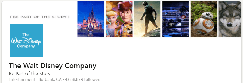
Walt Disney is a magical company, and they don’t shy away from sharing a little bit of their magic with the rest of us, whether in the form of a theme park or an animated movie.
This banner from The Walt Disney Company represents everything that they are.
It is a great collage of some of their most memorable moments and movies, which is something that just about anyone who will visit their page will be familiar with.
Further, the slogan added to the LinkedIn banner “Be Part of the Story” simply adds to the overall emotional element that the company is so well-known for. Who wouldn’t want to be part of Disney’s story?
#3: Search Engine Journal
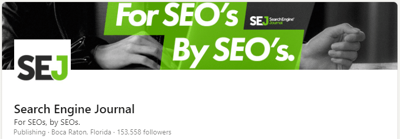
This banner is a great use of contrasting colors so that the main part of the image stands out, improving brand visibility, and the greyscale image in the background of computer usage is still seen, but it is just that — in the background.
What is also great about this LinkedIn banner is that they don’t shy away from putting their niche out there.
They make it clear who their brand is for: SEOs.
#4: Hootsuite
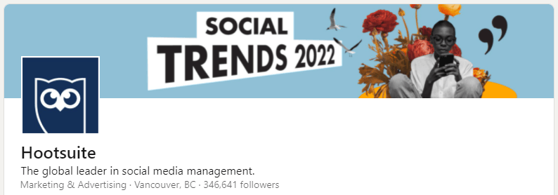
Although this banner design from Hootsuite is pretty simple, it is also straightforward in the point that the company is trying to get across to those who visit their company page.
In fact, that was probably the point.
Hootsuite’s focus on this banner design was to let everyone know their Social Trends report for 2022 has been released.
If they went overboard with text and graphics, the point of the banner would have been lost in it all. It could have become too distracting.
So, they kept it simple and concise, yet visually attractive at the same time.
#5: Amazon

The LinkedIn banner from Amazon has simple, colorful, and visually appealing illustrations that are eye-catching.
These illustrations are a great representation of Amazon as an overall company, and that’s exactly what makes it memorable and creates a lasting impression on the user.
Add in the “Come build the future with us” slogan, and visitors to the page almost feel like they can be a part of Amazon from the get-go.
The invitation is welcoming and encouraging, which is exactly how a company needs to make someone feel when they’re trying to build a relationship.
#6: Apple

Apple is probably one of the largest and most well-known companies, and when you take a look at their LinkedIn banner, you don’t see anything extravagant and heavily edited.
Instead, you see something very simple. You see a picture of the very famous Apple Park, which is the headquarters of the Apple company and opened back in April 2017 in California.
Although simple, this image is the perfect representative of Apple, and they need to add nothing else to their banner.
It is simply an easy way to say that Apple is an awesome place to work (or so it would seem, right?).
#7: Fabio Marrama
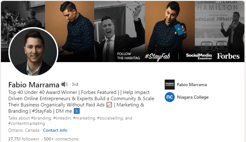
To bring the spotlight to someone other than a big company, this banner showcases how someone has taken their LinkedIn banner and used it for the benefit of some personal branding.
As a marketing and business leader in Canada, Fabio Marrama is an empowering speaker and leader in the industry who has been featured in Forbes before 40 years of age.
On his LinkedIn banner, he features a collage of headshots showcasing himself in a variety of different situations, including images of himself speaking at conferences.
He also doesn’t forget to include his unique hashtag that he is known for and hopes that you’ll follow and use.
Wrap Up: LinkedIn Banner Examples to Inspire
Your LinkedIn banner is by far one of the more important and visual elements that can be added to your LinkedIn profile or page.
When done appropriately, it has the capability of creating a good first impression — and one that is memorable — solidifying your brand, and helping you stand out in your industry.
Just make sure to keep updated and current so you don’t fall behind.
Of course, none of this means much if you don’t have followers. Check this post out to learn how to increase your LinkedIn followers!
![How to Create a LinkedIn Banner? [+ Examples to Guide your Production]](https://rockcontent.com/wp-content/uploads/2021/11/linkedin-banner-examples-1024x538.png)

