Network visualization is everywhere. From roads and supply chains to biological pathways and the internet, any items that share a relationship can form a network — such as in the way we deal with data visualization. Everything can be widely analyzed with node-link diagrams, which are an intuitive and commonly-used visual representation of networks.
Also known as network graphs, these images formed by links and data are pretty interesting and can give us insightful information about any issue. When people find out the best techniques to get the essence of this material, it’s possible to communicate results in an open-viewed perspective.
If you’re interested in learning more about network visualization, in this article you’ll find out:
- What is a network visualization
- Why node-link diagrams are essential
- Why the visuals matter
- What is the importance of the layout
- When network hairballs are fixable.
Keep reading!
Download this post by entering your email below
What is a network visualization
Network visualization is a concept used to get the picture of complex relationships between some elements — in most cases, a large number of them. It displays a graph structure that gives us more apprehension about connections, using nodes and lines to highlight a different kind of information about some topic.
It’s interesting how that sort of organization can show us plenty of types of networks, not only about movie characters’ relationships, for example, but also about the way the universe is all connected.
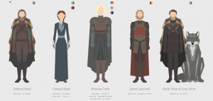
Yes, let’s emphasize the Marvel Cinematic Universe as a 3-D network at first. There are nodes, lines, and colors representing relationships and natural proximity between all the characters — so that Marvel universe starts making total sense!
Another example? We can observe the idea of network visualization in the interconnectedness of the galaxies as well. Here, a group of researchers tries to show through a network mapping that all galaxies are connected and held together by gravity. Little is known about that part of cosmology, but the research has constructed multiple models of this cosmic web using data from 24,000 galaxies.
All those interactive visualizations give us lots of insights, as you see, but it’s generally accepted that this concept is also relevant in different corporative areas.
Marketing and sales are great examples and place huge importance when it comes to data culture, for instance. In a business environment, it means that all your staff is constantly working with the information provided by data and analytics.
Why node-link diagrams are essential
How can we make things possible while the point is network visualization? In order to explain it, you need to know that the effectiveness of the graphs stems from the node-link diagrams.
Besides being responsible for the initial visual impact, they also permit a general overview of something that needs to find influential nodes, valuable insights, or even gaps detected in data.
Node-link diagrams were created long before bar, line, or pie charts, with simple examples dating back to the early 14th century. However, only recently, they have been used for illustration and also as an efficient tool for exploring the underlying dynamics of complex networks.
An example of using visualization for modern network analysis comes from the psychosociologist Jacob L. Moreno. Moreno used node-link diagrams to analyze and illustrate various social structures.
He published a node-link diagram in a 1933 New York Times’ article, depicting the web of friendships in an elementary school. Using this information, Moreno was able to identify the students who linked groups together, and the ones who didn’t fit into any social group.
Today, node-link diagrams are routinely used to visualize relationships in many areas, such as Mathematics, Biology, investigative analysis, and business. In fact, given the dramatic rise of social networking platforms in the past several years, people are better equipped for understanding network dynamics visually. So, what are some of the design possibilities for node-link diagrams?
Why the visuals matter
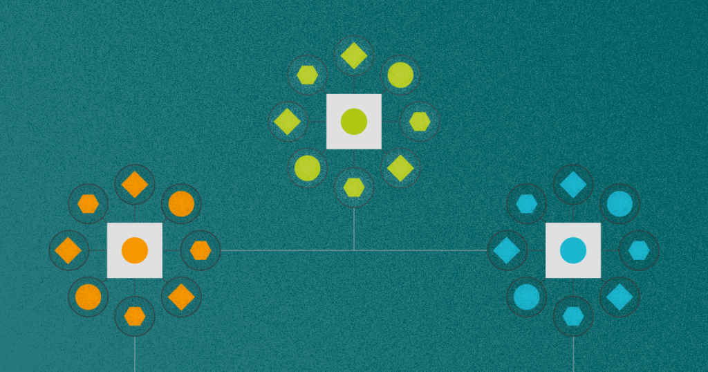
What is network data? A graph is a technical name for the underlying structure of a network, as you’ve already seen. Graphs are composed of nodes (vertices) and the links between them (edges). Optionally, each edge can have a weight, which is a distinct value describing the extent of the relationship among nodes.
Furthermore, each edge can be directed or undirected, meaning that the relationship is either one-way or mutual. Given this structure, several visual elements can be tweaked when constructing node-link diagrams. Here are some examples!
Node shape
Though typically represented as circles, nodes can be images or any other shape, including pie charts. As a general rule, you should consider using color for known classes and shape for any further divisions.


Node color
The color of a node usually represents some known classification. For instance, a network of voting records would use blue for Democrats and red for Republicans. It is a great way to distinguish your public in a social media analysis too.

Node size
Size can also be used to represent quantitative relationships between nodes. However, be sure to avoid quadratic scaling and ensure that your nodes do not become so large as to hide edges or other nodes.

Edge direction
A common way of representing the direction in node-link diagrams is with an arrow. Alternatively, tapered edges can actually produce better results, since the direction can be seen at any point on them rather than just at the ends.


Edge color
Edge color usually represents the type of relationship. Occasionally, a diverging color scale can be used to express edge weights directly.

Edge size
Edge size is also commonly used to represent edge weights. Keep in mind that tapered edges will also affect the size of an edge.
What is the importance of the layout
Undoubtedly, in line with the objective of the network visualization, aesthetics is fundamental not so much for looks but also readability. All links and nodes must be well organized to facilitate what worth most — an understanding on the verge of becoming valuable information, results, and decisions.
Once the visual elements for the nodes and links are determined, the network must be arranged in some way. So, methods for organizing it in a given space are called network layouts.
They’re typically constructed with the help of a layout algorithm. However, sometimes manual layouts can produce fantastic results that automatic methods simply cannot achieve.
Network layout algorithms usually try to optimize based on criteria like minimizing edge crossings and minimizing the distance between similar nodes. There are several ways to define node similarity, but in layout algorithms, it is usually based on the number of edges shared between nodes.
One of the most common and widely-available layouts is the force-directed layout. There are many variations of this design, but the essential idea is that edges act as springs, nodes act as attractors, and a sort of physics simulation is run to allow the nodes to adjust their positions based on the forces acting on them.
For example, see this figure of a wiki using force-directed layout:

Several underlying hierarchies, clusters, and isolated nodes are clearly shown. Other popular layouts include radial, balloon, and hierarchical methods. As an example, consider this comparison of balloon (left) and radial (right) layouts:
Many layout algorithms can be found in several free and open-source tools that exist for network visualization.
When network hairballs are fixable
Node-link diagrams are very susceptible to clutter as the number of links and nodes increases. Consider this figure of protein interactions:

These are called network “hairballs” for obvious reasons. Cluttered diagrams make it difficult or impossible to make discoveries in the data. Fortunately, there are several ways of addressing network clutter.
One option is to tweak the visual attributes mentioned above. Are the nodes or edges too large? Could the nodes or edges be made semi-transparent to make overlaps less obstructive?
Another way is by changing the layout algorithm. Try the different layout options in the tool you’re using. Coders may even consider modifying a layout algorithm to suit their needs.
One last technique worth mentioning is edge bundling, which is a layout algorithm for the edges themselves. Put simply, this method pulls similar edges together, kind of like merging roads into a highway. Consider the edge bundling in this network of U.S. air travel paths:

The results of edge bundling are impressive. Unfortunately, many edge bundling algorithms have not yet made their way from research papers into readily-available toolkits.
However, you can rest assured that researchers are continually working not only to improve existing techniques for network layouts but to fundamentally rethink how we visualize and analyze the networks that surround us.
Data visualization for mobile
Data visualization for mobile, as an example, is a kind of improvement due to the increased usage of smartphones and tablets for data processing. We use plenty of graphics, animations, and so on to make processes easier and more efficient. But it only works with responsive screen size and image resolution.
That’s the reason why we mustn’t scale back mobile-friendly solutions nowadays. They are a useful tool to ensure better conditions for data visualization analysis. When all this turns to be flexible, they also contribute to more collaboration in large teams dealing with massive data.
Radar chart
Having all the best practices about data and network visualization, you can even achieve competitive analysis using a radar chart with far more ability and assurance. So, under no circumstances have you disregard this strategic layout to visualize information and make correct decisions based on it.
Along the same lines, this type of graphic can be used as interactive media, empowering your data visualization — especially when the purpose is to display relations among metrics and contextualized situations.
Summing up, currently, it is crucial to keep up with new techniques and metrics like all aspects we addressed here about network visualization. The point is that there is valuable information in the links that bind our data. Seldom have we come across such a vast quantity of them. So, it’s about time to put your mind to network visualization and start using it in your marketing processes.
Want to add strategies like that in your next campaign? Reach out to us and get a quote right away!
<!–[if lte IE 8]><![endif]–> hbspt.cta.load(355484, ‘c060ded0-f017-4df0-92e8-7ace6dd314c0’, {});