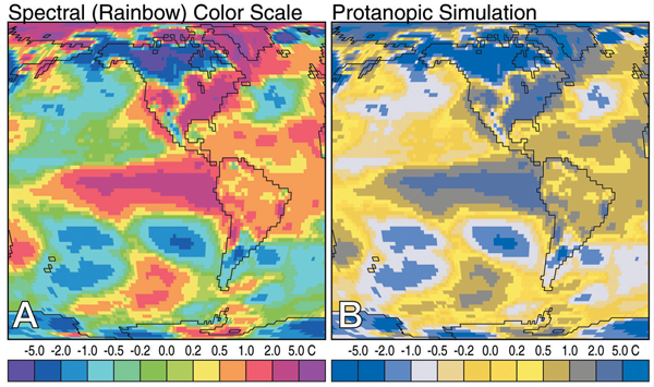
Dear NASA, The visualization community has noticed your insistence on using rainbow color scales for representing continuous data. This is a plea to you (and anyone else doing the same thing) to stop. On the surface, the logic behind using a rainbow color scale makes sense: the more colors there are, the easier you would expect it to be to see detail in a huge range of data. However, when perceptual issues are taken into account, rainbow color schemes are one of the worst ways to represent continuous data. There are five main reasons for that:
- Colorblind people cannot use them. The image below shows simulated views of what someone with Protanopia would see for two different color scales. Clearly, the diverging color scale is better for Protanopes because there are no repeat colors.
(source)
- The divisions between hues create edges in the visualization. These edges are entirely perceptual and have no relation to the data, so people see boundaries that do not actually exist.
- The spectral order of hues has no inherent meaning. This makes it harder to tell what colors represent larger quantities. For example, if you were never taught the rainbow and you were asked to place the following two sets of colors in order, you could probably do so easily with the grayscale one, while the colored set would be impossible to arrange.
- Yellow is special. It appears brighter than other colors because it activates both red and green cones. This means that yellow jumps out as if there were something significant about the data range that it represents. To solve this, yellow’s brightness and saturation can be reduced, but this is rarely done.
- Detail is actually harder to see in a rainbow. The logic that it is easier to see detail in a range when you add colors seems to make sense, but in reality, more detail can be seen in a single hue image with a high brightness range.
(source)
Now, to be fair to you, NASA, you have been releasing many more images with good color scales than images with rainbows.
You recognize that the data you deal with is arguably some of the most important data for the long-term future of humanity, and you have adjusted your practices. An occasional rainbow color scale still slips past, though.
So, NASA (and everyone else): please keep moving in the right direction and use color scales responsibly.
Sincerely,
Drew Skau
Drew Skau is a PhD Computer Science Visualization student at UNCC, with an undergraduate degree in Architecture.
Download this post by entering your email below


