Do you also feel like you blinked, and the year is over? Still, at the same time, we must admit that a lot happened in 2023. Artificial Intelligence exploded, dominating marketing and business discussions – sparking both celebration and skepticism.
Another topic that surfaced more than usual in 2023 was “rebranding.” Some we loved, marveling at the genius behind reshaping a brand, while others left us unsure if we truly grasped the concept. Of course, the internet spared no criticism.
In this article, I’ll guide you through the key rebrandings of 2023, exploring what drove brands to embrace change. I’ll also share a bit about how we did it at Rock Content with one of our flagship products: WriterAccess, our content marketplace.
Note: My goal isn’t to express personal preferences about the brands’ choices, okay? Let’s focus on the strategic motivations and outcomes. Want to know my personal opinion? Connect with me on LinkedIn; I’d love to chat with you.
But, first things first, what is rebranding?
Here on the Rock Content blog, there’s an amazing piece that will tell you everything about branding. But if you’re short on time, here’s a quick overview.
Before rebranding comes branding. Building a brand isn’t an easy task; it requires daily effort for people to associate your product with a message, a function. Every marketing professional wants their product to be spontaneously remembered by customers. We work to create memorable brands.
So when we talk about rebranding, we’re not just discussing changing the visual elements of a brand; we’re talking about something more significant that needs a strategy, careful consideration before implementation.
In the era of social media, where customers actively express their opinions, a company investing in redesigning its brand is automatically willing to face a moment of discomfort with its audience.
So why do it? What leads a brand to opt for rebranding? The need to communicate a strategic change, normally involving the brand’s purpose and value proposition.
Rebranding impacts the essence of the brand on various levels, requiring a more profound approach. By choosing to undergo a rebranding process, companies aim to communicate both internal and external changes, such as mergers, shifts in executive vision, new technologies, or competitors.
This isn’t a simple process and typically reflects months (or even years) of work.
Here are 10 significant rebrandings of 2023
WriterAccess

To kick off this retrospective of the biggest rebrandings in 2023, there’s nothing better than discussing a project we undertook here at Rock Content involving one of our flagship products: WriterAccess, our content marketplace.
In April 2022, Rock Content took a significant step toward expanding its Content Marketing services by acquiring WriterAccess, a marketplace specialized in connecting freelance talents (such as writers, editors, designers, and digital strategists) with clients seeking high-quality content.
Following the acquisition announcement, the WriterAccess logo included a “by Rock Content” tag. However, we knew from the start that this would be a temporary change.
In early 2023, it was time to genuinely update the visual identity.
With the new logo, we aimed to communicate to the market that WriterAccess is now an integral part of Rock Content’s suite of products. To ensure product coherence with other Content Cloud solutions (Ion, Studio, and Stage), WriterAccess’s green gave way to Rock Content’s blue. Typography and the icon were also updated, providing cohesion across all our products.

Nokia

At the end of February, for the first time in 60 years, Nokia unveiled its new brand identity, featuring a fresh logo accompanied by a vibrant color palette. The change aimed to shift Nokia’s perception from a mobile phone company to an innovative B2B technology brand.

In the new logo, geometric and abstract features prevail, replacing the classical typography. Lippincott, collaborating with Nokia for over 15 years, simplified the letters of the logo to read “Nokia” only when they are together, and some letter shapes were repurposed as distinct graphics.
Another change was in the brand’s purpose: “At Nokia, we create technology that helps the world act together,” reflecting the creation of technology that promotes global action.
Johnson & Johnson

When Johnson & Johnson announced its rebrand, it was also to signal a shift in positioning. The new visual identity marked a significant change, replacing the traditional cursive font of the logo with a more modern approach.
This change aimed to mirror a broader transformation within the company, now focusing on health innovations and the most complex challenges in the field.
The transformation included renaming the pharmaceutical division, previously known as Janssen, to Johnson & Johnson Innovative Medicine. Additionally, the widely recognized consumer product line, including brands like Band-Aid and Listerine, became known as Kenvue.
However, the repositioning strategy opted for a gradual transition, temporarily retaining the Johnson & Johnson name on products until a complete stock replacement occurs.

The design change, from the logo used since 1987, was led by Wolff Olins, prioritizing the construction of an online identity that aligns more effectively with the demands of the Digital Era. This involved not only modernizing the logo but also maintaining the red color and the “&” symbol, redesigned for global recognition.
The new Johnson & Johnson logo not only aligns with current pharmaceutical design trends but can also be seen in the Kenvue identity and the recent GSK redesign (also by Wolff Olins), providing a visual signal of the brand’s transformation.
Western Union

Western Union is globally renowned for financial transactions, operating in over 200 countries and territories. In 2023, it was one of the companies that announced its rebrand.
Faced with the increasing use of digital payments and the decline of traditional banking services, Western Union underwent rebranding to align with consumer expectations and bridge the gap between its current and future services, focusing on its online platform and app.

The rebranding was led by the Los Angeles-based agency Love Street and Company. The new logo represents a significant departure from the company’s previous identity.
The updated design is more modern and dynamic, featuring changes in typography and the creation of an abstract monogram. The color palette, including the vibrant traditional yellow, was retained for brand recognition continuity.
Pepsi

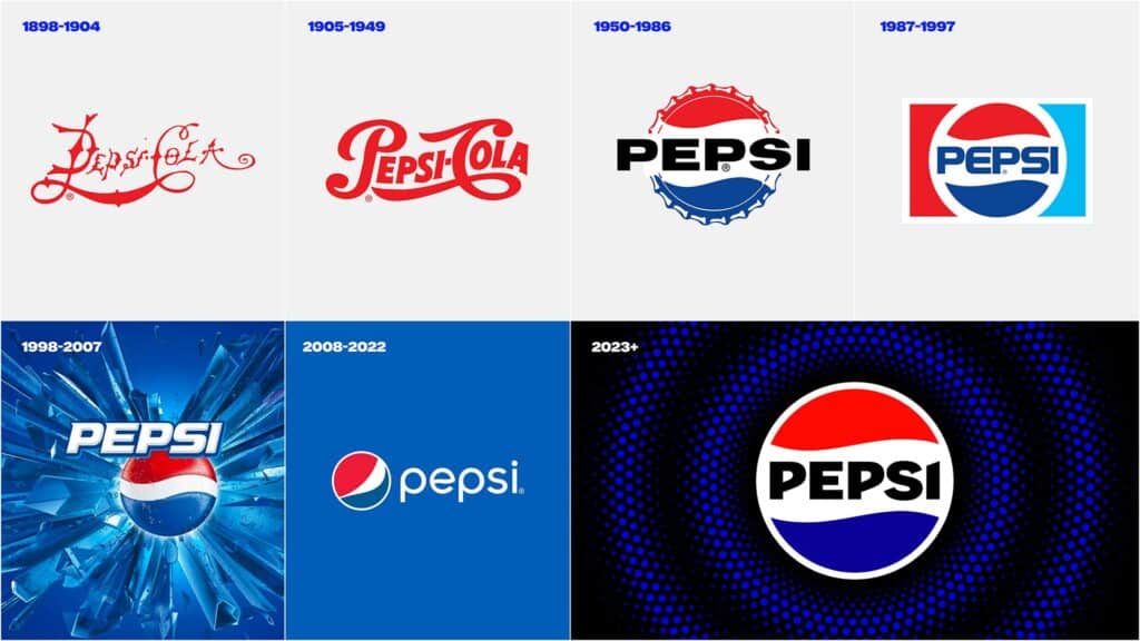
To celebrate its 125th anniversary, Pepsi announced its rebranding first in North America and globally throughout 2024. After nearly 15 years since the last update, the company paid homage to its rich brand heritage while incorporating contemporary elements.

The new logo stands out with bold custom typography, introducing a distinctive “pulse” and an updated color palette. Black takes center stage, reflecting the brand’s commitment to Pepsi Zero Sugar, a current consumption trend.
Moreover, Pepsi aimed not only to modernize its image but also to ensure flexibility and impact in a constantly expanding digital world.
The introduction of movement and animation in the new visual identity aims for versatility in various contexts, from retail shelves to digital spaces. This allows for creative collaborations and keeps the brand relevant across different touchpoints.
Max
At first, you might have found it odd that HBO Max was going to be called simply Max. However, when we analyze the strategy behind this move, it becomes clear that the rebranding was necessary.

Initially, the goal was to showcase the blend of programming.
HBO Max was initially the successor to HBO but included content beyond the cable channel’s traditional offerings. By adopting the name Max, Warner Bros. Discovery wanted to emphasize that within the streaming service, there is more diverse content beyond HBO’s traditional offerings.
Another factor that motivated the rebranding was the desire to make the streaming service more “family-friendly,” as the HBO brand might have limited the service’s reach to families with children.
Reddit underwent a significant transformation in its visual identity, marking a new phase in its history.
The project, in partnership with the design agency Pentagram, resulted in a more cohesive and updated visual identity, with a focus on the iconic mascot Snoo, which now has a 3D version.

In addition to revitalizing the mascot, the redesign included the introduction of new typefaces, such as Reddit Sans and Reddit Display, as well as an expanded color palette to represent the vibrant diversity of communities on the platform.
The new logo, featuring the stylized head of Snoo and the wordmark “Reddit,” reflects the platform’s evolution into a more mature era, gearing up for a potential initial public offering in 2024.
The platform used the rebranding to reaffirm its commitment to being the digital meeting place for communities of all kinds, celebrating the inclusion and creative expression of its users.
Twitter X
I can confidently say the most controversial rebranding of 2023 was Twitter’s. This case will be discussed in marketing classes worldwide for years to come. But, in case you’ve been on another planet or off the digital world and want to catch up on Twitter’s case, the complete story was told in our blog post.

Twitter’s rebranding, now called “X,” took place under the leadership of Elon Musk. Since Musk officially acquired the former blue-bird app in 2023, the company underwent drastic changes. Who remembers the dismissal of about 80% of its employees? Or the introduction of measures like limiting the number of posts and direct messages?
Regarding the rebranding, the announcement came after a series of mysterious tweets from Musk, unveiling the new name and logo.
The shift to “X” reflects Musk’s vision to transform Twitter into a “complete app” or “super app,” similar to the Chinese WeChat, incorporating not only social interactions but also financial and shopping functionalities.
The choice of the letter “X” aligns with Musk’s vision, as he has used the same letter in his company, SpaceX.
For many marketing experts, the change was a mistake as it destroyed a brand built over 17 years, along with various other criticisms and memes that emerged after the rebranding announcement.
And why did so many brands rebrand in 2023 again?
You’ve probably noticed that since COVID-19, the world has been undergoing significant and increasingly accelerated changes. In the branding world, this is no different.
A study by Hanover Research showed that 75% of companies underwent a brand overhaul since 2020. Another survey by UPCity in 2022 concluded that 51% of companies changed their visual identity since the COVID-19 pandemic.
What has motivated these companies to invest in this type of repositioning? From what I’ve gathered studying the subject, I arrive at two main points: necessity and opportunity.
Necessity is driven by reasons like mergers, leadership changes, or a crisis that impacts how the company is perceived by the public.
On the other hand, opportunity arises from growth expectations, significant changes in the product or service, or even a company reorganization in the face of the market.
Regardless of the reason that leads a company to invest in rebranding, this is a time-consuming process that doesn’t bring financial gains in the short term. Depending on the chosen strategies, it can bring discomfort to the audience. However, it should always (or should be) a strategy that seeks to build a better future.
2023 saw over a hundred brands go through their rebranding process, but this is our list. Did any brand here also catch your attention? If you were to write this text, would you have chosen other brands to reminisce about? Share this text on social media, sharing your opinion with us.


