What could be worse than a poorly designed infographic? A poorly sourced one.
Too many infographics and data visualizations are put together after hardly a perfunctory Google search or a quick trip to Wikipedia. As a result, much too often these days we see infographics that end with something like this (we’ve toned down the colors on purpose, so the original piece isn’t easily identifiable – no need to point fingers):  … or this:
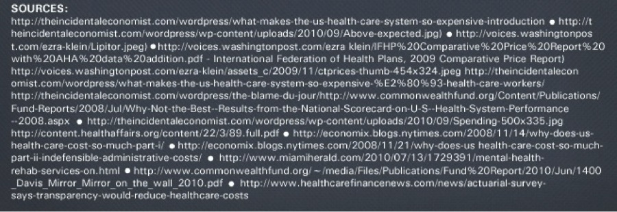
  … or this:
  The amount of sources used in the first two examples is headache inducing. But that’s not the only reason they’ve been subjected to this questionably honorable spotlight. In the first example, you can tell the author did a good deal of Googling (try “comparative price report with AHA data addition” and note the first search result – now find it on that list. Repeat the words in any link in which you see “%”). The author of the second example references Google Answers, in addition to several websites of questionable origin and authority… you know that’s the case when you see a domain with an Alexa rank of 732,206. And in the third example, we can only assume Wikipedia played a major role as a resource, along with something published on Mashable, where dozens of articles, blog posts, infographics and videos are uploaded daily. Why is this wrong? Infographics have become a widely popular form of content, and that puts a weight on the shoulders of the design community: to make sure the information they visualize is not only accurate, but the most appropriate information/ data for the topic in question. Say, for example, that you need a number for the population of Oregon for an infographic. Do you reference:
- Google’s public data explorer (No.1 Google search result!)
- Wikipedia
- the U.S. Census Bureau
The first link has information from 2009. The other two quote the 2010 U.S. Census: the population of Oregon is 3,831,074, per the 2010 U.S. Census. Clearly, the number-one Google search result is outdated. The second one is accurate, but it’s not the original source. This Wikipedia contributor didn’t personally send out a team to count all Oregon residents last year: the kind folks with the U.S. Census Bureau did. And so the correct answer to our question is C.: the appropriate source for this data is the original source, the U.S. Census Bureau. Tracking down and using the original source for a piece of data or information is the first and most important step in researching and sourcing data for infographics. Fail to do that, and you may be republishing information that was wrong, wrongly referenced or misrepresented. It’ll only get worse if someone else picks up – or quotes – your infographic, giving new life the false or outdated information. Here are the top five rules of proper sourcing.
1. Track down the original source and confirm the data
Instead of using information you saw quoted in a New York Times article, a blog or any other (traditional or social) media outlet, pay attention to the source quoted in that article. Journalists and bloggers aren’t supposed to simply make up numbers — they report those numbers, based on what sources tell them. Rather than taking the information you read on the web for granted, track it down to the organization, company or government authority that released it. That is your source, not the media outlet that published it.
2. Make sure you’re using the most recent data available
Surveys and reports get outdated – fast. A good rule of thumb: if a data set is older than 2009, then chances are there is more recent data available. (Even from the government.) Get back to work and find it.
3. Do not, ever, source information from user-generated content websites
Wikipedia is a wonderful source of facts, obscure and obvious alike. Yahoo and Google Answers are amazingly well SEO-ed. But when it comes to sourcing, those are off limits. Why? For starters, you can never be 100% sure who wrote the article or answer you are using as your source, where they got their information and whether it’s the best one out there. It could even be wrong. Someone could have made up a bunch of facts, put them on their blog and then written an article on Wikipedia sourcing that blog. Does that make those “facts” legit?
4. 99% of the Web is just your starting point
What you can do is use Wikipedia as a starting point: click through the quoted resources at the bottom of the article, follow the information path (i.e. rule number one: track down the original source and confirm the data). The same goes for any blog or website you come across containing data or facts you’d like to use. Find out where they got their facts, confirm them, then credit the appropriate source. As for Yahoo Answers or any other UGC website… unless they attributed what they’re saying properly, just forget it.
5. Limit the number of sources you’re using
Cliché, but true: Less is more. The more sources you use, the better the chance that you create one of those forever-long infographics that have so many different charts and graphs that just scrolling down to the end gives you carpal tunnel. One to three great data sets, on the other hand, are plenty for creating an informative – but not overwhelming – infographic or data visualization. And let’s face it: the fewer the sources, the smaller the chance that you mess things up with a bad or wrong piece of information. So, all said and done, how should a source list look? Here are three of my favorites:  What Are the Odds? references a blog post written by a Harvard professor who conducted all the research used in the infographic. The designer, in fact, worked closely with the Harvard professor himself.
  Why Startups Fail was produced in collaboration with the Startup Genome Project, which researched and supplied Visual.ly with all the data needed for the infographic.
  Each of the organizations sourced in our #WhiteFriday infographic is the original/ most authoritative source for the respective piece of information used. It’s harder and more time consuming than grabbing whatever facts pop up on the top three Google search results – but in the end, if you’re going to spend hours or days on an amazing design, why sabotage your work with bad sources?