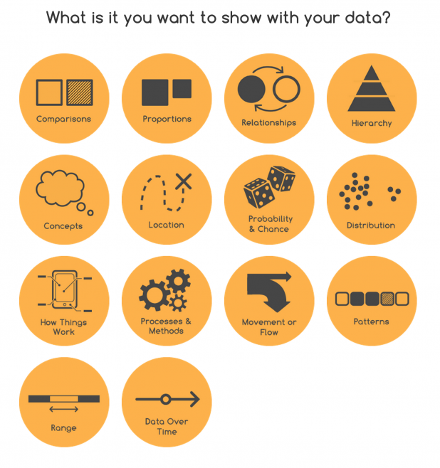
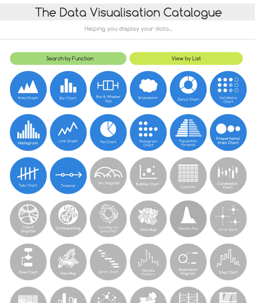
If you’ve ever struggled with what visualization to create to best show the data you have, The Data Visualization Catalogue might provide just the help you need. 

The Data Visualization Catalogue


Subscribe to our blog
Sign up to receive Rock Content blog posts
Related Posts
From Meta to Cara: Where Artists Reclaim Their Creative Freedom

What is Ephemeral Content And 5 Ways To Perfect It
March 29, 2021

A CMO Guide: How to Get your Teams to Tell Better Stories
August 17, 2017

Be Wary of Word Choice When Talking Addiction
November 29, 2022

Order badass content with WriterAccess. Just as we do.
Find +15,000 skilled freelance writers, editors, content strategists, translators, designers and more for hire.
Want to receive more brilliant content like this for free?
Sign up to receive our content by email and be a member of the Rock Content Community!
Talk to an expert and enhance your company’s marketing results.
Rock Content offers solutions for producing high-quality content, increasing organic traffic, building interactive experiences, and improving conversions that will transform the outcomes of your company or agency. Let’s talk.

