Treemaps have proliferated fast and far since Ben Shneiderman invented them in 1990. One reason for this quick spread is the clarity they give to hierarchical information. The technique has a very low learning curve, but it gives very good insight into structure and quantity.
Dr. Shneiderman was dealing with a whopping 80MB hard drive shared among 14 people. This was big enough to allow for a rather unruly directory structure, but too small to allow people “unlimited” space. It quickly became evident that a method for visually finding large files buried deep in directory structures was needed. Traditional hierarchical visualizations mainly showed structure, not quantity, and they left lots of screen space unused. After being puzzled by several methods he tried, Dr. Shneiderman had an “Aha!” experience: Dividing the screen into alternating horizontal and vertical rectangles could show both the hierarchy, and the percentage of used space.
When exploring treemaps, take note of the following three properties:
- They have a hierarchy represented with “containment”.
- They have quantities represented by area.
- They have part to whole relationships.
Treemaps’ hierarchies are shown with children “inside” the parent. Grandchildren are inside of children. Quantities of a node are represented by the area a node takes up. This relationship, in conjunction with the containment relationship, creates the part to whole relationship. The nodes on the bottom layer are parts that together make up the whole treemap. If you cut off a branch of the tree, the same remains true for each branch.

There are several algorithms that create the layout in a treemap. The simplest of these algorithms is the “slice and dice” layout. Unfortunately, slice and dice creates thin slivers and the hierarchy is hard to read. It is difficult to compare the areas of regions that have extremely high or extremely low aspect ratios. Ratios close to one are much simpler to compare. This property has led to the creation of the squarified layout. This algorithm tries to make sure each node remains as square as possible. Squarified treemaps are easier to read because each node has a similar aspect ratio, and the aspect ratios are close to one.


Another issue with some treemap layouts is stability. Stability is important when animating treemaps. If the size of a node changes too much in an unstable layout, the node will jump from one position to another. This discontinuous movement is hard to follow, and makes the layout unusable for animation. There are five commonly implemented layout algorithms, each with advantages and disadvantages.
- BinaryTree – Partially ordered, not very good aspect ratios, stable
- Ordered – Partially ordered, medium aspect ratios, medium stability
- SliceAndDice – Ordered, very bad aspect ratios, stable
- Squarified – Unordered, best aspect ratios, medium stability
- Strip – Ordered, medium aspect ratios, medium stability
You can see a java applet demonstration of the strengths and weaknesses of each of these here.
In addition to these algorithms, there are also layouts that do not use rectangles. Voronoi treemaps by Michael Balzer use a Voronoi tesselations to subdivide the space. Krzysztof Onak and Anastasios Sidiropoulos have a layout with guaranteeable regularity. Kai Wetzel has created circular treemaps without any aspect ratios to bother with, but the layout has lots of empty space.


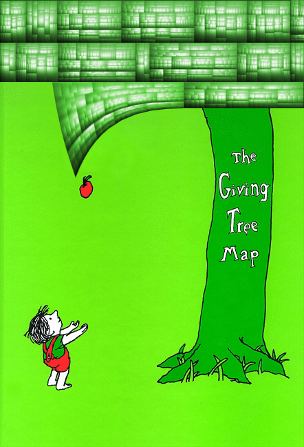
These experimental layouts are not incredibly popular, and they do have their own issues with perception and screen space, but they represent people pushing the edge and trying experiments to improve current visualization techniques. One of the most useful advancements in treemap layouts is cushion treemaps. By simply adding a brightness gradient to each node, the layout no longer needs any border lines. This reduces clutter significantly, and frees up pixels to help represent data. (Plus they look really cool!)

The prevalence of treemaps and the amount of work that has been done to improve them is amazing, considering how young they are. They give so much, communicating both structure and quantity, while efficiently using screen space. They ask for very little in return, requiring only a few moments of introduction before a viewer understands them completely. Thank you, Dr. Shneiderman, for such a giving visualization!
Drew Skau is a PhD Computer Science Visualization student at UNCC, with an undergraduate degree in Architecture.


