In the olden days – 30 years ago – when many U.S. newspapers were beginning to use more graphics as storytelling devices, some newsroom staffers often considered those visuals to be illustrative rather than informative. Art, some news folks thought, didn’t have to be edited or proofread. After all, art wasn’t real journalism or real content. Art was just art. “Read news art the same way you read a news story,” I pleaded to copy editors and reporters in a handout I distributed in newsrooms and at workshops. “Don’t think of a graphic as an illustration that need not be proofread.” The world of visual information has gotten technically and aesthetically more sophisticated in the last three decades, and the process of editing informational graphics has improved. The evidence is on news pages – print and digital – everywhere. Just take a look at the visuals that are shared on Visual.ly. But everybody (including this writer) needs a copy editor. Visual journalist Charles Apple makes this point occasionally in the reports on his blog, The Visual Side of Journalism. Two cases: 1. Ideas on ideology

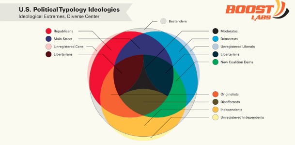
What’s Your Political Typology? was recently posted on Visual.ly, and the work caught my attention when Tokyo journalist Satoshi Toyoshima – a former Gannett colleague – shared the link on Facebook. When I looked at the graphic I was impressed with its use of color and its organization. Then I started reading the words and the art. Immediately I had questions, questions that a newspaper or news-site reader ought not have:
- A label refers to “Unregistered Cons.” Are cons former convicts? What is an “Originalist,” the only category that has no text definition?
- The ideology circles representing Republicans, “Main Streeters,” and those unregistered prisoners called cons are the same size. Does this mean all ideologies are populated equally? Sure looks like it.
- The circles overlap, indicating that everybody shares ideologies. What’s the difference between the circle’s indigo Libertarian and its brown Libertarian?
- Where on the graphic is the source of the information? Why is the upper-case style not consistent? Are “solid liberals” really the “most popular” ideology, as the fever line indicates? If so, ought the graphic take the opportunity to explain why and how? Would a reader find the pie charts easier to read if the percentage figures were inside the pies instead of below them?
I went to the source of the graphic, Boost Labs, and asked. CEO Ali Allage was effusively appreciative. “Thanks for the interest in our work and the awesome feedback.” Turns out the visual, as posted on Visual.ly, is a work in progress. (Who knew?) Boost Labs “never expected such response” the the posting, Allage said. “A more detailed infographic will be released soon with more depth and refinement” and “will be more concise and contain more information.” “We hope it will be more viral as a result,” he said. 2. Classical gas

NPR’s look at the cost of gasoline, shared on Facebook by Doctrine Man, raised questions in this reader’s mind a week ago. Did one of the parts reverse colors between legend and map? Should the copy say “its” instead of “it’s”? I raised those questions to a contact at NPR, and those two questions are answered in the current version. Another, larger question for Visual.ly readers: Should a graphic about the price of gasoline use “gasoline” and “gas” interchangeably, and if so, will some readers think “gas” refers to natural gas?
The take-away
The intent of this article is not to slap the fingers of the creators of these two informative graphics. Rather, the article hopes to remind editors that:
- Each of us needs to make sure somebody else earnestly reads and edits and proofreads our work before publication.
- Sharing a graphic on a site such as Visual.ly allows folks around the globe to read and comment and suggest ways the work can become more compelling and meaningful for readers.
J. Ford Huffman was design editor of the first two prototype editions of USA TODAY, and was a deputy managing editor when he left the newspaper in 2007. (Circulation has since gone down.) He has worked with The Washington Post, San Francisco Chronicle and Hindustan Times (India) and is a Visual.ly advisor.