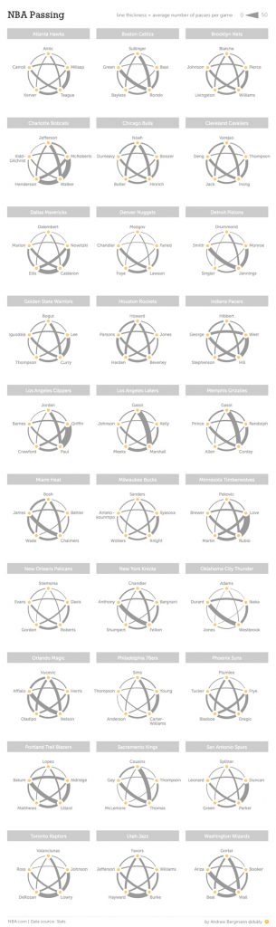
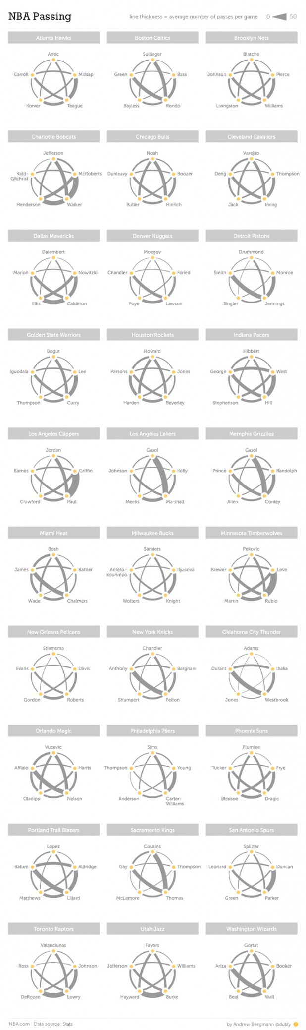
The 2013-2014 season is the NBA’s first full year using SportVU technology in all NBA arenas, and basketball analytics have never been more powerful. For the non-statheads, SportVU is a six-camera system installed in the rafters of NBA arenas that collects incredibly detailed data about player movement 25 times per second. Examples include speed, distance to the ball, directional movement, touches, and more. SportVU began a test run in 2011-2012 and expanded to include the entire league this year. The NBA made the data open and free to the public in November on a special section of NBA.com. This week, Andy Bergmann published his latest project on the NBA’s Hang Time blog – Analytics Art: NBA Passing. Bergmann’s graphic combines simple, striking design with advanced passing analysis from SportVU data that would have been unavailable just a few months ago. The graphic depicts the number of passes between each team’s starting five players from games where all five were active and saw playing time. The thicker the line, the more frequent the passes. Bergmann’s decision to standardize the organization of each team’s starters gives the graphic a mesmerizing star-like web, which makes it easy to understand the differences between how teams distribute the ball. Analytics Art: NBA Passing For example, the Minnesota Timberwolves have built their team around two young stars, point guard Ricky Rubio and power forward Kevin Love. While spectacular passes between the two are easy to find on top 10 lists and highlight reels, individual highlights don’t allow sports analysts to draw a statistically valid conclusion. Using the data from SportVU, however, Bergmann is able to quantify just how much the Timberwolves’ offense revolves around the Rubio/Love partnership compared both to other players on the team and other teams in the league.
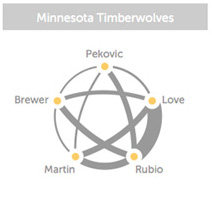
Visualizing data in this way can allow coaches to optimize their gameplan in the future – if the lines are particularly thick between two players, coaches could institute a more balanced attack on offense. And on the other side of the ball, coaches could create a defensive strategy designed to shut down ball movement between two players. Said Bergmann, “you could look at this and say ‘all you need to do is get someone between Love and Rubio’ – and good luck to you in that endeavor!” Minnesota Timberwolves Bergmann initially began creating a graphic that would also show directionality of the passes. The impulse is to assume that point guards or shooting guards would send passes away more frequently than they received them, but the SportVU data revealed that this is not the case. “It turns out that most passing between players is fairly well reciprocated,” Bergmann said. “In one version I set the endpoints of the lines to be different thicknesses based on passing direction, which created a nice taper to the lines. However, once I put in the actual data, it was almost impossible to distinguish the differences and ultimately made the charts slightly more difficult to read.” Bergmann’s graphic using SportVU data is certainly useful to front office executives and NBA sportswriters who look at complex sports analytics trends every day, but it is also simple enough for the most casual fan to check out how their favorite team stacks up. Bergmann, a long-time Knicks fan, might suggest the Knicks front office use his graphic to have a chat with Carmelo Anthony. New York Knicks “Just yesterday, Phil Jackson was hinting that Melo needs to pass more frequently,” Bergmann said. “You can certainly see that in this graphic, but there are definitely bigger ball-hogs in the league.” The full graphic can be accessed here. For more information about SportVU, visit the portal on NBA.com. For more information about Andy Bergmann and other cool graphic projects, visit Andy’s personal site at Dubly.com and follow him on Twitter @Dubly. Jon Salm is an associate client analyst at Millward Brown Digital in New York City and a freelance data journalist in the Visual.ly marketplace. He has a bachelor’s degree in English from Washington and Lee University. You can find him online at about.me/salm.jon and follow him on twitter @S4LM3R.
Share
2024 State of Marketing Report
Your golden ticket to crush your goals with data-driven insights!
Want to receive more brilliant content like this for free?
Sign up to receive our content by email and be a member of the Rock Content Community!
Talk to an expert and enhance your company’s marketing results.
Rock Content offers solutions for producing high-quality content, increasing organic traffic, building interactive experiences, and improving conversions that will transform the outcomes of your company or agency. Let’s talk.


