One of the most important things designers work with is color. Every element they draw, type, or generate with a computer, gets a color. It is impossible to create anything visual without making color decisions. And to make things harder, estimates of the total number of discernable colors range from one hundred thousand to ten million. That’s a lot to choose from. Add issues of human perception and color vision deficiency, and you could get a headache doing anything with colors, let alone building a color scale for data. Luckily, you have some great tools at your disposal to help with color decisions. These tools incorporate different approaches, so each one is good at slightly different things. There are two main classes of tools for dealing with color. The first class is intended to help with design decisions, and the second class covers data driven color scales.
Design
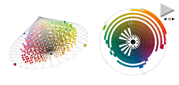
Color Scheme Designer’s interface encourages good choices between color relationships and exports colors to many different formats. It also supports options for showing what each color scheme looks like for different types of color blindness. MudCube’s Sphere is very similar to Color Scheme Designer, but its interface for changing brightness is more accessible. It does only produce a color scheme with similar brightness and saturation for each color, but it has a great interface for it, and also includes color blindness simulation. Colrd has a whole suite of tools for dealing with colors. With a simple but well considered interface, their color palette generator is extremely effective, and easily lets you create palettes with arbitrary color relationships. Their gradient creator is also fantastic, with great controls for positioning each color within the gradient, and controlling the fade. They also offer a great tool for pulling a color scale from an image. Adobe’s Kuler used to offer this feature, but removed it. It’s great to see a tool that still offers this strategy for creating a color palette. Adobe’s Kuler is probably the most simplistic of all of the tools, and has poor export options. One thing it does nicely, however is the scaling of the brightness of each color individually. NCS Colour has a free color picker called NCS Navigator. The tool is interesting because it displays different hues that all have the same “Whiteness” or “Blackness.” That can be useful if you are looking for consistent brightness values across several hues. NASA has their own Color Tool that helps to see the perceptual relationships between colors. The tool is intended for interface designers, so that the interface can be seen no matter what the lighting conditions are. (Who knew NASA used things besides rainbows?)
Data
ColorBrewer2.0 is probably the simplest way to choose a color scale for representing data. It has several pre-set color scales, all categorized depending on their qualities. The tool is great because you select the qualities your data has, and it shows you color scales that would be appropriate. I Want Hue is perhaps the most advanced of all of the graphical color tools. It outputs colors in formats designed for programming, and does a fairly good job of building good practice into the color picker itself. If you are an advanced user creating color scales for data visualizations, this is one tool you cannot miss. Chroma.js is a great tool for programming color scales. It has some pretty advanced color spaces, and can help you to avoid pitfalls like equidistant HSV colors. If you are building interactive visualizations with color scales, this is what you should be using. Depending on your needs, one of these tools should help you to make those important color decisions in a responsible and educated manner. Keep human perception and color blindness in mind, and use your best design sensibilities. Happy color picking! Drew Skau is Visualization Architect at Visual.ly and a PhD Computer Science Visualization student at UNCC with an undergraduate degree in Architecture. You can follow him on twitter @SeeingStructure