How to Use Maps in Data Visualization

Maps are probably the biggest subsection of visualization types. There are many variations on map types, each with its own strengths. These variations can be combined with each other, and many can be tweaked even further to produce new types of maps. Here's an overview of some of the common types and what they are good for.

Updated: February 12, 2021

Need content for your business? Find top writers on WriterAccess!

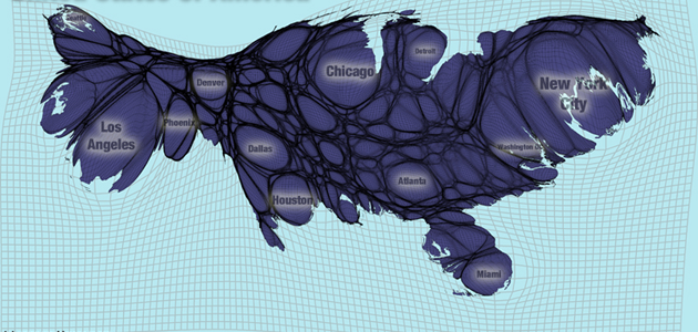
Maps are probably the biggest subsection of visualization types. There are many variations on map types, each with its own strengths. These variations can be combined with each other, and many can be tweaked even further to produce new types of maps. Here’s an overview of some of the common types and what they are good for. Choropleth maps are one of the most frequently used maps in infographic style visualizations. As the name suggests, color is the important part to these maps. A color scale is assigned to categorical or numerical data, and the value for each region is used to color the region. These maps usually use political boundaries as the regions. This method is very easy to understand, however it often has some perceptual issues. To take the United States as an example, the Southwest takes up a huge area but the population in the area is relatively low. New England however, is a tiny portion of the map but has very high population numbers. This means that for population-related information, perceptually, New England is under-represented. Choropleth Map (source) Cartograms alleviate the area issues involved with choropleth maps, but they have their own problems. Cartograms distort the area of a map based on data (in most cases, population data). This means that the data is all equally represented on the screen or page, but it distorts boundaries and can make regions unrecognizable. Cartogram (source) Proportional Symbol maps are another method used to alleviate the region area issues in choropleth maps. Typically these maps use circles or some other simple shape centered on each region. The size of the shape is connected to quantitative data. One common variation on the method is to use pie charts in place of the shape in order to add more data to a single map. Sometimes these maps suffer from occlusion problems, however this can often be alleviated with translucency and appropriate scaling of the symbols.

via

Some people have combined proportional symbol maps with cartograms to produce a hybrid. This is a fairly effective method, although having the same symbol for each region might be easier to read. Proportional Symbol Cartogram (source) Pinpoint maps show the exact location of things. These are becoming more and more popular as more data sources include exact location. Twitter posts and flickr photos are commonly mapped this way. Another ubiquitous version of this map is searchable maps like google maps that show the exact location of the items you searched for. GPS units also use this type of map technique when they show your position.

via

Connection maps are similar to pinpoint maps, although they have a small addition. The points have connections between them. In many examples of this technique, the connections are abstract (like phone calls or tweet replies), so the connections are represented with an arc or straight line. These maps are essentially graph or network data that has been drawn with a geo-spatial layout. The famous map of Napoleon’s march by Charles Joseph Minard is a version of a connection map with a quantitative dimension added. The width of the connecting lines shows the size of the army at the time.

via

Subway maps are another version of connection maps. The connection is most important in these maps, although the precise station location is not. Subway and transit maps are always manually created by designers who simplify the routes down to lines at a few different angles. This simplification makes the map much more legible for the really important information: What stop am I at? Where do I want to go? What train/bus do I take to get there?

via

Isopleth maps may have a daunting name, but we have all seen them. Isopleth means range of quantity, and that’s exactly what the maps show. The most common place we see isopleth maps is for weather data. Radar maps, temperature maps, rainfall maps are all isopleth maps.

via

Stream plots aren’t always shown on geographic maps, but they can be. They show things like airflow direction, and if you have seen one, it was probably weather related. It is also common to combine this type of map with an isopleth map. Stream Plot Stream Plot and Isopleth Map Prism maps, are a 3D map type with many problems. This technique involves changing the height of regions of the map based on quantitative data. The biggest problem with the method is that it almost always results in some regions hidden behind other regions. It is also very difficult to read numbers from 3D objects, and even harder in this case because there is no good way to put a scale on the map. Prism Map (source)     Drew Skau is a PhD Computer Science Visualization student at UNCC, with an undergraduate degree in Architecture.

Share
facebook
linkedin
twitter
mail

Human Crafted Content

Find top content freelancers on WriterAccess.

Human Crafted Content

Find top content freelancers on WriterAccess.

Subscribe to our blog

Sign up to receive Rock Content blog posts

Rock Content WriterAccess - Start a Free Trial

Order badass content with WriterAccess. Just as we do.

Find +15,000 skilled freelance writers, editors, content strategists, translators, designers and more for hire.

Want to receive more brilliant content like this for free?

Sign up to receive our content by email and be a member of the Rock Content Community!

Talk to an expert and enhance your company’s marketing results.

Rock Content offers solutions for producing high-quality content, increasing organic traffic, building interactive experiences, and improving conversions that will transform the outcomes of your company or agency. Let’s talk.