We are all familiar with percentages: we learned about them in grade school and we encounter them everywhere. The concept of abstracting a quantity to a common range can be extremely useful. Percentages let us compare relative quantities of groups, measure changes in quantity over time, we use them in how we calculate interest, to measure slope, and in any number of other ways. By far, the most common use of percentages is to indicate a portion of a whole. Despite their advantages, percentages add a layer of abstraction that can depersonalize data. It’s hard to conceptualize percentages and translate them to quantities of real units, especially when the actual quantities are very large. For example 19% of the world’s population lives in China. But since this number has been abstracted and the unit of “People” has been removed, we don’t have much of a personal connection to the statistic. An alternative way of conceptualizing the same numbers would be to create a hypothetical scenario. If the world were 100 people, China would have 19 people in it. This returns the intimacy to the numbers. Now we can have thoughts like, “I know that many people”, “My extended family is that big”, or “That’s fewer than the number of kids in my third grade class.” These types of thoughts can help us empathize with other issues involved in the data: important issues like the number of people going hungry, or literacy rates, or wealth distribution. Let’s take a look at how effective this technique can be. If the World Were 100 People looks at some global statistics using this hypothetical situation. Remember, you could put a percentage sign on the end of all of these numbers and they would still be accurate.
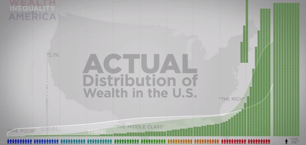
That’s pretty effective. 17 people can’t read, and only 7 have a college degree! 13 have unsafe drinking water. That’s a small enough number that I feel like I could help them by myself. It really makes you wonder why conditions like this still exist if the relative quantities are so low. This technique definitely returns the human scale and empathy to these numbers. It can be even more effective when used to point out a group of people causing a problem. Wealth Inequality in America transitions to this 100 people technique at about the two minute mark, but at about four minutes thirty seconds, it uses it to callout an individual. That individual represents the top 1%. But when it is phrased as 1%, the effectiveness is gone. It’s an amorphous blob of an unknown quantity. But, when it’s one person, phrased as “this guy,” it becomes far more powerful. That’s a guy I could speak my mind to. I could show him the conditions people live in, struggling to make it. I could have a beer with him, and an honest conversation.
The power of this hypothetical situation is a good thing, and the examples above use it for good purposes. It is a good way to return emotion to statistics, but like all powerful things, it should be used with caution. Overuse could do more damage than good. It’s a technique that should be considered carefully before being employed. Drew Skau is Visualization Architect at Visual.ly and a PhD Computer Science Visualization student at UNCC with an undergraduate degree in Architecture. You can follow him on twitter @SeeingStructure


