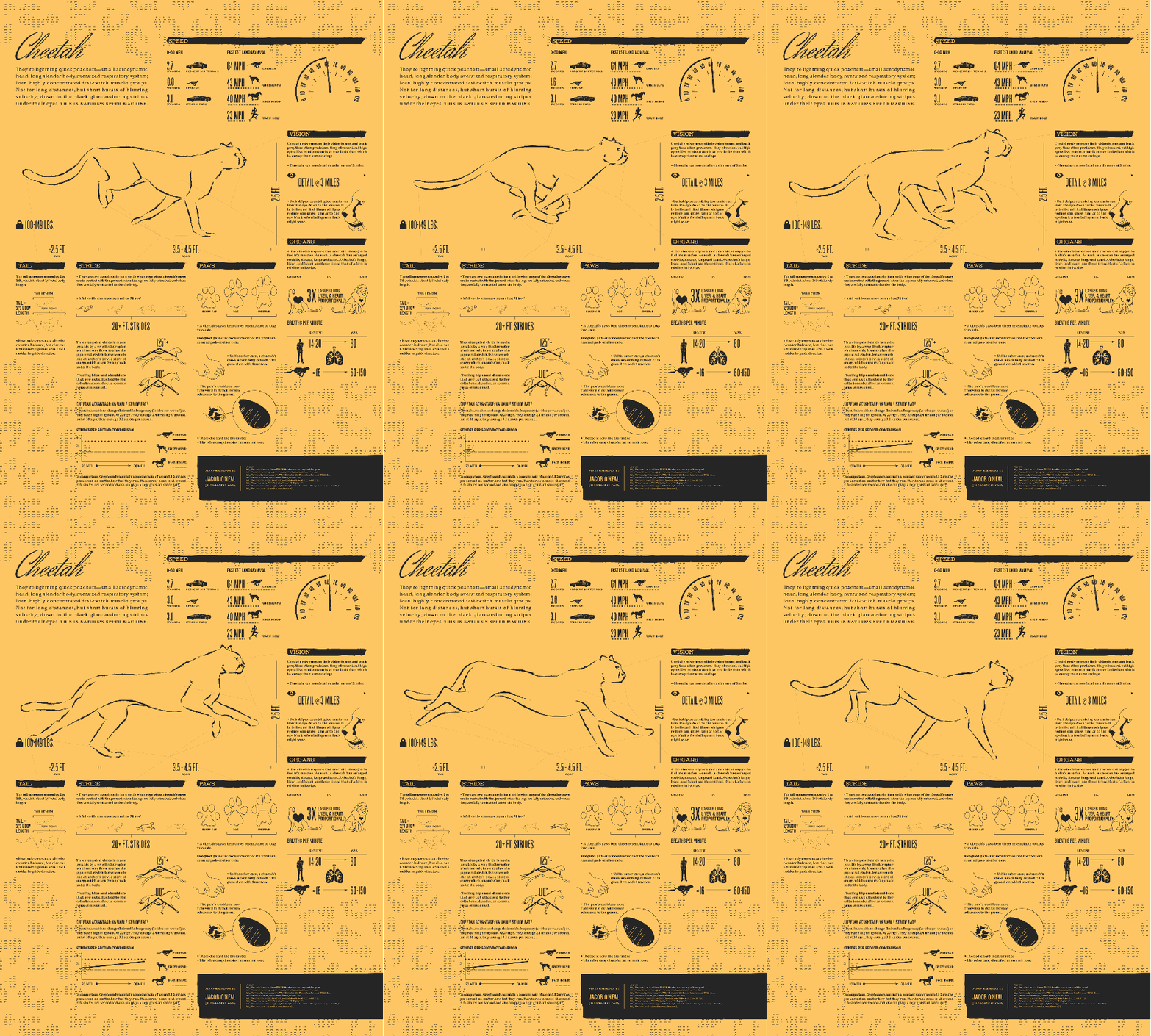
Animated infographics are a relatively rare thing, but they can be a powerful way to convey certain types of information. Sometimes an animation is simply the best way to show a process, but there are still stats and charts that work great in a static form. That’s where the animated GIF infographic comes in. This unique breed combines some of the advantages of motion graphics with the static capabilities of a standard infographic. (Click through to the full size versions to see all of the animations.) Cheetah: Nature’s Speed Machine by Jake O’Neal is a great example of how this format can be used effectively. The animation does a great job of clearly conveying the different phases of a cheetah’s stride, and the animation in the other charts is eye catching and draws your attention to the data.
Are We Making the Grade in Colorado by Elkano Data uses animation in a different way. The maps in the infographic build from year to year, showing the change in grades in Colorado over time. This animation helps to reduce overplotting, and cuts down on the number of charts. It also makes the changes from year to year much easier to spot.
How Big is the US Trade Deficit?, also by Jake O’Neal uses the animation to catch your eye, and bring your attention to the charts and data that are on the graphic. The header instantly pulls you in with a large animated portion.
Golf Swing Anatomy by Lumen Interactive is another great example of using the format to show the kinetics of a process combined with stats, charts, and text.
Making an animated GIF infographic requires a specialized set of skills. There are only five such graphics on Visually, three of which were created by Jake O’Neal. He had this to say about the process:
- “Adding animation to a static graphic (read: a graphic that doesn’t really need it) can work as a gimmick to boost visibility. However, animations which repeat in a short, infinite cycle make the most compelling animated GIF subject matter. The Golf Swing is a good example. Mechanical things, movement, etc. These are often subjects that would be difficult to illustrate WITHOUT animation.”
- “GIF animations can’t be stopped or started, so it’s important to keep annoying or distracting graphics to a minimum, or be certain they are necessary to tell the story. The “Trade Deficit” graphic pushes the limits in this realm, but I did that for a client who requested such things. My Cheetah graphic is a better example of riding the line between tasteful repetition and excessive movement.”
- “GIFs don’t support gradients or shaded effects well at all. Such effects not only look bad but also amplify the image size exponentially. Keeping a simple, flat color palette will dramatically reduce file size. My Cheetah graphic is 25+ frames, and yet it weighs in at a cool 500kb. That’s smaller than many flat JPG graphics! I limited the graphic to only 2 colors. Even the cheetah spots in the background use a dotted effect to give the illusion of a lighter color while still using the same shade of black as the rest of the graphic. You can certainly use more than just 2 colors. However, it’s important to test-export the static image and see how image sizes are boosted with each color you add to the graphic.”
Jake may be the leading expert on creating animated GIF infographics, and he’s available to work with on the Visually Marketplace, if you’ve got a kinetic process, or some animation that pairs well with static charts and graphics. Drew Skau is Visualization Architect at Visual.ly and a PhD Computer Science Visualization student at UNCC with an undergraduate degree in Architecture. You can follow him on twitter @SeeingStructure


