At their best, white papers can propel a business to the next level – by gaining new customers, circulating cutting edge research, or simple self-promotion.
At their worst, they are never read. Perhaps the best way to draw readers in is by employing visual storytelling tactics.
The practice can boost a presentation’s power, an event’s influence, and of course, a white paper’s persuasiveness.
Here are four expert visual tactics to achieve the best white paper design.
1. Keep it Clean
Cleanliness is vital for any sort of data visualization. A few simple changes to clean up a graph can make a world of difference. The same holds true for white papers.

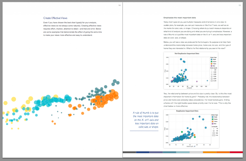
Tableau’s Visual Analysis Best Practices makes expert use of white space, columns, and easy to understand visualizations. While Tableau may have a slight advantage due to the subject matter, any business can adopt a similarly clean and clear layout for their white paper design.
2. Join Forces with a Creative Tour de Force
Partnering with a designer, like one in the Visually Marketplace, can transform a text-heavy white paper into a visually stunning reading experience. Expert designers work wonders with white space, break up text into perfectly readable units, and dazzle with custom graphics and illustrations. But perhaps most importantly, they take the guesswork out of content creation.
3. Make it Interactive
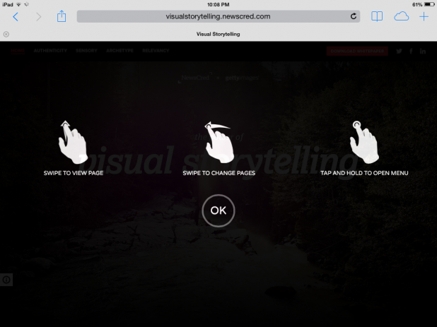
Interactive web experiences are best for keeping consumers engaged with content. Rich media ads routinely test better than their flash counterparts, and interactive visualizations do a great job of conveying information. Why should white papers be any different? NewsCred’s fantastic Power of Visual Storytelling white paper is interactive both on web browsers and tablets, where you can click, tap, and swipe your way to become an content marketing maven.
4. Mix Digital Mediums to Tell a Story
In the digital age, calling publications “white papers” might be a misnomer. Most will be read in full color on a computer, on a tablet, or even on a smartphone. It would be shortsighted to limit the potential of these mediums. Businesses can take advantage by adding content such as images or short-form videos (think Instagram or Vine videos) in digital publications. Whichever route you choose, adding visuals to a white paper is a must. And we can help – visit the Visually Marketplace to get in touch with content marketing experts ready to take your white paper to the next level. Jon Salm is an associate client analyst at Millward Brown Digital in New York City and a freelance data journalist in the Visual.ly marketplace. He has a bachelor’s degree in English from Washington and Lee University. You can follow him on twitter @Jon_Salm.


