Keeping up with the latest marketing trends is essential today. Yet, what really matters is how your target audience reacts to what you offer.
With tons of content already out there, you’ll need to stand out and get their attention in an entirely new way.
One way to accomplish that is with interactive newsletters.
These exciting marketing phenoms can engage your customers, create personalized experiences they’ll remember, and boost conversion rates. They are a way for customers to communicate directly with your brand.
So, what is the secret to creating a successful interactive newsletter?
You’ll need to go beyond providing hyperlinks and CTA buttons, and include enticing interactive content to attract attention.
By inviting such interaction, you can do away with one-way experiences for your customer and instead pave a two-way street that builds loyalty.
When you’re ready to make your mark with compelling interactive newsletters, here’s what you need to know to get started.
- What is an Interactive Newsletter?
- Why Should You Include Interactive Content in Your Campaigns?
- Interactive Newsletter: 5 Best Practices to Create Your Own
- 5 Amazing Interactive Newsletter Examples
- Wrap Up: Create Your Own Interactive Newsletter
What is an Interactive Newsletter?
An interactive newsletter includes elements that require the consumer to actively engage or participate in order to experience fully what the content has to offer.
They may need to swipe, tap, or in some other way interact with different content included in the newsletter.
In other words, an interactive newsletter goes beyond the plain text and occasional image found in static newsletters and provides different ways for readers to immerse themselves completely in the content.
For you, it’s all about finding a way to add curiosity and functionality to otherwise static content and enticing readers to interact.
The interactive content itself promotes a playful experience for the reader, encouraging them to positively remember your brand.
Why Should You Include Interactive Content in Your Campaigns?
Interactive content can be a strategic part of your digital marketing plan. Incorporating it into your newsletters and email campaigns is a good way to start.
These newsletters provide you with a new way to reach your audience and invite them in so they can join in on the experience, making them feel involved and part of something bigger.
But there’s more.
Interactive content in your campaigns is a fantastic way to collect data about your targeted audience and current customers.
With it, you can gain powerful insights in regards to preferences and tastes, then use what you find to sculpt future strategies and campaigns.
Customer feedback, quizzes, and surveys are ideal for this and become part of your content marketing strategy.
Need more reasons to use interactive content in your campaigns? Here they are.
- Boosts user engagement by creating excitement and curiosity.
- Provides a way to repurpose content.
- Improves email open and engagement rates.
- Bolsters brand awareness by grabbing the attention of your audience.
- Provides more ways for consumers to get to know your brand, product, or service, boosting their interest level.
- Differentiates you from your competitors.
- Increases dwell time.
- Aids customer segmentation efforts thanks to insightful data
- Increases lead generation, which can then lead to higher conversions and sales.
By encouraging interaction and participation in your campaigns, both you and your target audience benefit.
Create interactive content and experiences with Ion! Request a free demo now ➜Interactive Newsletter: 5 Best Practices to Create Your Own
When designing your interactive newsletter, it helps to know a few best practices to help guide you along the way. Here are five.
1. Include an Interactive Table of Contents
Provide your readers with an interactive table of contents at the top or side of your newsletter. This allows them to easily navigate to different sections or modules at their convenience.
It also shows you respect their time and interests, allowing them to go straight to the topic they want to know more about.
As you can imagine, these are especially useful for longer newsletters filled with lots of great content.
2. Keep Design and Imagery in Mind
Consumers are increasingly visually-oriented today, and respond and react to visual images within text.
For this reason, keep the design of your interactive newsletter in mind and include different images throughout to attract the reader’s eye as they progress through the content.
Mix the types up, inserting illustrations along with photos and other visuals.
Also, vary the width and placement of your content to encourage a fun, playful, yet interesting format. Utilize background colors, different sized fonts, and incorporate white space into the overall design to avoid overcrowding.
3. Vary the Type of Interactive Content
Try to vary the type of interactive content you include in your newsletters. This will keep readers surprised and make you less predictable or even boring.
While you may want to include certain types, such as image rollover effects, as a staple, experiment with other interactive content, such as:
- Surveys (for feedback so you can add value to offerings)
- Interactive Calculators (to show how they can save with you)
- Interactive Infographics
- Checklists
- Games
- Interactive videos
- Interactive eBooks
- Scratch cards (for gifts, offers, or discounts)
4. Use Animation to Grab Readers’ Attention
Animation is popular with consumers today, and even a little can go a long way in capturing their attention.
For instance, inserting an animated GIF will draw the eye but not serve as a distraction from the other content.
A GIF is simply an animated sequence of small images used for entertainment, to display products, showcase a logo, or reveal another creative endeavor.
It is a flow of contrasting movements, catching the reader’s eye and often forming an emotional connection.
You can also use animation to turn static content and boring images into something more.
5. Make it Scannable
Your interactive newsletter needs to be scannable by readers.
Resist overcrowding it with too much information and design, creating a busyness that turns readers away.
Including too much text, videos, or images can overwhelm at first glance, and visitors may leave and never return, regardless of how amazing your content may be.
Create interactive content and experiences with Ion! Request a free demo now ➜5 Amazing Interactive Newsletter Examples
For inspiration, here are five amazing interactive newsletter examples to get the wheels turning.
1. The Official Rock Content Newsletter, The Beat
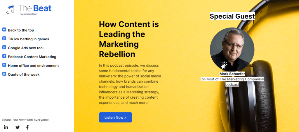
Rock Content is a leader in creating innovative marketing products and services and extends that excitement into the design of their interactive newsletter, The Beat.
At first glance, it’s easy to see the interactive newsletter is scannable. Readers can glance down the page and locate what interests them most.
An interactive table of contents in a column located on the left side of the screen also makes navigating through the content easy.
Design and text introduce each article and podcast, then provide a button to click on to continue reading, or in the case of the podcast, listen.
And don’t forget to check out the animated musical note at the top left.
This catchy, playful animated gif captures the eye without being overly distracting, and you just can’t help but smile and maybe even tap your foot along with the beat.
This full example of an interactive newsletter incorporates many best practices, including scanability, easy navigation, and pleasing design with white space to break up the visual and textual elements.
2. Toms
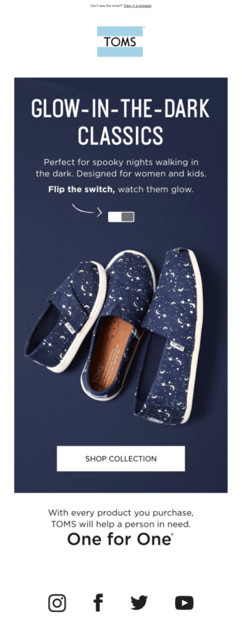
Toms, the well-known shoe and apparel company, is not new to taking a creative approach to reach customers.
The brand’s product newsletter is just one example of this and includes spectacular interactive content, often including surprising seasonal appeal.
For example, at Halloween, Toms newsletter allows readers to hover over the slider to show a glow-in-the-dark shoe in action.
Rather than providing two separate photos of the shoe, one in the light and one in the dark, the brand lets the visitor discover the change for themselves.
This one small feature engages and compels viewers, catching them by surprise, and is a prime example of how to provide a fun and unique way to show off a product.
3. Burberry
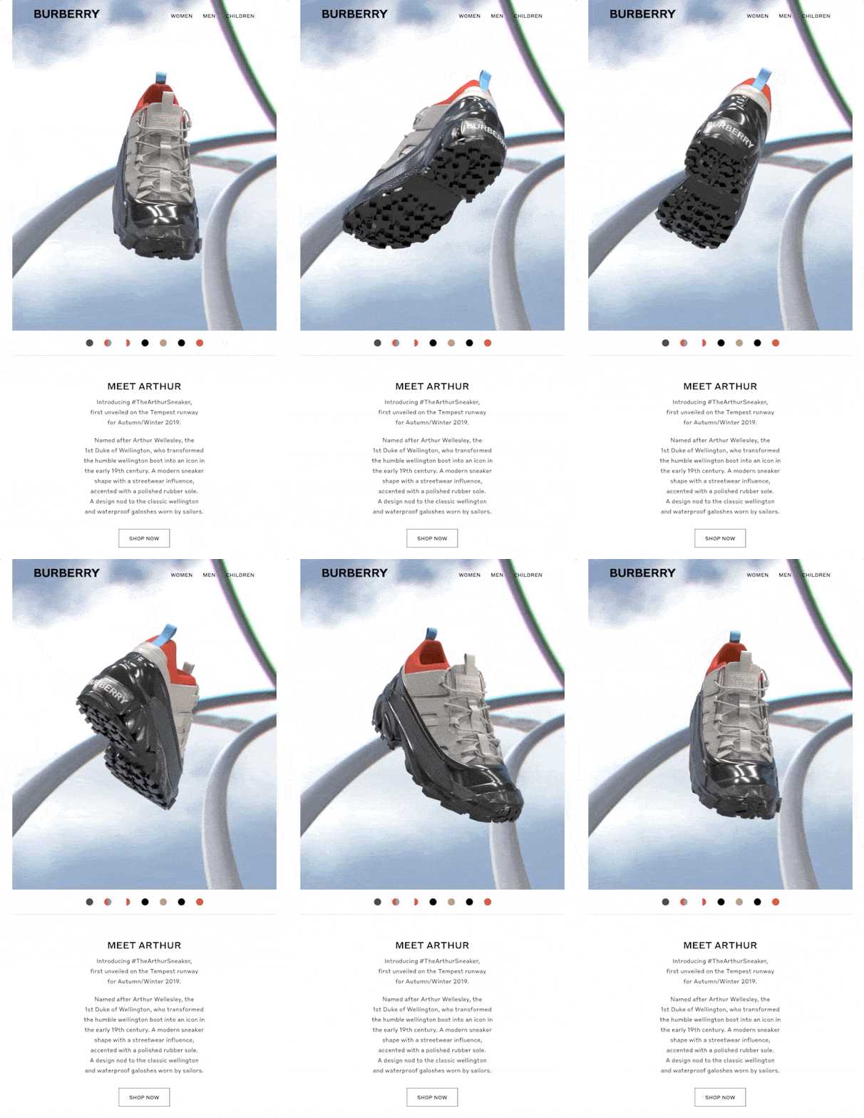
Luxury British clothing and accessories brand Burberry also found a way to display a product and capture attention.
Specializing in high-end items, Burberry doesn’t disappoint when it comes to design.
With a sleek website featuring splashes of color, video clips, an image slider, and more, it’s no wonder that their interactive newsletter is just as dynamic.
One piece of interactive content, in particular, really stood out for this brand. It was a promotion for specialty sneakers and incorporated a brilliant animated gif.
The sneaker spins around in a circle, allowing visitors to experience a 360-degree view, seeing the shoe from all sides and angles.
Those interested in learning more simply click on the “Shop Now” button conveniently displayed below the gif and are taken to the product page for the full details.
While this may seem like a basic example of how to use interactive content, it shows that a little can go a long way in garnishing the attention of a targeted audience.
4. BHLDN
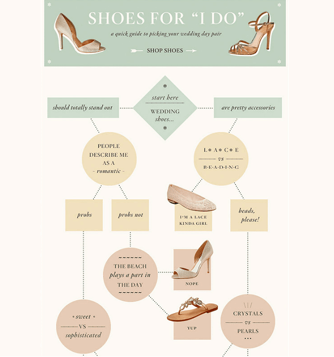
The brand BHLDN specializes in selling wedding dresses, gowns, and formals, along with related accessories, to ease the journey of the bride-to-be and bridesmaids.
To help lessen the anxiety and overwhelm of planning a wedding, BHLDN injects a sense of playfulness into their website and their interactive newsletter as well.
One thrilling part of their content is an interactive game called Shoes for “I Do.”
This game entices email subscribers to find the perfect shoe for their wedding day in an interactive and fun way.
Starting at the top, the viewer must first select whether they wish the shoes to be a stand-out item of their wardrobe or a less noticeable but pretty accessory. They then work their way through different screens until they find the shoe that fits their wants and needs.
Clicking on a particular shoe takes them to the product page on the website, provides more details, and allows them to purchase.
BHLDN understands its target audience and buyer personas and streamlines the process of finding the right shoe in an interactive and enjoyable way.
Such an interactive game concept can be useful in many different niches, either for products or services.
5. British Airways
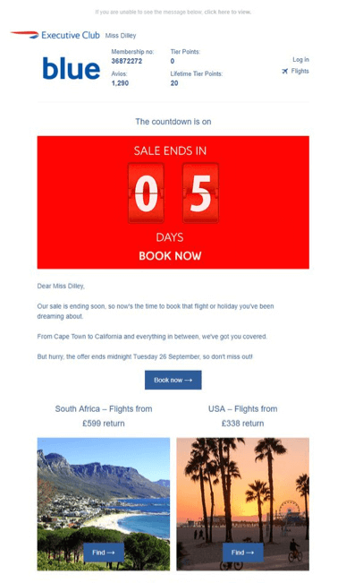
For a slightly different take on interactive newsletters, check out those sent out by British Airways.
One type of interactive content this brand likes to use is a countdown timer.
This timer continues to run, letting viewers know how much time remains until the end of a promotion or sale.
In one email campaign, the brand offered certain discount prices to those who bought tickets within a set timeframe.
The timer acts similar to other events requiring a calendar and evokes a feeling like that experienced when counting down the seconds until midnight in Times Square on New Year’s Eve each year.
Its existence builds excitement, anticipation, and maybe even a bit of anxiety (the good kind).
You may also be interested in these articles:
- Top SEO Newsletters to Boost Your Marketing Campaign
- Email Marketing Guide: How to Build a Solid Strategy for This Year
- Check Out Best Practices to Improve Your Email Deliverability
Wrap Up: Create Your Own Interactive Newsletter
Today you need a way for your brand to stand out from the competition and attract your audience in new ways.
An interactive newsletter can accomplish this, creating more engagement with readers, which can then lead to higher conversions, increase leads, and boost sales.
Start with a design refresh, add color, images, and most importantly, various types of interactive content, and you’re well on your way.
Find m
Looking to revolutionize your newsletters with interactive experiences?
Discover Ion, a powerful tool within our Content Cloud suite, designed to transform your newsletters into engaging interactive content. Get started right away to unlock the full potential of interactive newsletters with Ion and other innovative tools available in Content Cloud.
Find more ways to take your content strategy to the next level by downloading our free Interactive Content Guide!
Start creating interactive content with Ion and increase your marketing results!
Start creating interactive content with Ion and increase your marketing results!





![What is MarTech? [+ Examples to Add to Your Tech Stack]](https://rockcontent.com/wp-content/uploads/2021/12/martech-1-300x158.png)
