Hello. I’m Andy Cotgreave, Social Content Manager at Tableau Software, and it’s my pleasure to be doing a guest post for Visually. Pop quiz: when did people first start writing about effective ways of visualizing data? Your answer might go back to the 1980s (Edward Tufte, perhaps) or even further back into the 1960s (Jacques Bertin, maybe). Few people would go back so far as 100 years ago. That’s right: one hundred years ago. Willard Cope Brinton, an engineer living in New York, wrote Graphic Methods of Presenting Facts in 1914. The astonishing thing about this book is that in many ways it has not dated at all. You could read this book today and learn as much about effective data visualization as you could by reading anything by Stephen Few, or blogs such as this one. Let’s take a look at a few things he focused on in his book. While we do, ponder two things: how come Brinton isn’t famous; and how come we still need books about data visualization design when we knew it all 100 years ago? 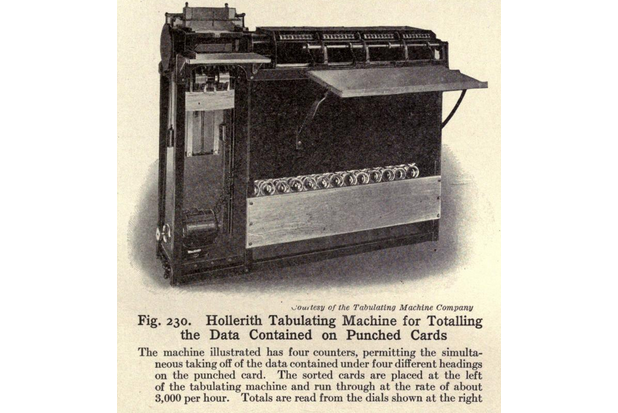 Imagine you are a data analyst in 1914. 1914 was an age of Big Data. Millions of dollars were being invested in data collection, and with cutting-edge punch card technology, you too could process 3,000 records per hour. Imagine the analytics you could do with that much data! In 1914, just as today, it was likely you were struggling to convince your bosses to come to fact-based conclusions. You needed to display your data correctly, since, as Brinton said, “there is danger in giving too much information to executives of small brain capacity.” Perhaps there’s still an element of that today? J Once your data was processed and aggregated by these amazing machines, how did Brinton recommend you show it? Well, there were a bunch of chart types he thought “should be banished to the scrap heap.” Out went radar charts, area charts and pie charts (3 chart types still abused today, despite no shortage of clear analyses of when they do and do not work).
  Secondly, he was very aware of the challenge of balancing effectiveness against engagement. He recognized that a little decoration or creativity would engage the user. This is a debate that rages on, 100 years later. In the example below, he applauded the designer for using an image to attract the attention of the reader and then use an effective method, bars, to represent the data.
 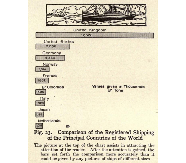 At the other extreme, he cautioned against what we today would call infographics. In describing a cartoon of a money-grabbing octopus from a newspaper, he found fault in the difficulty of accurate and quick comparison of any values. Brinton did not outright condemn “the cartoonist style”. Instead, he said “there is a great opportunity waiting for the man who can combine cartoon methods with accuracy of numerical statement.” This is reassuring for all you infographic designers out there!
 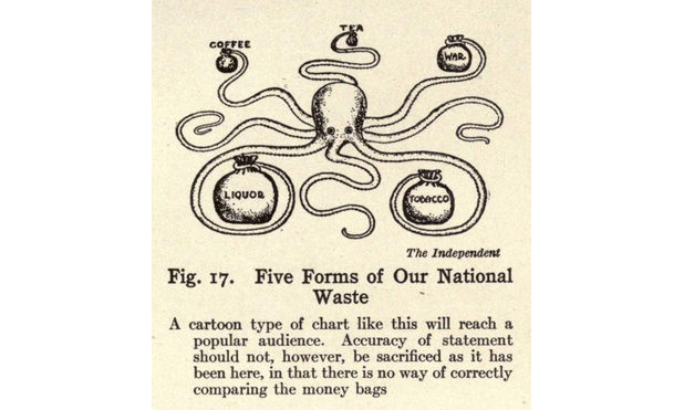 The final point I’ll cover is about sharing work. In 2014 it is easy. You upload a picture to Twitter and anyone in the world with a browser can see your information. That’s amazing. In 1914, people had the same desire to share, but they could only use the available technology. My favorite photo from the book is the one below. It’s of a municipal parade in New York. Check out the horse and cart. What’s on the back? A great big board with charts printed on it. If you were a city worker, and wanted to share data about education, health, or welfare in your city all you need is a great big board, a cart, a horse and rider and you’re set!
 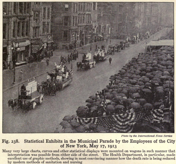 We’ve looked at just 3 insights from the book. There are 100s more. In this short space, I hope I have piqued your interest to find out more. If so, please head over to my Tumblr, https://100yrsofbrinton.tumblr.com/. I’m adding insights from the book over time, combining them with modern day equivalents or new ideas to add to Brinton’s. Join me in making Brinton famous!
  If you want to let me know your thoughts on Twitter, I’m @acotgreave or you can use the hashtag #100yrsOfBrinton.