All your favorite things; Now in 3D!
While this is a great tagline for movies and video games, visualizations work differently.
The main purpose of a visualization isn’t entertainment — it’s effective communication. A visualization should represent data in a way that makes information assimilation and comprehension simple.
Comparing things or finding patterns or groupings are some of the operations that we use to help with comprehension, and visualization can make some of these operations very easy. Our visual system is really good at these operations, and good visualizations take advantage of that.
Don’t get me wrong: 3D visualizations have their place. They are good for data that has a three-dimensional spatial component. For data that doesn’t have these characteristics however, adding a third dimension to the visualization often harms communication.
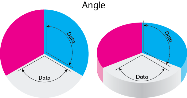
Pie charts are the worst offenders. The main encoding of data in a pie chart is in the angle of the slices. In a 2D pie chart, the angles are accurately represented, but as you can see in the image below, in a 3D pie chart, the angles have to be distorted to create the 3D effect. Our brains are not good at accurately building a mental 3D representation of the chart to be able to rotate back to an oblique view. Because of this, the main representation of the data has been destroyed by the 3D effect.


The bottom line is, 3D pie charts take the only two features showing data and distorts them!
 Pie charts are not the only examples of bad 3D visualizations, and the problems they have are not the only problems caused by 3D. Another usual suspect: maps.
We’ve all seen 3D maps where the height of the region is connected to data. These maps look dramatic, often with crazy tilted angles and strong perspectives to help increase their dynamism. They do look cool, but they suffer from some terrible occlusion problems. Very often, regions on the map are either partially or fully hidden by taller regions in front. This makes it impossible to tell what the data is for a given region. Is Wisconsin taller or shorter than Ohio? In addition, there is almost never a readable scale for the vertical dimension, so getting an accurate number for any given region is impossible. How tall is Louisiana?
Adding a third dimension to some things definitely adds to their “cool” factor. Unfortunately, a visualization‘s cool factor is directly related to how useful it is, and adding a third dimension to many visualizations makes them less useful. Think carefully about your visualization technique before you decide to go 3D! Drew Skau is a PhD Computer Science Visualization student at UNCC, with an undergraduate degree in Architecture.