Back in 2010, I was giving a workshop on interactive data visualization in Lima, Perú, discussing whether a dataset has a unique or at least an ideal way to be visualized. For a simple data structure — a list of some hundreds of numbers, for instance — around half of 20 participants were convinced that there’s one way that is clearly better in communicating the data, regardless of the unit of the values, their range, meaning, context and possible aim of the visualization. This discussion actually came out as a consequence of another idea, which resonated with most participants, as well: that there should be a guide that indicates the best way to visualize each possible dataset. So I proposed the following exercise:
let’s try to find all possible ways to visualize a ludicrously small data set of two numbers. Afterwords, let’s try to pick the best visualization.
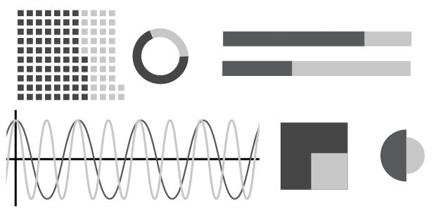
With such a tiny dataset, you would think we would complete both exercises in less than 5 minutes. Yet, we spent more than two hours without having actually accomplished either of the two tasks. Not only was the number of possible ways to visualize two values far higher than expected, but also each single visualization method admitted multiple and interesting variations and opened new questions and discussions. The following is a list of different ways to visualize two numbers. In many cases, the visualization depends directly on the unit, meaning, interpretation and context of the values. Some of the examples might be seen as variations of the same theme, others will be perceived as excessively eccentric or even esoteric. On the other hand, I’m sure many of you will come up with visualization methods not included in the list (in which case, please include them in the comments!). I explain only some of the methods; in general they are clear and well known. Some have a very bad reputation, but I won’t get into that kind of discussion. I’ll also avoid the discussion about which method is better according to the context and goal.
75 and 37
1. writing, number notation

2. squares

3. repeated icon

4. hundreds, tens, units, decimals… represented by squares

5. bars

6. line graph

7. percentages bars

8. spliced bar

9. proportion

10. interval

11. squares merged

12. percentages in squares

13. pie charts

14. donut chart

15. circle areas

16. semi-circle areas

17. circle and external ring

18. co-centered circles

19. square divided

20. shape divided

21. square surfaces

22. shape surfaces

23. different shape surfaces

24. icon surfaces

25. icon height

26. volumes

27. special metaphors

28. gray tones

29. color scale

30. geometric proportions

31. horizontal/vertical proportions

32. coordinates

33. angles

34. geographic coordinates

35. values associated to countries

36. density

37. percentages / density

38. dashed

39. nodes and connections in a network

40. parameters of a mathematical function

41. harmonic frequencies

42. pulses frequencies (in pulses per minute)
43. rotation frequencies (in revolutions per minute)
44. sound frequencies (in Herz) a. 75:[haiku url=”https://s3.amazonaws.com/scribblelive-com-prod/wp-content/uploads/2012/07/s75.wav”] and 37:[haiku url=”https://s3.amazonaws.com/scribblelive-com-prod/wp-content/uploads/2012/07/s37.wav”] b. 37 to 75:[haiku url=”https://s3.amazonaws.com/scribblelive-com-prod/wp-content/uploads/2012/07/s37to75.wav”] 45. fat fonts

So what’s the point of this list?
I’m sure this list is not complete and could be organized in better ways. But I don’t think it’s possible to build a definitive list — it just doesn’t exist. New ideas will always appear (like in 45.) Among the methods mentioned in this list, some are scalable to bigger lists of numbers, and others are not. That’s because they don’t depict each value separately; rather, they say something about the relation between the values (for instance the ones that represent proportion, or the coordinate systems). By adding more numbers to the list, the amount of possible combinations rises exponentially. What happens if we move to other, richer datasets — lets say a table containing a list of countries, lists of numbers, and lists of dates? (I’m talking about small datasets anyway, nothing that could be called ‘big data’.) The data set not only contains more values, it contains different units. And not only could each list be interpreted and contextualized in different ways, the relations between lists and individual values can be interpreted and contextualized differently. This is the classic complexity context: simple elements that interact; you add more elements and the number of possible interesting (meaningful) patterns increases dramatically.
Information visualization is a language.
A language able to explain the world, tell stories, point specific facts and objects, elaborate ambiguous messages, defend arguments, attack arguments and carry ideas and ideologies. As any language, visualization works with combinatoric and generative rules. And as with any language, it’s just impossible to delineate its borders or enlist all the objects it can produce. It’s not a coincidence that I started and ended the list with text (from millennial to to the most recent notations): I see visualization as an extension of writing. By combining some of the methods of this list, it’s possible to create new ones: co-centered donut charts (14.) can be used to visualize tree structures, dashed shapes (38.) can be used on maps, line graphs with solid shapes (6.c.) can evolve to steam graphs, free shapes with surfaces proportional to values (23.) can be found in cartograms or non-rectangular treemaps; with fat fonts (45.) it’s possible to build special heat-maps, etc. The purpose of this list is to stimulate this kind of combinatorial, generative and creative thinking. Doing this exercise in Lima was a thoughtful experience for every participant, it raised multiple new ideas and debates, and that’s what I wanted to bring here. Don’t take this list as 45 answers to a question, but as 45 points of departure for new questions.
References:
Exercices in Style FatFonts The Grammar of Graphics Information Graphics
A PDF poster of the images in this post can be downloaded here. Santiago Ortiz is a mathematician, educator, developer, researcher , freelancer. He creates interactive visualization projects. https://moebio.com @moebio