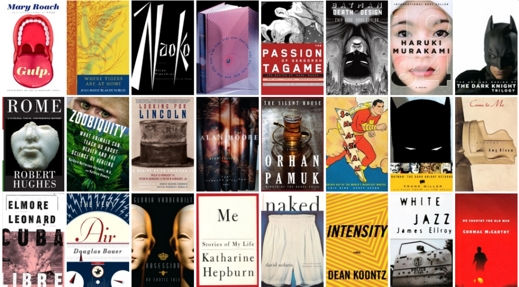
Iconic graphic designer Chip Kidd recently released Go: A Kidd’s Guide to Graphic Design. It’s an introductory text on graphic design for kids, but its lessons hold just as well for adults doing data visualization. As information designers, we’re caught at the crux between good data and good design–and to create a good visualization, you must have both.  Whether you’re a numbers person or a visual person, this book provides a great, quick overview of design basics as techniques. Go is filled with great design tips and considerations, but we pulled out a list of five lessons that are especially poignant for information designers, adults and kids alike.
Form Follows Content
 This is the most important lesson in graphic design. Often, and correctly, we take that adage to mean data first. What some forget is the second part, form, and how that is completely reliant on our data. Alternatively, it can be tempting to use a particular data visualization because, well, you like it or it looks good. However, if you don’t consider the data, you’re liable to put a bubble chart where your bar chart ought to be. How do you figure out what to do? Kidd writes: “For any given design problem, you have to ask: What is this trying to do? What is the content’s purpose?” A data set — say, healthcare coverage by state — can often be visualized in a number of ways, depending on what your intention is for that data. If you want to show the states in which people are most to be likely insured, a ranked bar chart could be in order. If you wanted to see how regions stacked up, a heat map would quickly show viewers the problem areas of the country. To show viewers how their state relates to the average, you’d probably want to chart the states on a bell curve to see how far away they are from the mean rate of insurance in America.
Font
 No matter how visual your design, it’s still going to have text. And that text, like the other elements of design, should fit with what you’re saying. “What letters look like can be just as important as what they say,” Kidd writes. “Part of creating any graphic design using typography has to do with what form that language is going to take.” Kidd suggests a nifty exercise in which you consider what typeface “feels” like you. While this is admittedly for kids, considering which font “feels” right is a good way to approach font selection. Following the tone of your visualization will help for a more cohesive project. The book also provides a good primer on classifying and recognizing fonts, as well as a brief history of typography. He also gives the subject of color the same treatment as font.
Get Inspired
 Or rather, let others’ work inspire you. Kidd suggests collecting labels, packaging, posters or any other graphic design samples that appeal to you. Likewise, information designers should be checking out others’ work and trying step inside their shoes. Look at all types of data vis, especially that which appeals to you and consider: Why did the designer make the decisions she did? What could have been better? What should you try to do in your own work?
Attribution
A good visual — or bad, as the case may be — can travel a far way from its original source as people share it across the internet. While Kidd doesn’t spell it out, he does explain copyright and instruct kids to make their own logo with which to mark their work. Attributing your work — with your name, website, company — is beneficial to both you and your readers: It gives you the credit you deserve and it lets readers know where their visualization came from. Be sure to also always credit your data source. Transparency lets readers know what they can trust.
Don’t stop
 OK, so this is a little sentimental, but it’s true. The best way to get better at visual storytelling and information design is to keep doing it. Each project will have its own set of unique challenges and it’s in the act of solving these challenges that you get better and broaden your internal lexicon for future visualizations. For more from Chip Kidd, check out this great interview with Design Matters, where he discusses his TED talk and the making of this book–the first of its kind for kids.