Charts are undeniably powerful tools for communication, but with great power comes great responsibility. Chart makers should be careful with their power and ensure they are using proper practices when creating charts. These Seven Cardinal Sins are sure to miscommunicate your data and are easy things to avoid.
1. Cropped Axes
Context in charts is one of the most important visual cues we have when interpreting them. When you remove that context by cropping an axis, you destroy the context of the data. Sometimes it is necessary to show a detailed view of data, but in those cases, start with the overview and use a second chart for the focus. 
2. Unnecessary 3D
3D charts definitely look cool, we can all agree on that. The problem is, 3D effects really distort the data in the chart. Perspective and parallax effects cause angles to be distorted and heights to be misread. Avoid 3D charts at all costs. 
3. Part-to-Whole charts that don’t add up to 100%
One of the most egregious chart mistakes is a chart that has a part to whole relationship that doesn’t add up to a logical whole. Pie charts, stacked area charts, or stacked bar charts are a few examples of charts with a part to whole relationship. When these charts are used for percentage data and that data doesn’t add up to a total of 100%, the whole chart doesn’t make sense. 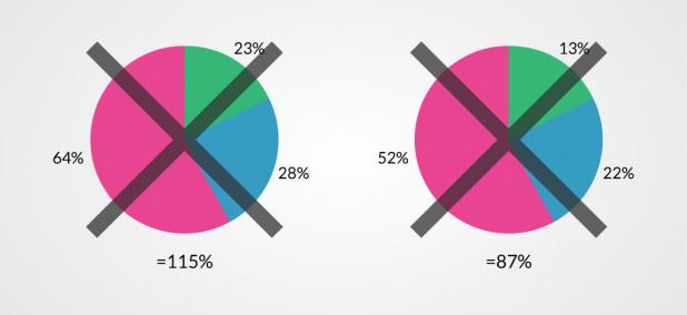
4. Poor Labeling
In standalone charts, axes are almost always labeled, however when designers start making charts for infographics, they often remove the labels. The axes of a chart are really key to understanding what the chart shows. When numerical values or units are missing from a chart axis, the rest of the chart is mostly useless. This also applies to diagrams. Designers sometimes use label lines as decorative elements, and this can lead to some pretty confusing diagrams. 
5. Radial Charts
Cartesian charts are much more in keeping with our mental models and organization of the world. Rectangular shapes the primary form for everything from packaging to architecture. Even our writing happens in Cartesian space. Radial charts look cool, but they make the data much harder to read. Keep your charts rectangular and show that data off. 
6. Poor Color Scales
If your chart uses color scales to help show data, you need to pick those colors very carefully. Rainbow color scales might be colorful and attention grabbing, but they can hide data features and make other features appear where there are none. Red-green color scales are useless for many colorblind males, and there are plenty of other scales that just don’t visualize data well. When you’re creating a color scale, make sure you design it with clear communication in mind. 
7. Overloaded Charts
Charts can be thought of kind of like a display case for data. They can do a good job of showing it off and helping people understand what is there, but they can only hold so much before they become overwhelming. An overstuffed chart makes it easy to miss certain parts of the data, and the details disappear. Keep the amount of data in your charts to reasonable quantities.  Avoiding these charting sins still won’t guarantee you have an excellent infographic or chart, but it does get you much closer. There are other things to watch out for to avoid making bad infographics. We also don’t want to discourage designer creativity, but we do want to make sure the ultimate goal is clear and accurate communication. Drew Skau is Visualization Architect at Visually and a PhD Computer Science Visualization student at UNCC with an undergraduate degree in Architecture. You can follow him on Twitter @SeeingStructure