Big data visualization is a remarkably powerful business capability.
According to IBM, every day, 2.5 quintillion bytes of data are created from social media, sensors, webpages, and all kinds of management systems are using it to control the business processes.
By helping correlations between thousands of variables available in the big data world, technologies could present massive amounts of data in an understanding way, which means Big Data visualization initiatives combine IT and management projects.
In this article, we will address data and how its visual representation should move together to ensure it is effectively employed.
You will see the following topics:
Download this post by entering your email below
What is Big Data visualization?
A defining characteristic of Big Data is volume.
Today’s companies collect and store vast amounts of information that would take years for a human to read and understand.
Visualization resources rely on powerful tools to interpret raw data and process it to generate visual representations that allow humans to take in and understand enormous amounts of data in a few minutes.
Big Data visualization describes data of almost any type — numbers, trigonometric function, linear algebra, geometric, basic, or statistical algorithms — in a visual basis format — coding, reports analytics, graphical interaction — that makes it easy to understand and interpret.
Thus, it goes far beyond typical graphs, bubble plots, histograms, pie, and donut charts to more complex representations like heat maps and box and whisker plots, enabling decision-makers to explore data sets to identify correlations or unexpected patterns.
Why is it important to have a good method of visualization?
The amount of data is growing every year thanks to the Internet and innovations such as operational systems, sensors, and the Internet of Things.
The problem for companies is that data is only useful if valuable insights can be extracted from large amounts of raw data and read by who can analyze them — data literacy in near real-time.
Big Data visualization techniques are important because they:
- Enable decision-makers to understand what the amount of data means very quickly;
- Capture trends — the use of appropriate techniques can make it easy to recognize this information;
- Reveal patterns — identify correlations and unexpected connections that could not be found with specific questions; and
- Provide a highly effective way to communicate any insights that surfaces to others.
What are the types of Big Data visualization?
Big Data visualization provides a relevant suite of techniques for gaining a qualitative understanding.
We described the basic types below.
Charts
Charts use elements to match the values of variables and compare multiple components, showing the relationship between data points.
- Line chart — the comparable elements are lines that could help to analyze peak and fall moments at an axis variant, such as sales volume over a period.
- Pie and donut charts — they are used to compare parts of the whole, such as components of one category. The angle and the arc of each sector correspond to the illustrated value, and the distance from the center evaluates their importance.
- Bar chart — each value is displayed by a bar, either vertical or horizontal. It is not indicated when values are very close to each other.

Plots
Plots help to visualize data sets in 2D or 3D. It can be:
- Scatter (X-Y) plot — shows the mutual variation of two data items (axis X and Y).
- Bubble plot — it has the same scatter plot concept, but the markers are bubbles. The main difference is the bubble size, the third measure that represents another variable.
- Histogram plot — represents the element variable over a specific period.

Maps
Maps make it possible to position data points on different objects and areas, such as layouts, geographical maps, and building projects. They could be heat maps or a dot distribution map.

Big Data also makes companies find new ways of data visualization — semistructured and unstructured data require new visualization techniques. You can try to use some of the ones below to address these challenges.
Kernel density estimation
If we do not have enough knowledge about the amount and the distribution of data, they can be best visualized with this model of Big Data visualization technique that represents the probability distribution function.

Box and whisker plot
It shows the distribution of massive data, often to understand the outliers in the data in a graphical display of five statistics:
- Minimum;
- Lower quartile;
- Median;
- Upper quartile; and
- Maximum.
Extreme values are represented by whiskers that extend out from the edges of the box.

Word clouds
It represents the frequency of a word within a body of the text: the bigger the word, the more relevant it is.

Network diagrams
It makes relationships as nodes and ties to analyze social networks or mapping product sales across geographic areas, for example.

Correlation matrices
They are used to summarizing data, as input and output for advanced analyses that allows quick identification of relationships between variables with fast response times.
![Pooled within-group correlation matrix. Pooled within-group correlation matrix R w.RELIGGRP , computed by weighting the within-group polychoric correlation matrices for the religious group (RELIGGRP), with weights proportional to group size, based on the 1998 ISSP Religion data [50]. https://doi.org/10.1371/journal.pone.0216352.g002](https://s3.amazonaws.com/scribblelive-com-prod/wp-content/uploads/sites/4/2020/07/fykr6_KMsNRTHWI3N9YrvUwWPFRVpQy9WpXyP7bIT0hnHiNjTE0XiidCAkOnpbPTFNIZ0NEfkK2-6Y1EhUlQ_QG1UU7TlAH9Eh8OvdAk92acraXUqt30cO_nX9a5HVfKzBkmJRRl.png)
What are the main tools for Big Data visualization?
Big Data visualization tools need to support multiple and high amounts of data sources and provide instant analysis. Users can better understand information by designs and dashboards to discover correlations, trends, and patterns in data. The main tools to build a decision-making platform are:
- Visual.ly
- Power BI
- Sisense
- Periscope Data
- Zoho Analytics
- IBM Cognos Analytics
- Tableau Desktop
- Qlik solution — QlikSense and QlikView
- Microsoft PowerBI
- Oracle Visual Analyzer
- FineReport.
Visual.ly is a new way to think about content creation and data visualization for your company — capture more relevant information with visuals to deliver better content faster.
By using charts, maps, interactive content, infographics, motion graphics, explaining videos, histograms, scatter plots, regression lines, timelines, treemaps, and word clouds, the Visual.ly platform reaches more details from data to leverage businesses’ results and generate better opportunities for brands.
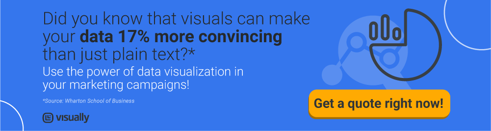
We know the power of Big Data visualization to get insights, communicate information, reach leads, and develop better goods and services.
Get a quote right now for an amazing data visualization solution for your business!
<!–[if lte IE 8]><![endif]–>