
Capturing and retaining the attention of your audience can be quite a challenge in today’s crowded digital landscape. With numerous tactics available, finding the right approach can be tricky.
However, there’s one strategy that, when executed effectively, can yield impressive results: the strategic use of a compelling call-to-action (CTA).
By incorporating a well-crafted one-click CTA, you can streamline the process for viewers to take immediate action.
This approach can significantly enhance your content marketing strategy, driving leads, increasing conversions, and transforming viewers into devoted customers and enthusiastic brand advocates.
Are you eager to delve deeper into this powerful technique?
Download this post by entering your email below
What is a Call-to-Action (CTA)?
A call-to-action (CTA) is a concise prompt on your website, email, or other content that encourages visitors to take a specific action, further engaging with your brand.
To be impactful, a CTA should clearly communicate the benefits or outcomes of taking immediate action.
CTAs can be presented as clickable text, buttons, or images, guiding viewers toward the next desired step.
In essence, CTAs are designed to entice and motivate viewers to act, depending on the goal or purpose of the content.
Some examples of CTAs may include:
- “Start your free trial today”
- “Download your comprehensive guide now”
- “Join our VIP community”
- “Get 50% off your first purchase”
- “Subscribe for exclusive updates”
- “Book your appointment now”
- “Unlock premium content”
- “Claim your limited-time offer”
- “Get a personalized demo”
- “Shop now and save”
Whether you’re looking to increase the number of subscribers to your newsletter or convince your readers to make a purchase, you need the best possible call-to-action to get them there.
Why Should You Use CTAs?
There are several reasons to use CTAs, whether you are a B2C, B2B, or eCommerce business.
One of these reasons is that the use of a strategic CTA will guide your audience along the buyer’s journey, alerting them to what to do next and building trust and authority in your brand along the way.
Without them, your potential customer may be unsure where to go next to continue interacting with your brand, and, as a result, they are more likely to abandon your page or site for lack of direction and look elsewhere, such as to your competitors.
CTAs are an effective way to encourage your audience to continue interacting with your brand, website, or blog.
Place them in various locations, including:
- your website
- landing pages
- social media posts
- email campaigns
- blog posts
Use CTAs as part of your digital marketing strategy to help convert your visitors into qualified leads, or better yet, paying customers.
What is the Impact of a Good (and a Bad) Call-To-Action?
With all the work that goes into creating a digital marketing plan, the last thing you want is for your audience to go elsewhere without taking any action after spending time on your content.
CTAs can motivate your audience to enter into deeper engagement with your brand, such as following you on social media where you can share more content to help move them more quickly along their buyer’s journey.
The impact of a good CTA can also add to your marketing assets by growing your email list, so you have a broader set of leads to nurture and build relationships with.
Ultimately, a good call-to-action can impact your lead generation, improve your conversions, and even increase your sales.
A bad CTA, on the other hand, can drive potential customers away.
An example of a bad CTA resulting in a negative reaction by viewers is making it too salesy, turning them away from your product or service and losing their trust.
Also, if your CTA is too long or generic, viewers may skim right over it without acting.
How Do You Write a Fantastic Call-to-Action?
To benefit from a call-to-action, it needs to be fantastic and irresistible to your targeted audience.
To write one of these, start by determining the goal, or intention, behind each call-to-action. Is it to boost conversions, increase subscriptions, capture emails, or direct viewers to other content on your website?
Next, understand your buyer personas and speak to them where they are on their buyer’s journey. Use different CTAs at different stages, such as:
- “Learn More” with content relating to the Awareness stage.
- “Download the eBook” or “Subscribe” at the Consideration stage.
- Or “Shop Now” for the Decision Stage.
But this should only be the starting point, remember to always contextualize them in a way that they communicate the benefits or outcomes of taking immediate action. Write and design your CTA following these tips:
1. Keep it short
Avoid using sentences, and instead, find a short phrase that gets straight to the point.
All you really need are 2-5 words to say what you need to say in an effective manner.
In some cases, you can go a little longer, using up to 5-7 words. These longer CTAs need to add value, such as “Buy Now and get 30% Off.”
2. Use action words and phrases
Use your CTA to compel viewers to take immediate action using action words or phrases, such as “claim now.”
3. Add a sense of urgency or immediacy
With so much noise online and in everyday life, viewers can easily become distracted.
By including a sense of urgency or immediacy in your CTA, it can move viewers to take action immediately instead of allowing a distraction to move them away from your offer.
An example of words to use includes “limited time offer,” which conveys a sense of urgency to respond right away.
4. Emphasize no-obligation, low risk
Direct your CTA to something of high quality, beneficial to your viewer but also low risk, such as a no-obligation offer.
Avoid any pressure tactics and let your viewer know that by clicking on your CTA, they are not committing to anything just yet.
For example, you can use “Get a No-Obligation Free Trial” to emphasize low risk.
5. Create a design that captures attention
To capture the attention of your viewer, also consider the design of your call-to-action.
Use a different color for the CTA text, or use a brightly colored button to draw the eye. This strategy can also make the CTA easier to find.
Location on a page or email is also key. Your CTA can be a blog post’s closing statement, a side panel button on a webpage, or strategically placed within an email.
The key is to create high visibility, such as surrounding it with white space so it stands out.
As long as you clearly understand your buyer personas and how your product or service can benefit them, you can write fantastic CTAs that bring results.
Call-to-Action Examples and Why They Work
For inspiration, check out how others are successfully using a call-to-action to further their marketing and business goals. Here are examples to get you started.
#1: Dropbox
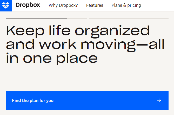
Dropbox provides a “Find the Plan for You” call-to-action on its homepage, which takes visitors through a set of questions to gain insight into what they need, then points them in the right direction.
For viewers who continue down the page without clicking on this CTA, there is another one at the bottom, “Explore Plans,” which allows viewers to see all the actual plans without having to answer questions.
Dropbox is a firm believer in the power of simplicity and white space interspersed with its content and design.
The use of the bright blue CTAs captures a visitor’s attention immediately and stands out from the rest of the text and images on the page.
The Dropbox logo is also the same bright blue as the CTA, and viewers make the connection or association, correctly interpreting the CTA as finding a Dropbox plan specifically.
#2: Evernote
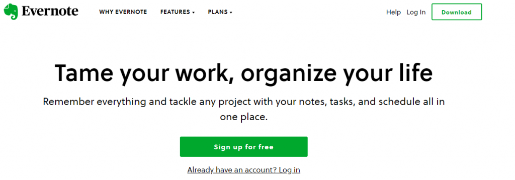
Evernote makes it clear what its message is and how it can help customers, starting with its homepage.
The simple design allows a visitor to identify the value and benefits of the app and quickly notice the CTA to “Sign up for Free.”
The green of the CTA button coincides with the green of the Evernote logo, making both stand out from the white page design.
#3: Stitch Fix
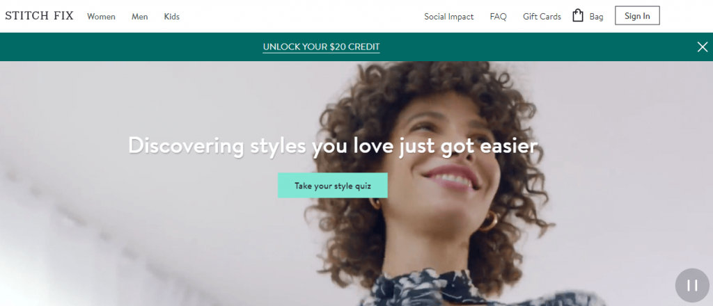
As the video loops in the background of the homepage, Stitch Fix’s CTA invites viewers to “Take Your Style Quiz.”
The quiz itself is a hyper-personalization strategy, serving as a way to cater to what the viewer sees in terms of styles and looks.
Such interactive content captures attention and draws an audience in, making it a more personal experience, which is what consumers often prefer today.
Stitch Fix also uses various CTAs throughout its website to further entice viewers to take immediate action, such as “Save 25%” and “Free shipping.”
#4: Patagonia
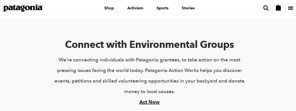
The outdoor apparel store, Patagonia, doesn’t waste visitors’ time by making them search for what they are looking for.
Instead, the site guides them to the categories they focus on, including shop, activism, sports, and stories, streamlining shoppers in one direction or another based on their desires.
As a result, these four pages include their own unique CTAs.
For example, on the Activism page, Patagonia highlights its own efforts to protect the environment and prompts visitors to “Act Now” as a CTA, inspiring them to get involved.
#5: Slack
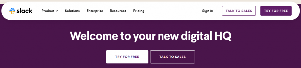
The Slack website is well-organized, showcasing the skill it wants customers to achieve by using its platform.
Visitors can choose between the two CTAs, “Try for Free” and “Talk to Sales,” which are located at the bottom of the homepage.
These CTAs are geared toward different audiences. The Talk to Sales CTA is for visitors who already know what they are looking for and are now in the decision stage of their buyer’s journey.
Slack understands its audiences, so it also offers a no-obligation “Try for Free” CTA for those currently in the awareness or consideration stages of the buyer’s journey.
#6: EPIC Games

EPIC Games introduces you to their work and animations immediately upon arriving at the website.
As these animations rotate, a different CTA stands out, grabbing the attention of viewers and inviting interaction.
CTAs include “Learn More”, “Pre-Purchase Now”, “Explore Now”, and “Play for Free”, all geared to their particular audience.
#7: charity: water
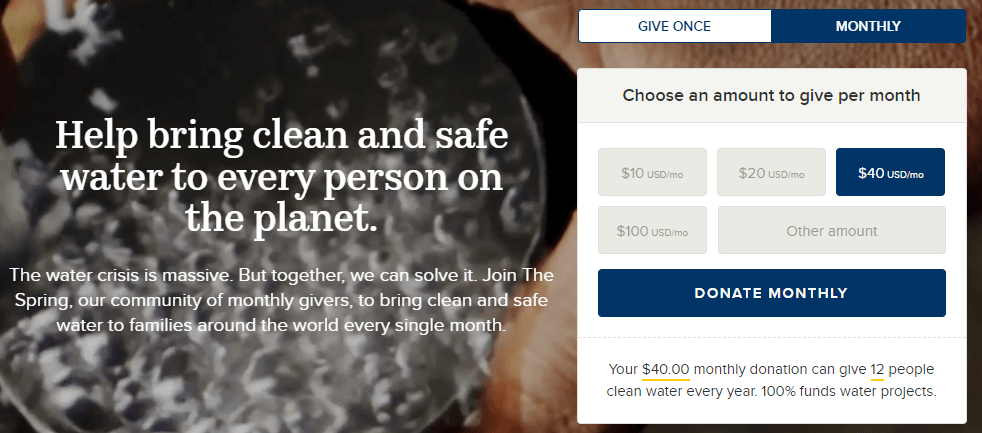
The main goal of charity: water is to raise donations to bring clean water to everyone on the planet.
They also understand, however, that not everyone prefers to donate in the same way. This is shown by providing the different CTAs of “Donate Monthly” and “Give Once.”
In addition, charity: water goes a step further by highlighting a specific amount ($40), which may sway viewers to donate this particular amount versus a smaller one.
Yet, the uniform sizes of these CTA buttons show that all donations are important and all are acceptable.
Other important CTAs on the site include the options to give via credit cards or through PayPal, providing additional convenience for donors.
The reason this all works is because charity: water gives people options and also understands who their potential donors are and what it takes to move them toward taking action (making a donation).
Wrap Up: Add a CTA and Keep Visitors Engaged with Your Brand Longer
While digital marketing strategies continue to evolve, the ultimate goal always is to drive your targeted audience to take a desired action and engage with your brand longer.
To make this happen, you’ll need to create dynamic calls-to-action and position them to stand out and get noticed by your viewers.
Effective CTAs can make a valuable impact on your ability to gain leads, boost conversions, and increase sales.
Use them to guide your targeted audiences along the buyer’s journey and meet their needs at every stage.
However, it’s important to remember that CTAs alone cannot work miracles if your content isn’t of high quality. Fortunately, with WriterAccess, you can rely on exceptional content that complements your CTAs effectively.
WriterAccess is the ideal platform to help you streamline your content production, combining the efficiency of AI-powered tools with the creativity of human writers.
Why not give it a try today? Enjoy 14 days of free access to our network of expert writers and discover what great content can do for your business!

![[ROCK NA] [EBOOK SEO] Complete Guide](https://rockcontent.com/wp-content/uploads/2024/06/banner_Search-Engine-Optimization.png)