Last week, Visual.ly published a blog post by Drew Skau, containing a Code of Ethics for data visualization, and ending with this succinct “Hippocratic oath” for data visualization professionals, which deserves to be explored further: I shall not use visualization to intentionally hide or confuse the truth which it is intended to portray. I will respect the great power visualization has in garnering wisdom and misleading the uninformed. I accept this responsibility willfully and without reservation, and promise to defend this oath against all enemies, both domestic and foreign. It is doubtful many people use visualization to intentionally mislead, but there are countless examples of visualizations and information design going wrong, anyway. This oath seems to carry the underlying message that one must create visualizations that not only use accurate data and avoid 3D pie charts, but are purposefully designed to tell a clear story and convey information effectively. In other words, any old graph will not do — every dataset deserves its own canvas. The easiest way to explain this is to look at a well-made visualization and describe why it is effective. Obviously, no viz is perfect, so take this as a “let’s point out what works and what doesn’t” discussion, rather than a dissection of the viz archetype. This one was originally published on Geekwire and shows the (rather disappointing) collective performance of last year’s tech IPOs.
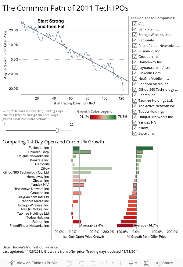
The visualization tells a story: 2011 tech IPOs are tanking. The moment anyone looks at it, the story is clear, and there are a couple of reasons for that. • There is a clear title; • The annotation clearly tells the story “Start Strong and Then Fall”; • You can see the story played out in the line chart itself; • To confirm the finding, you can examine the individual results for each company right underneath the line chart; • The color legend is clear and also displayed (a common problem with many graphics). This piece is particularly interesting because it tells a very simple story, yet the data itself is complex. Imagine the myriad ways that one could show the aggregated percent change for twenty different companies. The author of this visualization experimented with different views and arrived on the two that told the story most completely, most effortlessly. And they did not stop at just completing the visualization. They labeled the interactivity “Include These Companies:” and explained the complex pieces in the visualization (the slider that filters companies based on trading days). Perhaps most importantly, they told us how they got the data and when they last updated it, so should we want to, we can go check it for ourselves. Great visualization is not simply a chart that shows the data; it is a chart that tells an accurate and interesting story. Creating great visualizations is not easy, but by examining well-made examples, it becomes a little easier. If you would like to learn more, Tableau has compiled a series of videos on the Tableau Public site that go into significantly more detail. Ross Perez is a data analyst at Tableau Software. You can connect with him on Twitter.