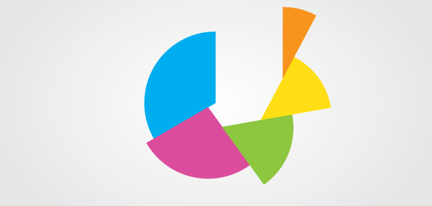
Last week, we showed you some of the ways designers get creative – perhaps too creative – with bar charts. Another visualization element that is often customized to match a look and feel of a graphic is the pie chart. Radial charts are already on the fringe of effective data visualization when compared to cartesian charts, but there are cases where they can still be used beneficially. Unfortunately, designers often add their own twists that damage the effectiveness of pie charts. Let’s take a look at nine of the tweaks that designers make to pie charts, and dissect if and how they are harming the communication of the data.
- Donut Charts are the most common tweak done to pie charts. The center of the circle is a powerful location, and having it available to place a statistic or icon can really make that element stand out. This does produce some problems however. The center of the pie is where the angle is most easily read, so removing it makes reading the data in the chart significantly more difficult. That said, the center space is very powerful, so it can still be an appropriate technique to use in some instances.
- Thin Donut Charts are a slightly different version of donut charts. In a normal donut chart, there is still a significant amount of area that can be read to help represent the data. This means that the data is encoded using area and arc-length. When the donuts get too thin, area stops being a legible encoding, and arc-length is the only thing left encoding the data. Limiting the chart to one visual encoding significantly reduces its effectiveness at communication.
- Call-Out Wedges are an effect designers use to pull your attention to a certain segment of a pie chart. When done on a normal pie chart, this can be a reasonably effective method, but done on donut charts it is definitely harmful.
- Exploding Pie Charts are used to add a little pop to a chart, and make it seem more active. The perceived graphic benefits are probably not enough to make the readability sacrifice worth it, though.
- Spiral Pie Charts are an extreme version of exploding pie charts. They are used to add dynamism to a chart, however they utterly destroy the legibility of the chart. This technique should definitely be avoided.
- Coxcomb Pie Charts have another data dimension added to the radius of the wedges. Similar to Coxcomb Diagrams attributed to Florence Nightingale, they destroy the area dimension. They are certainly not recommended for communicating data, however they do look cool.
- Proportional Area Pie Charts are a good technique for comparing two different wholes that each have part to whole relationships. The charts essentially become small multiples, and can be very effective.
- Icon Pie Charts (Piecons) are typically not a good technique. They merge the pie chart concept with an icon shape. The problem is they take away arc length and area as data encodings, and leave only angle. Combine that with oddly shaped icons that can change our perception of angle, and you get mostly useless charts.
- 3D Pie Charts are undeniably bad. This technique has absolutely no data legibly encoded, and is data art at best. (Data art can be beautiful, it just doesn’t always communicate data.) If your goals are communicating effectively, 3D pie charts shouldn’t be something you even consider.
Pie charts can be effective ways to show data with a part to whole relationship, and some of these effects can help to increase the visual interest people have in the chart. Use them wisely, and carefully balance effective communication against the modifications. Drew Skau is Visualization Architect at Visual.ly and a PhD Computer Science Visualization student at UNCC with an undergraduate degree in Architecture. You can follow him on twitter @SeeingStructure


