Creating a great visualization is not as hard as it seems. Provided you have some interesting data and an effective tool with which to visualize it, a little bit of thoughtful design will lead to a decent result. That said, there are some mistakes that are very easy to make, but can ruin even a thoughtfully-made piece. Here are four data visualization mistakes you should avoid.
1. Serving the Presentation Without the Data
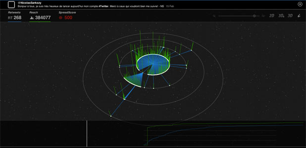
Which comes first: the presentation or the data? Oftentimes, in an effort to make a visualization more “interesting” or “cool”, designers will allow the presentation layer of a visualization to become more important than the data itself. The visualization captured below is an unfortunate casualty. A considerable amount of work went into it and there are parts that are informative, like the summary counters at the top left. However, without a scale or axis, the time series on the bottom right is meaningless and the 3D chart in the center is even more opaque. Tooltips (pop ups) would help, if they were there. Instead, this looks amazing, but does little. 
2. Showing Too Much Detail
We all know the feeling of finding a dataset that is rich and easy to visualize, with numerous usable categorical and numerical fields. The temptation is to show everything at once, and allow users to drill down to the finest level of detail. Often, that actually makes a visualization superfluous because the user could simply look at the dataset itself if they wanted to see the finest level of detail. The trick, then, is to show enough detail to tell a story, but not so much that that story is convoluted and hidden. More data can be revealed as the reader progresses through the story. This visualization could have been great but there is so much detail it is hard to garner much information from it.
(source)
3. Not Explaining the Interactivity
Enabling users to use and interact with a visualization makes it more engaging and engrossing. However, without telling them how to use that interactivity you risk limiting them to the initial view. How you label the interactivity is just as important as doing it in the first place. Usually, informing the user at the top of the visualization (or the part they will see first) is good practice, as is calling out the interaction on or near the tools that utilize it. This visualization is actually very interesting, but without labeling the interactivity, it is easy to overlook the fact that you can click the words at the bottom of the screen to change the view. Even using a common design concept such as underlining the words to associate a hyperlink, would have been helpful. (source)
4. Failing to Experiment
Often, your first idea is not the best idea. It is easy to get excited about a visualization and then stick to the first vision that came to your mind when you saw the data. However, it is always best to start a visualization with a blank slate of ideas. Then shift perspectives: try ten or twenty different configurations and types of chart before you settle on one. The best part about experimentation is that it often forces new findings out of the data. This chart is not ineffective, but it would be much better if it used bar or even area charts to display its information. It is actually difficult to compare the magnitude of the different parts of the “blob” with this type of view. 


