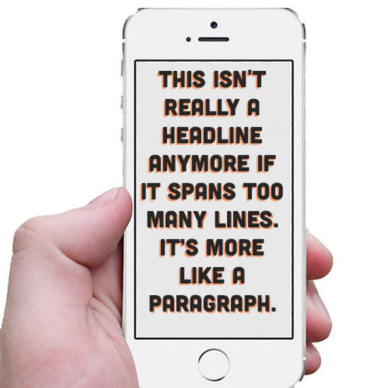
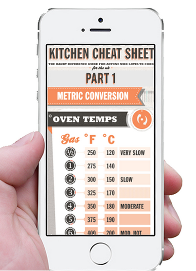
Infographics have long been a content marketers staple, but let’s face it, any content that requires viewers to pinch, zoom, and pan is going to turn people off. We simply cannot abandon mobile users if we want our content to have a maximum impact so that means we need to create or retro-fit infographics for a mobile audience. This is a great infographic by Shelli Walsh, one of our certified designers. Unfortunately, and like most infographics, it doesn’t work well on mobile. 
Can we have our cake and eat it too?
Ideally we could create infographics that work well on both our 24” monitors and our 4” phones but since the content inside an image is not responsive, that is not an option. A mobile optimized infographic needs to be a separate image, fortunately we do not have to double our efforts to create it.
The Content
Infographics are great at telling stories, as their visuals and text can connect to guide the viewer through the graphic. They can tell complex or emotional stories. But mobile isn’t the place for longer form storytelling when viewers are looking for a quick distraction or your content has to compete with endless notifications. If your main infographic is a series of five major points, you have two options. You can redo the infographic as essentially headlines of the major points with supporting graphics and leave out all the blurbs, callouts, and supporting text paragraphs. Re-use the graphic assets but only where necessary. This will give the user the gist of the story but without the depth, but this is ok. 
The Format
Most blog format infographics come in under 800px in width. This is because if they are any larger, they run the risk of being shrunken by most publishing platforms. If you have ever viewed an infographic on your phone, you know it’s already a miserable experience, with the graphic being shrunken well beyond illegibility. And nobody wants to ‘navigate’ image based content. So for the best results, keep the pixel width below 640px when designing the infographic. Given an endless array of display sizes and pixel densities, there will never be an image that is optimized for everything, so just give up on that. The best way to see if something works is to judge for yourself. As with other forms of web or application design, there’s no substitute for extensive testing. Bring up the image on your phone, and your friends phone. Is it legible? Is the phone resizing it to an unacceptable level?
The Design
If you thought blog format infographics were restrictive then mobile will really force you to focus. In blog format, you could get away with several items on the same line, but not with mobile. The design for mobile should really focus on one item at a time. Timelines or processes that went left to right need to be recreated to go top to bottom. 
The Call to Action
If the goal is brand awareness, that can be achieved on mobile, but if you want the viewer to do anything more complicated like buy something, sign up for an newletter etc, it’s best to link the viewer back to the main infographic. Something like “See the full infographic at company.com/infographic” will help guide the viewer. Sure you are linking back to a graphic that isn’t suited for mobile, but mobile users are quite accustomed to saving content that isn’t optimized for mobile for later by bookmarking or using Evernote, Instapaper, Pocket or other services. The full infographic will allow you to be more persuasive and provide more motivation for the calls to action that require more of the users time and attention. Let’s not forget the share buttons! Sharing on mobile is second nature to many users and since they will have just found some awesome content that looks awesome on their phone they may be more inclined to share.
The Edge
Optimizing infographics for mobile is currently a very new technique. Do I have any data that this will increase your ROI over the long term? Nope. But in my experience, the biggest ROI gains in content marketing only show themselves when you take the needed risks to get out there early. The edge of the established marketing cliff can be scary at times, but it’s where you get the best view of what’s coming in. 


