As the 2012 US Presidential election heats up, the array of maps for analyzing likely outcomes is increasing. Different data, different interactivity, and different visualizations all give each map a slightly different angle. Here are eight different interactive election maps, and a little about what they did wrong and what they did right. Before we jump into each map, though, a refresher on the electoral college might be helpful. Rather than a direct election scheme using pure popular vote, the electoral college system uses electors designated to each state who cast the official votes for president (270 electoral votes to win). These electors pledge to vote for specific candidates, however they are not legally bound to vote the way they pledge. For 48 states, the electors are an “all or nothing” arrangement. So if the popular vote for the state swings one way, all electors vote that direction. For Maine and Nebraska, however, two votes go to the popular vote winner, and the remaining votes are designated to the popular vote winner in each congressional district in the state. In the 2008 election, this meant that Nebraska’s electoral vote was split for the very first time. One common theme in these maps is “swing states” or states where the popular vote is very close. These states are where the uncertainty in the election comes from. Polls ahead of time often show them as coming down on one side or another, and until the final result is in, it is difficult to tell which side they fall on. Now that we’ve had a refresher on the awkwardly convoluted electoral college voting system, let’s jump into the maps. 1. Let’s start with the BBC’s map. It seems that being based outside the US means that the BBC’s target audience does different types of analysis. Their approach isn’t very good for comparing republican voting states to democratic voting states. They separate republican, democratic, and swing states into separate maps that cannot be viewed simultaneously. They also use separate donut charts to show the percentage of the electoral college for each group. It is good at showing the landscape and system to people unfamiliar with American politics because it separates the components. That way, someone new to it all can see individual parts instead of one jumbled, overwhelming mess.

2. Politico’s map really emphasizes the swing states. The other states are lightly colored so that the swing states are pulled to the forefront. In the default view, the interaction is only hovering for highlight, however in the “Predict Your Own Results” view, you can select who you think will win each state and see the outcome on the map and in the electoral vote bar at the bottom. This gives the piece a slant towards doing your own analysis and then sharing it with others online.

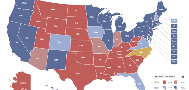
3. 270 To Win is a website dedicated just to an electoral college map. The map uses the same sharing strategy that Politico’s map uses, although the initial poll information and interaction is different. The interaction lets you change the outcome in any state, not just swing states. The map also allows you to take advantage of Maine and Nebraska’s potential for splitting their vote. One interesting change is the bars showing the total of the electoral votes. Instead of a single bar, they use two bars letting you easily see who is in the lead, but sacrificing the part to whole relationship shown in the traditional opposing sides single bar approach.

4. The sharing strategy seems to be popular, because Vote Night uses the same scheme. They also have the additional angle of encouraging people to vote. A big countdown clock at the top ticks towards voting day, reminding you to set the date on your calendar. The map itself uses Google Maps, providing a bit more detail than is really necessary for this style of map. They provide a dropdown menu with historical voting records to load up the map up. They do not provide the ability to split Maine and Nebraska’s votes.

5. The CNN electoral map is very similar to 270 To Win’s and Vote Night’s, but much better executed. The key differences, other than execution, are the traditional electoral vote bar, and the addition of the ability to pre-load results from past years and other analysts. CNN has also included the ability to split Maine and Nebraska.

6. The Washington Post’s map is meant for doing more in depth analysis and lots of exploring. This is a great angle for them to take, because it lets people do some armchair analysis without ever digging into data themselves. Their map allows you to filter states by extra categories, and spot patterns that exist. For example, gay marriage is mostly banned in republican states, while democratic states have a mix of various other rules about it. They also let you drill down for details, all the way to the county level. The Washington Post has definitely done some major number crunching to put this together, and it is a very solid result.

7. The Huffington Post has taken a different approach altogether. They have incorporated the most up to date data possible, and pull from almost every poll that is relevant. All of this data goes into an algorithm and makes predictions about each state. This results in a map that is dynamically changing, and that should get increasingly more accurate as the election approaches. They also have provided a cartogram to help avoid the disproportionate area effect of choropleth maps. For example, Wyoming takes up a huge area on the map, but only has three electoral votes. The cartogram fixes this by sizing each state’s bubble relative to the number of electoral votes it has.

8. The New York Times has a reputation for being great at data visualization, and great at storytelling, and these definitely come through in their map. Their page uses a multi-step approach to move through different scenarios and show what the results of the election would be for each. To start with, they show two maps, a choropleth, and a cartogram, with an emphasis on the cartogram to avoid the area issues in the choropleth. Stepping through the scenarios takes you to an interface where you can pull states into different slots and see the effect on the electoral vote totals. Each step has different scenarios based on historical events or interesting outcomes. The great thing about this interface is that the colors do not change, only the spatial position of the state bubbles. This approach makes it easy to pull swing states back and forth without losing track of them.  All of these maps use categories to represent the popular vote outcomes. Some of them break the outcomes into five categories (solid dem, swing dem, swing, swing rep, solid rep), some into three (dem, swing, rep), but they all use categories instead of a continuous scale. This is a good thing, because the amount of information loss caused by going from continuous to categorical is an appropriate way to account for the uncertainty of the data coming from preliminary polls. One thing that none of them seem to do well enough (except the Huffington Post) is indicate what polls they are using for their decisions, and how they dissect those polls into the maps. Accurate sourcing is just as important in these maps as in any, and it is disappointing that reputable publications are not doing a better job of it. And just for fun, here’s a cartoonized visualization of the projected electoral college by The Guardian.

Drew Skau is Visualization Architect at Visual.ly, and a registered to vote PhD Computer Science Visualization student at UNCC with an undergraduate degree in Architecture. You can follow him on twitter @SeeingStructure