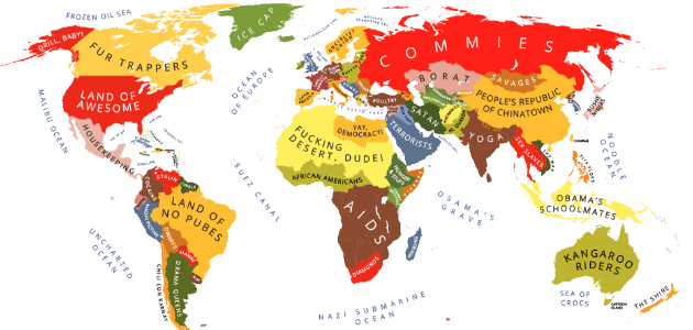
You may have seen this image appear in your Pinterest, Facebook, Twitter or other social media streams — or similar ones, mapping Europe, Northern America and the World in a funny, uncensored manner.

They’re all part of a popular series of maps designed by Yanko Tsvetkov, a freelance graphic designer who was born in Bulgaria, lives in Spain, writes in English and goes by the moniker Alpha Designer, chosen because “it makes people think what I do is really important.” And so it is. Maps are among the most common visualizations we use in real life, yet how often do they make us laugh, rather than simply inform? Poke fun at social and national stereotypes rather than display national borders?
Download this post by entering your email below
Call it Satirical Visualization
Tsvetkov designed the first map, Europe in January, back in 2009, inspired by the genuine concern of friends who had heard of the natural gas crisis that dominated the news for a while that winter — caused by a pricing dispute between Russia and Ukraine — but didn’t quite understand what it was and what it meant for the rest of Europe. See how long and boring that paragraph was to read? Likewise, Tsvetkov knew that a regular explanation of regional politics and historical references would make for a conversation doomed to blank stares and empty nods, at best. So he sat down and, without much thought about process, tools and documentation, whipped up a map and uploaded it to Flickr.

“I had no idea it would become something significant, so there weren’t any sketches, drafts or notes,” he told Visually. “I just got the idea, opened Adobe Illustrator and I typed in the labels on my template. … If I had the slightest idea about what was coming, I would have spent much more time on it to make sure I have a story to tell. I envy illustrators who are capable to plan their projects in such a way but I am messy by nature and my workflow isn’t pretty.” He might just be too humble (by one stereotype, just so you know, Bulgarians are notoriously lacking in self-promotion skills). Soon, he was making more maps, and they went viral. Really, how wouldn’t they? They were politically incorrect; downright offensive, and irreverently hilarious. Some, perhaps more than others:

An Atlas of Prejudice
The entire map collection unsurprisingly found itself on the book market, first published in Germany and, recently, in the United States as well. Atlas of Prejudice is available in English, German and Russian, and sequel is on the way. The maps are grouped into categories, each prefaced by an entertaining essay or story by the author. A quick peek: We asked Tsvetkov some questions about the book, his inspiration, process and plans for the future, among other things. Here’s what he told us: Visually: Where do you find inspiration for what type of map to make next? Yanko Tsvetkov: Everywhere. News, books, media reports… National stereotypes surround us all, especially those of us who live abroad. There’s not a day in which I am not reminded about them. I live in Spain, my partner is Venezuelan. In a 100-meter radius around our house we have Argentinian, Bolivian, Pakistani and Chinese stores. On Sundays the only ones who work are the Chinese. On a major religious holiday everything is closed, except the Pakistani. We have a saying here: “Thank God for Islam or we would be starving!” You always end up joking because you see so many different lifestyles. It opens you up. When working on or thinking about a map, do you do any research? What is that like? It depends on the country. If it’s a big one like Britain, I rarely have to do any specific research because I have so many personal impressions. As countries get smaller, I have to look here and there. But I try to be sneaky and I avoid asking people directly what they think about a particular country. If I can’t observe people, I do a little bit of historical research. History is an extremely reliable source for excavating national stereotypes. Then come literature, cinema, and all the other arts that deal with storytelling. The hard phase comes after I collect all that information because I have to think about a joke that would describe the things I have encountered. How do you select your color palates? (For example: in Europe According to Great Britain, “Evil Federated Empire of Europe” is pink. Is that irony, or did you just wake up one day and think, “I’ll just make that part pink”?) Oh that sounds great, I wish I could say it’s true! Pink is actually the traditional color of Imperial Britain on most maps from the colonial period. I have no idea who picked it initially but I’ve heard that at that time pink had a very different symbolism than the one we have accepted today. I often try to use colors which are associated to a specific country. For example, on most maps I have seen in my life France is purple or blue, and Germany is brown. But I don’t stick to it as a rule. Russia is traditionally green but in my case is blue. Sometimes, it’s just about what seems “right” at the moment. What is the funniest (or most memorable) piece of hate mail you’ve ever received? Ah, most of it is bland and becomes funny only when it’s juxtaposed with others. There’s the usual “stop singling out my country, you fucking idiot,” in which the name of the country varies depending on the sender. Then there are those who begin with “You stupid American!” According to others I am a Russian who rarely showers. I’m a lot of things to a lot of people, just like Jesus. Do you ever incorporate feedback (or ideas/ inspiration) into future maps? Yes. Obviously I can’t edit maps once they are published but if someone I trust points out a problem and I encounter something similar in a new map, I usually take it into account. What map are you planning on next? There are lot of new maps coming because I am working on the second book from the Atlas of Prejudice series. It will appear in Germany in February 2014 with the help of my fantastic publisher, Knesebeck Verlag. I will expand the European collection with new maps. For example, according to the Netherlands and Serbia. I will also try some new ideas about culinary prejudices and social networks. And last but not least there is a map of the world according to my grandmother. What are you working on now? I’m trying to steal some time for my other projects. I have been working on a deck of cards called Mythos in the last 2 years. Unfortunately, the book often consumes all my energy. Apart from the German and the English version, there’s one in Russian that just came out and I am planning a Spanish and a Bulgarian one. I hope after that I will be able to focus on other things. I would love to write and illustrate a children’s book one day. Atlas of Prejudice: Mapping Stereotypes (Volume 1) is available on Amazon.com. Paperback: 74 pages Publisher: CreateSpace Independent Publishing Platform; 1 edition (August 11, 2013) Language: English ISBN-10: 1491297107 ISBN-13: 978-1491297100 Aleks Todorova is the Editorial Director at Visual.ly. She, too, was born and raised in Bulgaria, and can confirm firsthand encountering the “Dracula” stereotype here, on U.S. soil. Follow her on Twitter.


