Anyone who manages websites and blogs needs to have more information about how their audience consumes the content on those pages.
To better understand the interest in navigation, a heat map is a valuable tool for proposing improvements. This technology helps to understand which sections, links and headers the user has clicked and selected the most times.
This perception helps you understand the interest of those who visit your website, which is an important basis for making strategic improvements.
If there is greater public interest in certain areas, just analyze them to understand how it is possible to drive better results.
In this content we will talk more about heat maps on the following topics:
Continue reading and learn all about it!
What is a heat map?
A heat map is a graphical representation that shows at which points of a website, or blog, there was more activity by the user. This results from greater interactions with the cursor, also considering clicks and page scrolling.
Heat technology can be seen in several areas, even in sports, showing how an athlete moves on a football field, for example. In practice, considering a website, the concept is basically the same: the heat map shows which parts of the pages the visitor usually devotes more attention and time to.
In this case, the heat map related to the sites will show that users, for example, clicked on certain sections, links and banners. This technology will also show, in a text, which parts of it the visitor has spent the most time on, which is interesting to assess, for example, if there are any videos in the content.
Heat indicators
Indications of greater or lesser presence in certain areas of the heat map are made by colors. The most reddish areas are those that point to the highest navigation intensity, clicks, or length of stay at that point.
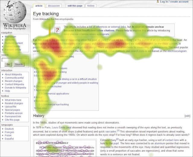
The bluish areas, on the other hand, represent less activity, with intermediate tones between red and blue. It is like a color scale, but in this case, the heat is always represented by warm colors where there is a greater presence. The cool colors, of course, show the parts where the user spent less time.
The heat map has as an objective to develop reports with these indications about visitor navigation. In this case, there is an important detail that helps to identify the user’s activities. There are three categories of interaction that can be detected.
Click maps
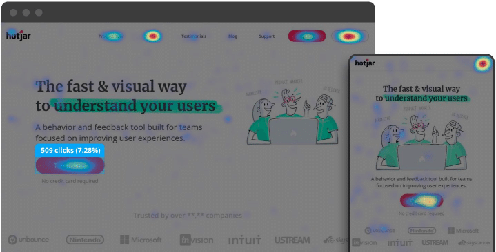
Click maps are heat indicators that show which areas of your site a user clicks on most. Those can be CTAs, banners, links, icons or section indicators. The perception becomes more objective and it becomes possible to analyze more deeply the interest of your audience in these areas of your site.
Scroll maps
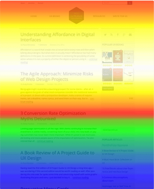
In this case, it shows page scrolling activity. The idea is to indicate to what point on the page the user is reading the content, that is, how far they will go. It is a good indicator, for example, to realize if the size of your posts is ideal, in a Content Marketing strategy.
Hover maps
The hover map requires in-depth analysis. It only shows the movement of the user’s cursor as he navigates the site. It is essential to understand, according to each report, if the visitor actually consumed the content and the cursor was an indicator, or if they left the mouse still during the activity.
What is the role of a heat map in a marketing strategy?
The heat map can be a great ally in the strategy of a marketing team with the proposal to optimize websites and blogs. This is a constant and of great value work since it involves two environments in which, besides capturing new leads, allows you to maintain the relationship with the public and generate conversions.
Therefore, a heat map has very specific functions when used as an assessment tool.
Basically, what can be achieved is divided into two fronts: the first is the possibility of analyzing the user’s behavior on the site. The other is to understand which parts of the website can be optimized for a better navigation experience.
Below, you will learn more about each of these two roles and how they provide significant improvements to your strategy!
Analyze user behavior
When designing a website, the user is the real starting point. Everything that is projected on that page is thought about how the visitor will interact, either with links or with content from each section.
Because of this, it is essential to work focused on continuity to understand how the visitor interacts with what is proposed by those who plan the site.
A well-made strategy is developed from analyzing public behavior, something that can be done with the support of a heat map.
The report, especially with its levels of detail, helps to better understand user behavior, always linking the maps to other metrics, such as bounce rate, for example.
Identify areas for improvement on the site
While heat points show where the user interacts the most, it automatically makes it clear which points are being rejected. This is a precise and objective way of concluding at which points there is a need for strategic improvements. For that, it is also necessary to make an analysis associated with other metrics.
For example, a CTA that doesn’t receive clicks needs to be reevaluated: is the button flashy? Is the text interesting? Does the offer make sense to the public?
These are some questions that need to be asked considering these findings. Detecting points of low interest is an excellent opportunity to propose optimizations and then improve future results.
How important is it to map the navigation of a website or blog?
When you map a website, there are more chances to perform strategic improvements in it, which will generate greater interaction with those who visit it. The detailed and complete data on all pages and their points is a rich and valuable resource for optimizations.
Learn how important it is to work with a heat map!
Generate more conversion points
Conversions are critical to a marketing strategy, regardless of the level at which they are in the sales funnel. A simple newsletter subscription, for example, is important. However, to achieve this, the CTA needs to be well-positioned within the site.
The heat map helps to understand the user’s navigation and preferences. From this, conversion points can be positioned more strikingly, meeting the habits of visitors.
Optimize content
Optimized content is can be more interesting to the reader. Scroll maps, for example, provide support for observing navigation, always with indications related to staying in different areas of a website.
When optimizing content, there is a text organization, for example, with strategic divisions of paragraphs. With good readability parameters, always keeping an eye on the heat map, it is possible to create content with a greater chance of being read until the end, delivering the CTA next.
Reduce the bounce rate
The bounce rate is one of the metrics that most affect a strategy aimed at websites and blogs. There are many reasons for the user to leave a page, so the most important thing is to understand each one. The heat map helps to understand when these people leave the site.
From this, it is possible to link these indications of the heat map with concrete motivations. Simply observe what contents are related to the activities on the map. The changes need to be strategic to generate greater permanence, something that impacts even your SEO.
How is a heat map created?
The heat map is made by automated work, always with the support of a tool. Some softwares monitor the activities of each visitor to the site, generating reports with checks in different periods, according to what is desired.
All activities are tracked to create maps. They are built with the average of navigation, considering all the visits in that determined period. Thus, the heat map results from automated work that checks every volume of visitors.
What are the 3 main heat map tools?
There are good options for heat map tools available, always with different and more in-depth features to help with your analysis. Among the main ones at the moment, there are 3 that stand out for delivering good features and simple operation. Here they are:
1. Mouseflow
Full coverage of activities and fully customizable time intervals. Mouseflow makes it possible to schedule A/B tests and also tracks all movement in the transition from one page to another.
2. Hotjar
One of the most used heat map tools worldwide, Hotjar allows, in addition to the basic functions, to request feedback from the site visitor. These are more direct questions, which help to understand behaviors that are unusual in a user.
3. ClickTale
ClickTale‘s proposal is to make large heat maps, with complete and detailed information for those who have a really large volume of visits and need an in-depth solution. It is most recommended for large sites, with 500 thousand visits per month.
A heat map is a modern, effective proposal that makes all the difference in a good marketing strategy for businesses at all levels. Optimizing websites and blogs is a primary and fundamental job to generate more permanence and, consequently, conversions.
To continue learning more, check out our complete guide about SEO to get to the first page on Google!

![[ROCK NA] [EBOOK SEO] Complete Guide](https://rockcontent.com/wp-content/uploads/2024/06/banner_Search-Engine-Optimization.png)