Infographics can contain a wealth of useful, interesting, and captivating information, but only if readers take the time to survey the entire graphic. It’s no secret that the typical Internet user quickly bounces from site to site while shuffling among multiple tabs and windows. With the added distraction from smartphones, TV, and print media, time spent on the Internet is valuable – especially for marketers and advertisers, who covet each and every second a user’s eyeballs are glued to the screen. In order to better understand how Internet users view and understand infographics, Visually teamed up with Dr. Ruth Rosenholtz, the Principal Research Scientist at the Department of Brain and Cognitive Sciences at MIT. Rosenholtz, who holds a Ph.D. in Electrical Engineering and Computer Science, leads a research team that studies human vision, including visual search, peripheral vision, perceptual organization, and the impact of visual clutter on task performance. Rosenholtz and her team developed a process that reveals how the human brain uses peripheral vision to view images. Rosenholtz created a computer program that takes an image and returns an alternate version called a “mongrel.” The mongrel shows how the brain interprets an image when centered on a particular point of fixation. Gmail browser page pre-analysis. Rosenholtz ran a mongrel analysis to learn if users can seee who signed on to chat as they compose a new email.Gmail browser page mongrel. Assuming the new email tab to the right as the point of fixation, the mongrel analysis shows that users cannot see who is signed into chat using just peripheral vision. “We became interested in studying peripheral vision because people in the field were saying that peripheral vision was doing this seemingly bizarre thing, of representing everything as texture, Rosenholtz told Visual.ly. “Texture is something we had studied. Some of the best progress in texture perception in the last 40 years has come from synthesizing textures, which are “the same” according to the model. So making mongrels to visualize the information available in the periphery was a natural step. Our work shows the extent to which one can extrapolate an understanding of human vision in the lab to and understanding of complex graphics.” Understanding mongrels is incredibly useful for the designers and illustrators who create infographics. The mongrel, which is based on how the brain deciphers complex visual information, can help designers understand the scientific basis behind infographic best practices. We gave Rosenholtz three infographics to run through the mongrel analysis. Rosenholtz and Lavanya Sharan, a post-doctoral researcher at MIT, provided feedback about the mongrel of each infographic and what can be learned from the mongrel. These examples represent bad, mediocre, and good infographic design.
Bad: Autumn – Heavenly Desserts
Autumn – Heavenly Desserts pre-analysisAutumn – Heavenly Desserts mongrel “When looking at the maple leaf in the center, several elements of the design layout are fairly well preserved. The brown rounded rectangles separating each recipe, the green text (not that the text is readable, but you can tell it is there), the orange rectangles, and the locations of the recipe pictures. However, the details of recipe pictures and the graphic embellishments (e.g., maple leaves, cakes) are not comprehensible in the periphery. We have learned that regular, uniformly-colored boxes such as the brown recipe boxes and the orange nutritional content boxes anchor the design, but irregularly arranged decorative elements such as the maple leaves do not add anything to the design when viewed peripherally.”
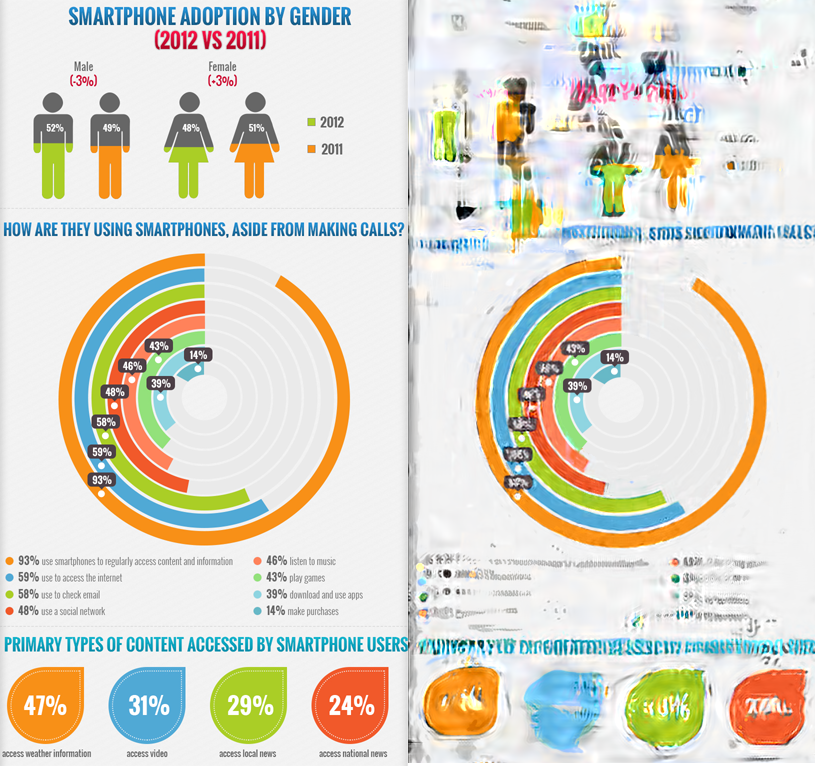
Mediocre: Portrait of Today’s Smartphone User
Portrait of Today’s Smartphone User pre-analysisPortrait of Today’s Smartphone User mongrel “We loved this example as it is an extreme test of peripheral vision with well-defined graphical elements that anchor the design elements locally. When the user is looking at the centre of the concentric circles, those circles are clear, as are the four leaf-like elements with different colors right below, the orange banner below that, and to some extent, the human figures right on top. There seems to be a trade-off between the eccentricity at which a graphical element is placed and how cohesive that element is (i.e. how much like a uniformly-colored simple shape is it?). For example, the human figures are more complex (multiple colors, complex shape) than the orange banner, which is simpler in form (one color, simple shape). So even though the human figures are closer to fixation than the banner, they fare worse in periphery. The tall vertical orange bar on the top manages to survive but not the horizontal, multi-colored bar graphs at the same distance below fixation. We have learned that well-defined, cohesive graphical elements can offset the effect of periphery to great extent. Given the aspect ratio and size of this image, I would be surprised if a less-geometric, info-graphic-y design would do as well in such extreme peripheral viewing.”
Good: Top 10 Entry-Level Salaries in Silicon Valley
Top 10 Entry-Level Salaries in Silicon Valley pre-analysisTop 10 Entry-Level Salaries in Silicon Valley mongrel “When looking at the 105k numbers in the center of the top graphic, the relative heights of the colored bars are well-preserved, as are the arrangements of the salaries on top of the bars. The company logos survive fairly well (Twitter is an exception, more on that soon). The text in the thin green font is lost. The text in the thick yellow font is better preserved but still not really readable in the periphery. You can make out the 5 and some zeros, but the number of zeros is not quite right. That prediction seems to bear out with my experience of looking at the design up close to match the point of fixation used in the synthesis. I could see the 5 and some zeros, but couldn’t tell if it was 5,000 or 50,000. Perhaps, if the smiley green faces are removed from the design, the number might be better preserved in the periphery. Finally, the logos that seem to survive the best in the periphery are those that are squarish or rectangular, uniformly colored, and matched in size to the width of the bar graphs. Look at how the Apple and Yahoo logos fare compared to the Google logo (too many colors). Or how well the Facebook and Oracle logos fare compared to the Twitter logo (not a geometric design, though it may also be suffering from being so close to the edge of the page). We have learned that regular, uniformly colored elements such as bars or arrangements of logos and salaries remain well preserved in the periphery. Text with embellishments like the smiley faces do not, even when it is large.” For more information about mongrels and Rosenholtz’s research, visit her MIT website and read her article “The Visual System as Statistician.” Jon Salm is an associate client analyst at Millward Brown Digital in New York City and a freelance data journalist in the Visual.ly marketplace. He has a bachelor’s degree in English from Washington and Lee University. You can find him online at about.me/salm.jon and follow him on twitter @S4LM3R.
Share
2024 State of Marketing Report
Your golden ticket to crush your goals with data-driven insights!
Want to receive more brilliant content like this for free?
Sign up to receive our content by email and be a member of the Rock Content Community!
Talk to an expert and enhance your company’s marketing results.
Rock Content offers solutions for producing high-quality content, increasing organic traffic, building interactive experiences, and improving conversions that will transform the outcomes of your company or agency. Let’s talk.