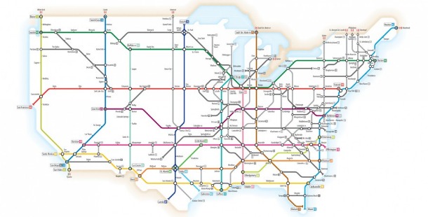
 Transit maps like the London Underground “Tube” diagram or the New York subway map are an integral part of life in cities with public transportation. Their bright colors, large type and simplified route lines allow complex travel information to be quickly and easily understood by commuters and tourists alike. Recently, the subway map has also become a popular metaphor for infographic design, especially for timelines or for depicting other complex networks. I’ve had two such diagrams featured on Visual.ly, both of which have been very well received: the Eisenhower Interstate Highway system (below) and the older U.S. Numbered Highway system.

In the course of creating these, as well as several other popular (but unofficial) transit maps for various cities over the last four years – Portland, Oregon, Washington, D.C., and Boston among them – I’ve developed some guidelines and techniques for creating beautiful transit maps. Bear in mind that even though these tips refer to creating an actual transit map, they hold true if you are creating a transit map-style infographic. (Editor’s note: the tips below were originally published, in more detailed form, on Cameron’s blog)
Plan Before You Start
Take time to consider everything about your diagram. How thick do you want the route lines to be? Are you going to use curves or straight edges where a line changes direction? Consider your station markers – will they be ticks, dots or something else? How would you like to differentiate interchange stations or transit centers? Choose the typeface you’re going to use for labels – it should be legible and simple. Next, examine an actual map of the area to be converted into a diagram. Draw rough route lines onto it if needed, or make a separate sketch. Simplify the routes down to their essential elements – horizontal, vertical and 45-degree angles. Identify the most complex interchanges, as they almost always need the most work. Solve them first, and the rest of the diagram often builds itself.
Use the Right Software
Creating a transit diagram is a very precise task, with route lines and curves that need to match up with each other perfectly, an underlying grid that holds the diagram together and professional-looking typography for station names and legend. For this type of work, you must use a vector graphics editor like Adobe Illustrator, CorelDraw or the open source Inkscape. When I see diagrams created in pixel-editing applications like Photoshop or MS Paint, I wonder how the creator even started the project, let alone finish it!
Define Your Grid
The most useful grid to have is one that equals the distance between the center lines of two adjoining route lines. This equals the thickness of those lines if they are touching each other, but if you want a bit of a gap between your lines, then this isn’t true. So, if you have 12-point lines that touch, use a 12-point grid. If you have 10-point lines with a 2-point gap between them, also use a 12-point grid.  Carry this grid through to other elements in your design for continuity in design: use a multiple of it to space your stations evenly along a route. If you have a 12-point grid, you might space stations 48 or 60 points apart. If you want to have curves instead of angled lines where a route changes direction, you may want to set them up as a multiple of the grid as well, although this can often be an aesthetic decision. The bigger the radius of the curve, the more elegant your diagram can look.
Let the Software do the Work For You…
Try to do as little manual placing or editing of your routes as possible. Snap paths to the grid to ensure precise placement. Use numerical values for transformation and movement functions as much as possible, especially when you’re moving things at angles other than right angles, as lines may not conform exactly to the grid in these situations. I love using Illustrator’s Smart Grid (Cmd/Ctrl-U) overlays when working on my diagrams, as it shows me when paths snap to points and angles.
…Except When Doing It Manually Works Better
One thing that Illustrator can’t help you with is adding curves to route lines. You might think that the “Round Corners” effect would be perfect for this task, but it simply doesn’t work. It adds curves properly to 90-degree angles, but its algorithm is fatally flawed with other angles, creating curves that have a larger than expected radius and that do not nest properly with other curves around the same corner.  So create a set of master curves and manually cut and paste into place once you’ve laid out the overall design of the diagram. Draw as many concentric circles as you need – if your diagram has a curve where five routes change direction together, you’ll need five circles – then cut each circle into four sets of 90-degree curves. Repeat, except this time, cut your circles into eight sets of 45-degree curves. Keep these master curves off to the side or on their own “Master Elements” layer to use as required. Copy the curves you require, place them precisely over the corner you’re working on (having those Smart Guides on works really well here), cut out the straight lines underneath your new curves and delete them, then join the curves with the remaining segments of the route lines. It’s time consuming, but also the most accurate way to add curves.
Consider Typography an Integral Part of the Design
Labeling of stations is one of the most difficult parts of creating a transit diagram. Whatever you do, don’t leave it until the end. Ensure your design has enough space so that type isn’t crammed into an inappropriate space. Try and prevent type overlapping route lines whenever possible so as to maximize clarity and legibility. A diagram that has all its type set horizontally is far easier to read than one where the type is angled in many different directions. You can alternate station names above and below a horizontal route line to save space. If you must angle your type, do it from one direction only to minimize the amount of head turning that people have to do. Having your type read from the right (tilting the head to the left) is preferred. 
Use Layers
I can’t stress this enough. Each route line should be on its own layer. Stations should be on their own layer. Text should be on its own layer. Any geography should be on its own layer. It makes complex selections easier, and keeps your working document neat and organized.
Use Global Colors
I don’t understand why Illustrator even lets you make non-global colors. This is such a useful feature to quickly tweak the look of your diagram. Want your Red Line to become a Green Line? Use global colors and simply edit the swatch: that color changes everywhere in the document. Cameron Booth is a graphic designer from Sydney, Australia who now resides in Portland, Oregon. He has almost 20 years of industry experience, and designs transit maps in his spare time because of his lifelong passion for them. He also runs a blog dedicated to transit map design. Follow him on Twitter or email him at [email protected].