Liz Burow teaches information design and collaborative design studios at Parsons School of Design in New York, NY. Short animations are one of the best tools out there for explaining ideas, but they aren’t used often enough for fear they’re too advanced. Yet, creating animations can really help designers understand the power of storytelling, beyond what can be accomplished with creating static visualizations. By adding time to the design ‘canvas’, one can start to understand how they are the director of an explanation, not just a designer of information. And while perfecting the skills of a storyteller and motion-graphic artist takes years, basic storytelling, argument building and dynamic visualization techniques can be learned fairly quickly and effectively. Here are five key principles in using animations successfully.
1. Know when to use animation as a medium
“ Beyond the age of information is the age of choices” – Charles Eames In a case where the designer is asked to use data to form an argument, explain a proposition, or show cause and effect, short animation is a good format for delivery. That’s because it asks one to think through the organizational structure of an explanation, both in hierarchy and flow, similar to how you’d approach writing an argumentative essay. (Video by Nicole Cioffe) On the other hand, an animation is perhaps not the right solution for an exploratory information graphic where you need to see a lot of data at once to compare and connect relationships, such as the conspiracy drawings of Mark Lombardi.
2. Structure the story
Creating animated visualizations can be as simple as stitching together quick sketches with very basic voice-over or text streams, or it can be more complex, with moving parts, sound tracks and professional narrations. Regardless, these animated videos must have an argument and a message that explains: (a) a need and an opportunity, or (b) a problem and potential solutions. As a starting point, here are three types of story structures that work well for persuasive, data-driven animations:
- Question/Response: Based on quantitative or qualitative data and research, pose a question. Explain why this question is worth asking and why it matters. Supply the response, or answer to this question.
- Problem/Solution: Introduce a problem. Explain the ‘who, what, where, when, and why’ surrounding this problem. Offer solution(s) and explain how it changes or affects the problem statement. Make the solutions tangible and actionable.
- Myth Buster: Introduce and explain the history of a myth or an urban legend. Bust the myth with the support of facts, figures and data.
(video by Elinor Samuelsson)
3. Try starting static and animate layers to build the explanation
Static and dynamic visualizations may hold the same content, but the medium can greatly affect the way people perceive the information. Before jumping into an animated data explanation, it is useful to create a static version. This lets you gather, organize and visualize the content, all in one space.
Then, you can start to re-imagine the explanation as a series of built-up layers of hierarchical information. The graphic is built before the viewer’s eyes and explains the data through a construction or deconstruction of the diagram. Audio or text narrative supports the visualizations in order to fold explanation and visualization together into the same time and space, creating a rich and dynamic ‘reading’ of the information. This kind of dynamic diagramming works really well with timelines, flow charts, lifecycles and maps, but can also be used for charts, graphs, plots and matrixes. (video and infographic by Michele Jang)
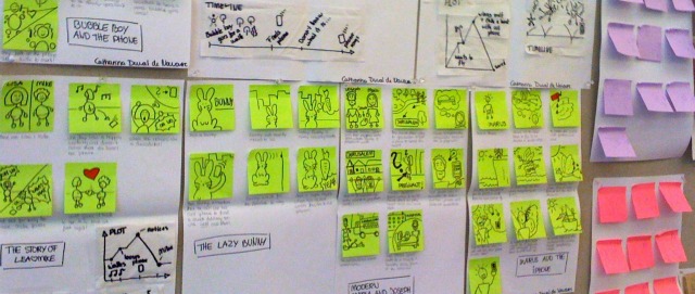
4. Use storyboarding to understand context and develop focus


(photos by Liz Burow) In graphic design, holding your audience’s attention often depends on good graphic design skills, including visual hierarchy, composition, and data ink design. Animations also require these skills, plus an understanding of pacing, sequencing, structure and rhythm. A great way to better understand what you have and how to put it together is the technique of storyboarding. Storyboarding can be done in a number of different ways that include using templates, index cards, or post-it notes, but it is best done when the ‘frames’ can be rearranged multiple times to best configure sequencing and explanation structure. Storyboarding is also useful for project management, since each ‘frame’ represents a unique visualization. Once the outline is laid out, it is easy to see how labor-intensive building an animation can become based on the storyboard visual and narrative complexity.
5. Give the Project Constraints
When first creating an animation, adding constraints to the project helps manage expectations and set clear goals for delivery. Setting the amount of time (e.g. five weeks to finish the project), an animation length (e.g. 90 seconds maximum), software (e.g. iMovie or Adobe Premiere) and minimum content requirements (e.g. this project needs a timeline and flowchart diagram) makes for better creative edits and decisions by the designer.
Go For It
Creating short animations can be seen both as a tool for thinking through explaining an idea and as a medium for creating engaging explanations. By understanding the when, why and how’s of making a short animation, the curious designer can quickly try, test and execute projects without having a lot of technical know-how. And while making an animation may seem like more work than putting together a static visualization or a PowerPoint presentation, the real reward comes when the audience gets to press ‘play’. Liz Burow teaches design seminars, studios and workshops that focus on tools, methods and strategies for design thinking across various disciplines, including architecture, business management and product design. She currently teaches communication design, information design and a collaborative design studios at Parsons The New School for Design in New York City.


![How to Create a LinkedIn Banner? [+ Examples to Guide your Production]](https://rockcontent.com/wp-content/uploads/2021/11/linkedin-banner-examples-300x158.png)