Infographics have already established themselves as engaging news and marketing tools, but they are also entering the education space in new and exciting ways.
Teachers can find infographics useful classroom tools in a number of ways. Most prominently, a good graphic makes information easily accessible, as it feeds into many students’ natural tendency to learn by seeing and interacting.
As educators around the country transition to the new Common Core State Standards, infographics can help them meet their learning goals. For those unfamiliar with the Common Core conversation, the new standards are meant to “provide a consistent, clear understanding of what students are expected to learn,” across the U.S. public education system.
Despite the arguments of CC detractors, what students are “expected to learn” are not facts so much as argumentation, logic and how to vet and interpret information.
The goal of the system is to help students distill the most important pieces of information from any given text and form a conclusion. A good graphic can fit these standards by reinforcing to students that their conclusions should be grounded in evidence and by challenging their ability to organize a hierarchy of systems, a.k.a. the ability to tell what pieces of information are the most important.
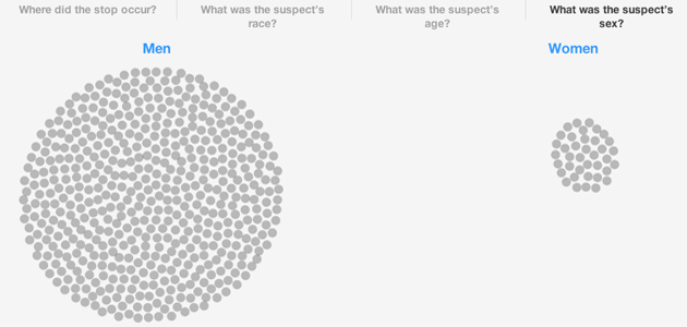
Infographics can also offer a rare chance for crossover between math and language arts, something that many teachers find difficult to do. For example, a recent lesson plan from PBS NewsHour Extra*, uses a graphic from BKLYNR that visually shows and divides all the stops in New York’s “stop, question and frisk” program last year to teach statistics and racial profiling.

(*Full disclosure: PBS NewsHour Extra employs the authors of this article) More than anything, basing a lesson plan around a graphic or using one as an integral part of classroom learning can lead students through a process of guided discovery and set them up for success.
Unfortunately, few leading providers of educational resources are releasing materials to demonstrate how to use infographics in an educational setting.
So, for teachers, or parents with curious children, who want to use infographics as classroom tools, here are five steps to take while writing your curriculum.
1. Choose the right infographic
Perhaps the most important part of using an infographic in a lesson plan is choosing the right infographic.
To work effectively in the classroom, use graphics that leave students the space to discover conclusions for themselves, but don’t leave them without adequate context.
This helps to support student-driven learning. Three questions a teacher should ask about a graphic before using it in the classroom should be:
- Does the graphic use verifiable information? Make sure you know the graphic’s sources, and whether they can be trusted.
- Does the visualization use best practices? Are you showing students the best example of how information can be presented graphically? Is the graphic distorting the information, and if so, for what end? Check out this other Visual.ly blog post on bad visualization practices for advice.
- Is the graphic engaging? Use an intriguing infographic to keep your students involved and emphasize why it’s important to produce engaging content.
If you’re a teacher looking to write a history or science lesson plan about the space program, for example, you could try this Space Launches graphic… or even simply print it large for your classroom wall to get your students excited about learning.

2. Create some context
Check to see whether your students know what infographics are. Simply reading them a definition or asking them to define the word may make the rest of the lesson easier.
Start with exciting background information on what the graphic is about and use materials from other media like videos or news articles to create a complete context. In the NewsHour Extra “Analyzing Stop and Frisk” lesson plan, student-produced videos and an article from the Washington Post were used to supplement and humanize the numbers shown in the graphic.
3. Have students analyze the graphics on their own
Put the students in small groups of two to four. Use a worksheet to prompt students to evaluate the infographic for conclusions they may be able to draw from it. On the worksheet ask students questions like:
- What surprises you about the information you are seeing? Are there points in the graphic where there are sudden shifts in the information/data?
- What story can you pull from the information/data you are looking at?
- What is the role of the narrator, or the person making the graphic? What is their perspective and what are they trying to tell us?
Then let the students go! Let them have the freedom to go explore and draw their own conclusions.
4. Debrief as a class
Have each one of the groups share what narratives and conclusions they drew from the graphic.
Ask them to support their conclusions with evidence they found in the graphic and the background information. Then start a classroom discussion on the differences and similarities between each group’s findings.
5. Evaluate
While it’s great to have a class discussion and get students thinking, every lesson needs an evaluation in today’s school system.
Have each of the students write an essay in which they develop an argument and support conclusions drawn from their experience with the graphic. Depending on the infographic, the student could also write a personalized narrative based on the visualized information.
Going back to the stop and frisk example, a student could write a statement on what the numbers say would likely be their experience if they lived in New York. “If I were an 17-year-old hispanic male living in Brooklyn I…”
Do you use infographics for educational purposes? Write your tips for integrating them into the classroom in the comments.
Allison McCartney is an editor at the PBS NewsHour focused on education and informational graphics, and a freelance designer in the Visual.ly marketplace. She has a bachelor’s degree from Washington University in St. Louis, where she studied Middle Eastern history and art. You can follow her on Twitter @anmccartney.
Special thanks to Katie Gould for her assistance with this post. Katie is the Teacher Resources Producer for PBS NewsHour Extra. She has a master’s degree in education from George Washington University. You can follow her on Twitter at @KA_Gould