Data visualizations are effective ways for inputting information into a human’s brain, and as Visual Analytics Researcher at Tableau Software and Visual.ly advisor Robert Kosara says, visualizations are what makes our world real. But even when the people who created the visualization are being honest, we can’t always trust what our eyes are showing us. We’ve evolved our visual perceptual system over millions of years (some other animals see optical illusions too) and it is extremely effective at what it does, but it still has some quirks. Sometimes it takes shortcuts to make things efficient, and those shortcuts are exposed in optical illusions.  In a data visualization context, illusions are dangerous because they can make us see things that aren’t really there in the data. Good practice helps us to avoid these optical illusions, but occasionally they can still sneak in through design choices, or just quirks in the way data lines up. There are two main types of optical illusions: Physiological and Cognitive. When designing data visualizations, it can be useful to be aware of these illusions and keep an eye out for them.
Physiological
Physiological illusions happen because of the way our sight systems physically work. Our anatomical structures and biological chemistry come into play to create these. They are often related to colors or brightness, but movement can also cause them. One of the most common places these illusions affect data visualization is in color scales. To avoid them, choose good colors. Rainbows are never good as a quantitative scale, partially because of how our cones work. Different hues activate different cones in our eyes. These cones are separated into categories (red, green, blue), and our brain does a bad job of merging them into a single continuous hue range. This leads to seemingly sharp changes in what is actually smooth data.  Afterimages don’t directly affect data visualization, but they could be an interesting technique for comparing two charts. Afterimages happen when the nerves in our eyes get so accustomed to something that they get sort of stuck and we see a negative of that image after looking away. It’s doubtful that this would be extremely effective, but it’s an interesting idea.
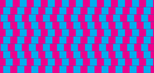
Cognitive
Cognitive illusions happen because of the way our brain works. Each of our eyeballs inputs mostly 2D information, in a format very similar to a bitmap image and our brains have evolved amazingly efficient systems for interpreting that information and turning it into semantic mental 3D models of our world. These systems are what let us do everything from identifying objects to estimating future motion of an object, and the illusions due to these systems cover a range of things that can mostly be classified as a part of Gestalt psychology.  Cognitive illusions are often more serious problems for data visualization because there are more of them, and they are sneaky. It is often harder to notice when they happen, so they pop up in bad places. Colors don’t just have problems with physiological illusions, they can also be harmed by our cognitive processes as well. The surrounding colors make a big difference in how we perceive a color. Element placement, background colors, borders, and spacing can all help to alleviate these problems.
  Size illusions can also be a major problem, and come from context as well. They are especially problematic in bubble plots and node-link diagrams where there is not a regular grid in element placement to help provide a size reference. Kaiser Fung of Junk Charts has an excellent post on the topic.
  No matter the type of illusion, they can definitely cause difficulties in accurately portraying your data. The best defense is just to be aware of the conditions that could cause them and when your visualization has those conditions, double check for illusions. If they show up, it might be time to change something in the visualization. And, just for fun, here’s a cat that sees the rotating snakes illusion.