Dear NASA: No More Rainbow Color Scales, Please
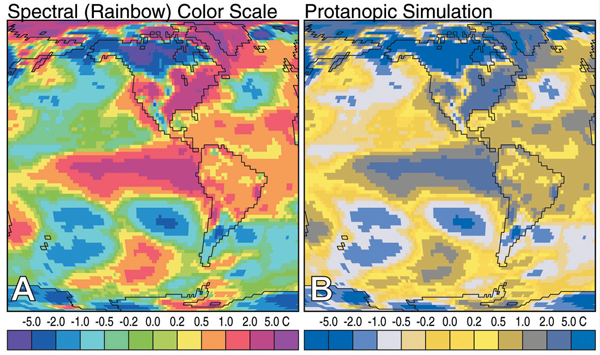
Dear NASA, The visualization community has noticed your insistence on using rainbow color scales for representing continuous data. This is a plea to you (and anyone else doing the same thing) to stop. On the surface, the logic behind using a rainbow color scale makes sense: the more colors there are, the easier you would […]
Uncovering Hidden Data: 5 Ways to Take Data Mining to the Next Level
Somewhere between readily available datasets and complex encrypted code lies a wealth of information that’s not immediately evident. Let’s call it “hidden data.” This information isn’t necessarily hidden on purpose or even hard to find, but it can be extremely valuable. With a little bit of searching, you can find illuminating comments, exact search results […]
5 Elements of Well Written Content

Great content has five common elements. 1. It is well written. The tone is engaging. The grade level is suitable for the target reader – sixth to eighth grade is what most newspapers aim for and it is fine for the Internet too. Triple check that spelling and grammar are correct. Most site visitors skim the […]
10 Things You Can Learn From the New York Times’ Data Visualizations
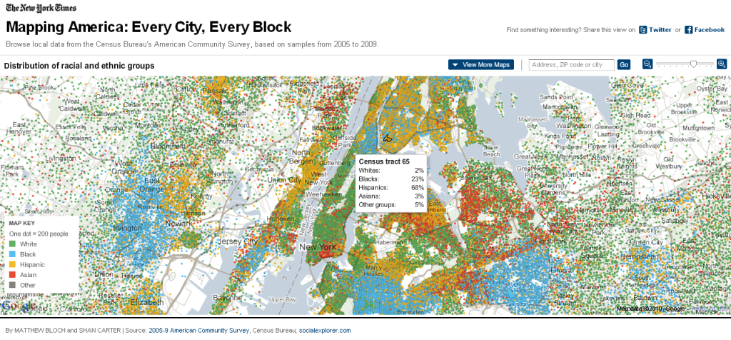
The Malofiej 20 awards, known as the Pulitzers of the infographics world, recognize the finest infographics published across the globe. This year, more than 1,500 print and online submissions competed for the prestigious awards. National Geographic Magazine, which won best print map and two gold awards, and Internet Group do Brasil iG (gold) were notable achievements.
What People Look for in a Real Estate Writer

Real estate is an important part of the economy. Some people invest their money in real estate to retire one day in the future, while others make a lifetime career out of it. Behind every real estate agent is an accomplished real estate writer. Anyone seeking a career as a real estate writer or seeking […]
40 Places to Find Open Data on the Web
If you are looking for reliable information for your data visualization process, you should consider open data sources. It means that all kind of datasets are available on the internet and you can access, reuse or even share them, depending on your own purposes. Here we explain more about the concept and list 40 websites.
Best Practices: Maximum Elements For Different Visualization Types
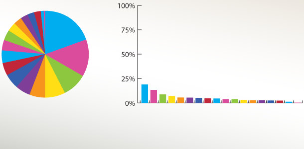
Visualizations are great for getting a grasp of data sets, but sometimes the data is too big for a certain visualization technique. Every type of visualization has limits for how much it can display while still being useful. These limits are not due to the visualization alone, they also come from the capabilities of our […]
Best Practices for data visualization: maximum elements for different visualization types
What data visualization best practices your company can rely on to deliver information? Find out the best graphs and charts for each challenge.
19 Beer Infographics To Make You See Double

Some of us may still be reeling from St. Patrick’s day weekend, so here’s a look at what probably put us into that state: Beer! 1. We should probably start at the beginning, with a History Lesson: The Story of Beer: a timeline of the history of beer. 2. Breweries of the 13 Original […]