Visualizations are great for getting a grasp of data sets, but sometimes the data is too big for a certain visualization technique. Every type of visualization has limits for how much it can display while still being useful. These limits are not due to the visualization alone, they also come from the capabilities of our brains to perceive and interpret what our eyes see. Different visualization types rely on different capabilities of our visual system, so they each have different limits. Let’s look at a few examples.
Download this post by entering your email below
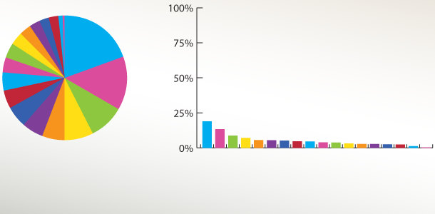
Pie Charts
Pie charts are among the most popular visualizations for percentage data, but they aren’t appropriate for more than seven categories. This is because our brains are not particularly good at telling different angles apart, and even worse at telling how far apart different angles are from each other. If you have a pie chart with more than seven categories, consider turning it into a bar chart. The part to whole relationship is no longer apparent, but typically, it is more important to see the difference between different categories. The data for the pie chart below was taken from a pie chart in an infographic recently submitted to Visual.ly. It has far too many categories to be useful, although being sorted certainly helps it a lot. The bar chart shows the same data, but the part to whole relationship is not visible. In this case, that relationship is not critical, though. What is more important is seeing not just which categories are ahead of other categories, but how much they are ahead (in this case, the only significant differences seem to be in the first two categories). Keeping the axis from 0-100% also shows the context of the values. 
Colors
You’ll notice in the charts above, that the colors repeat. The same repetition was there in the original pie chart, only with different colors. Colors are another limiting factor in many visualizations of categorical data. The maximum number of colors (with similar luminance values) that we can distinguish and remember easily is around 12. The 12 colors below have been taken from Colorbrewer2.org, a great resource for categorical and continuous color scales. 
Bar and Column Charts
Bar and column charts of categorical data also have an upper bound on the appropriate number of bars. That number is limited by several things. Hypothetically, screen space is important. After all, if you can’t see all of the chart at once, you rely on memory instead of visualization for the parts off the screen. Today, screens resolutions are typically high enough that pixel counts aren’t the limiting factor anymore. So the limiting factors are a bit more complex and depend on several issues. First, what matters more in the data? Is there an overall trend that is important, or is the difference between individual categories the focus? If the overall trend is the important factor, you might be able to get away with 50 bars or more. If individual differences are important, you probably want to keep the total number of bars under 12. Every bar you add increases the number of comparison possibilities exponentially. That is not to say that people actually make all of these comparisons when they look at a bar chart, they likely spot important ones or big differences and only make those. The chart below illustrates how individual differences are hard to compare using too many bars, while overall trends are still visible.

Line Charts
Line charts are another visualization type with limits on the number of elements. The number of points on the lines are only limited by screen space, however the number of lines is limited by perceptual issues. Too many lines will cause people to have a hard time seeing and tracing each individual line, depending on line crossings. The chart below was taken from a graphic recently submitted to Visual.ly. It only has seven lines, but the bottom ones cross a lot and cross at low angles to each other (try tracing the purple line). This isn’t a deal-breaker for this particular chart because the red line with the huge spike is where the story is, but not all data has the same story. 
Scatterplots
Scatterplots can easily show more elements than any other visualization for tabular data (the runner-up being parallel coordinates). There are several reasons for the high numbers. The first reason is incredibly simple: dots don’t take up much space. Second, since a scatterplot is good at showing correlation between dimensions, the information really comes from the aggregate group, not from the individual. For this reason, the space consuming labeling necessary on other charts isn’t needed for many scatterplots. In the example below it is easy to see two groupings, and some slight correlation within each group. With some color changes, axis labels, and explanatory text, this visual could take hundreds of elements and turn them into a small set of insights.  One critical thing to remember is that with almost all visualizations, the more elements there are, the longer people will need to spend examining the visualization before they can interpret the information. For an infographic intended to make a point, quick and easy is probably the goal. Bottom line: if your data is too big, you may need more analysis to distill it down to the essential parts. Drew Skau is a PhD Computer Science Visualization student at UNCC, with an undergraduate degree in Architecture.